This week marks the halfway point for The Untitled Drawing Club – six weeks in with six more to go. We are travelling to Finland, to visit the Helsinki Art Museum or HAM for short. Firstly, great acronym – made me very hungry reading it. Secondly, I am so excited to ‘digitally’ visit Finland and see their Art Museum. As soon as I opened the Google maps link, I knew exactly what artwork I was going to create. Read on to learn all about this Art Museum and to see the artwork inspired by my visit. Link to the Club will be shared at the end.
HAM
I would like to start by sharing the most random fact I know about Finland. It is the only country in the world with a sauna in one of their Burger King fast food restaurants. I felt it was necessary to share because sharing is caring. Let’s now turn to HAM. Although this museum is located right in the city centre of Helsinki, it has a much wider outreach that I will talk about later.
When you want to learn more about a museum or gallery, a great place to start is to find their mission statement. For HAM, their mission is ‘making Helsinki more fun through art.’ What a seriously great purpose. Their collection consists of over 9 000 individual works of art that, according to their website, ‘belong to the people of Helsinki.’ I am immediately drawn to the fact that this museum already sounds so inclusive and transparent. These artworks, along with international and national exhibitions, are displayed in a gallery space known as the Tennis Palace.
What I’m also drawn to is their language. It’s not usual art gallery language that can, at times, be alienating. Their vision is straight-forward – offer a distinct museum experience, work with audiences, reach new audiences and build international interest. The theme of inclusion really runs through everything they do. You can tell just how dedicated they are to the people of Helsinki and how they want to both establish and strengthen their relationship with visitors.
It is also worth mentioning their values because I find them particularly interesting. They are courage, joy and presence. That theme I just mentioned is also present here as the Museum wants to produce joy and facilitate connections. They exist for the public and want to welcome everyone through their doors for a meaningful experience.
Not only does HAM achieve its mission and implement its values within the four walls of the museum, but they reach almost every corner of Helsinki. There are just over 3 500 public works of art around the city with 480 accessible all hours of the day and night. Of the 3 500, 250 are part of HAM’s collection. Revealing again just how inclusive they aim to be, their website states ‘all residents of Helsinki have an equal right to live in a high-quality environment’ which is why they have ensured there are many accessible artworks. Reading about this museum has ticked one of their values – it literally filled me with joy.
HAM’s History
Very briefly, the history of HAM reaches back to 1885 when the City of Helsinki’s art collection acquired a Johan Ludvig Runeberg sculpture. After opening the Kluuvi Gallery in 1968 then the Art Museum Meilahti in 1976, the museum was eventually moved to the Tennis Palace which opened in 2015.
You can explore the public art online, but the collection is not digitally available. If you would like to see some sculptures then click here. I recommend starting with a couple of sculpture trails. The rainbow Helsinki one is very interesting. If you’re looking to ponder some difficult questions, check out the ‘Questions of Life’ trail (photographed below). You can follow the trails and click on each sculpture for more information.
Tennis Palace Exhibition Space
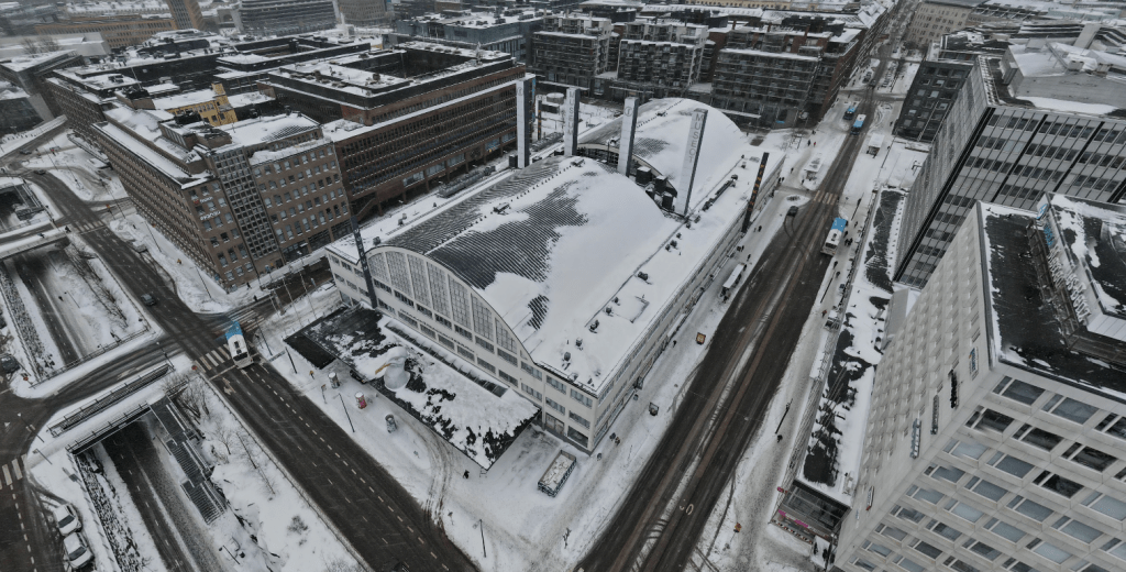
The links provided by the Club send you to an outside view of the Museum, a vlog (video blog) made by the artist (and Club organiser), Alexis Winter, and a Google maps image of an exhibition room. The latter two give an overview of what awaits visitors once they step inside. The exhibition rooms look very spacious and industrial. The beautiful curve of the roof adds a nice architectural touch that allows the space to feel much larger and grander. I imagine that actually visiting this space is quite an experience.
If you want to watch the artist vlog then click here. As well as HAM, the video also shows you Suomenlinna, an 18th century sea fortress. For the other links, you can access them via the Club’s page here.
My Artwork
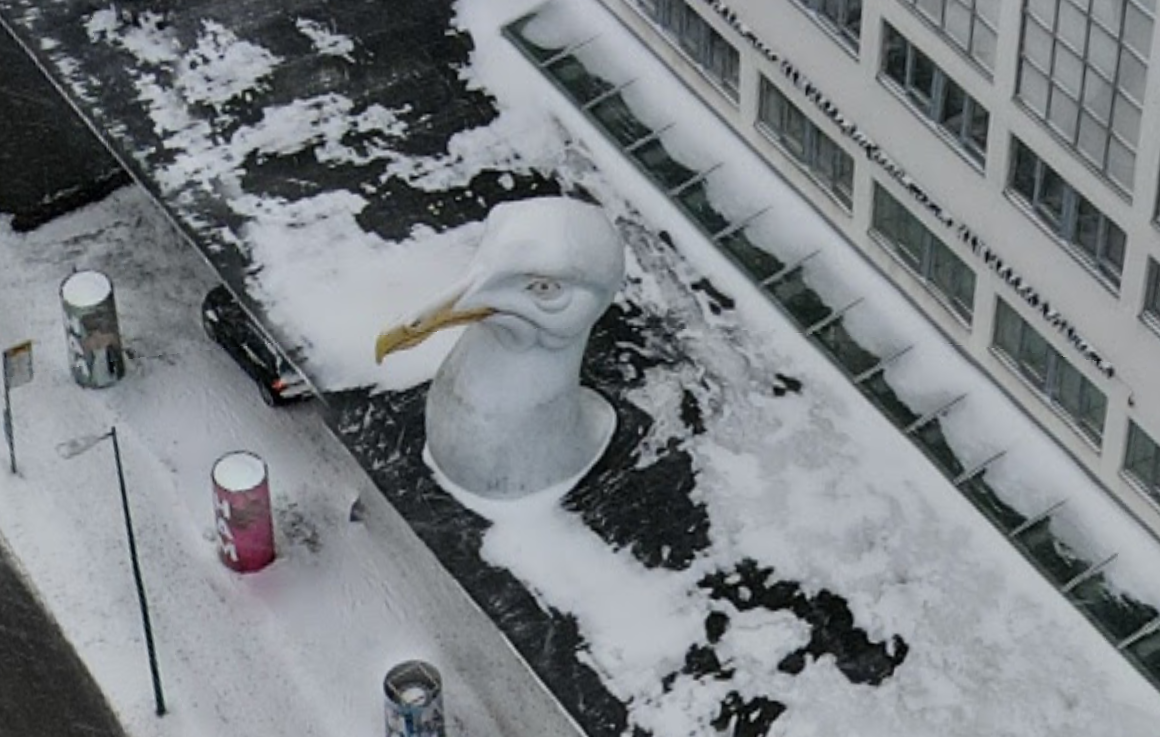
When I clicked on the link to see the exterior of the Museum, I noticed two things. Firstly, the snow on the rooftops of buildings surrounding the Museum. I love winter so much and seeing snow was wonderful. Secondly, the seagull head at the entrance to the Museum. I had to look twice to make sure it was, in fact, the head of a seagull. I can confidently say I’ve never seen a seagull (real or not) in the snow. So, to capture this weird juxtaposition, I have drawn the seagull and cross-stitched some snowflakes.
Week 6 Drawing
I leave this week with yet another museum I must visit. For those of you wondering, the Burger King with the sauna is about an 11 minute walk (approximately) from the Museum. I’m not telling you how to plan your day, I’m just providing you with an option.
The Untitled Drawing Club has, for the second time, sent us to an international location. This week, we are travelling to the Brooklyn Art Library in New York. The name of this library did ring a bell. I remember, a few years ago, learning about their Sketchbook Project and thinking it was a really amazing idea. I was glad to have this opportunity to discover more about the Library and learn what inspired the Project. As always, my artwork and a link to the Club will be shared at the end of the post.
The Brooklyn Art Library
Located in Williamsburg, Brooklyn, the Brooklyn Art Library occupies a two-story brick building that blends into its surrounds. Stored inside are over 50 000 sketchbooks that have been donated to the Library by around 30 000 individuals. I purposefully didn’t use the word ‘artists’ because you don’t need to be an artist to submit a sketchbook to the collection. This project, the Sketchbook Project, has reached almost all corners of the world with 100 countries represented.
The Project began in 2006 and was the brainchild of Steven Peterman. One of the links for the Club sends you to a short YouTube video where you are introduced to the collection and to the Library by Peterman himself. The Library has quite literally become a time capsule, documenting the creative thoughts and processes of people from all over the world. The sentiment that Perman shares in this video is great – rather than focusing on individuals the project has shifted to community creation. By contributing a sketchbook, you are joining hundreds/thousands of people who have embarked on the same process with the same shared goal.
To be involved, all you have to do is order a book online, create whatever art you like (ensuring the book remains thinner than an inch), then send it back. Putting my Curator cap on, I couldn’t help but think of how donation actually works. What kind of information is collected and how is the Library set up for users? Luckily, that was all answered in the video and on their website. When you donate your book they ask for some details including your name, title of work (if there is one), your location and any tags/biographical information you want to include. This helps people search for your book both onsite and online. You can elect for your sketchbook to be digitised and added to the online collection. Currently, there are about 25 000 sketchbooks searchable online.
Just like any other library, once a book has been donated it receives a call number. What’s really cool is that you are notified if your book is ever ‘checked out’ and if you decide to have it digitised, you can see for yourself how many online views its received and also the number of mobile checkouts.
The Library officially became a nonprofit organisation in 2020.
After reading a bit more about the Project I couldn’t wait to delve into the online collection and see what I could find. I can’t quite describe it, but there is something so personal about browsing through the sketchbooks, gaining an insight into someone’s thoughts and creativity. I could honestly spend hours on this website searching through the sketchbooks. No surprises here, but my first two search terms were ‘dog’ and ‘pathology’. All digitised images are protected by the Creative Commons Attribution-NonCommercial-ShareAlike license. For this reason, I’ll be posting a link to my favourite sketchbooks and no images.
One of my absolute favourites is this one (click the link here) called ‘Histopathology’ by Jenna Hannum. It contains a combination of sketches, old histopathology index lists and some writing. The index lists have been lifted from the ‘Physicians Desk Reference to Pharmaceutical Specialities and Biologicals’ printed in 1947. You can zoom in on the individual pages and really see the detail up-close. The watercolour histopathology pages are stunning and I love how each disease represented is described in pretty accessible language.
Another sketchbook completely broke my heart. Titled ‘memori JAN’ by Gea&Danny, this book (here) was created as a memorial to the contributor’s dog. It has been made to help cope with loss. On the back it says ‘R.I.P. my sweet companion’. I was moved to tears reading through the pages and seeing just how much love has gone into this project.
If you have a spare moment in your day, or want to make time to relax and unwind, then I highly recommend browsing the collection. You can access it here. On the homepage, there is also a link to participate in the Project.
Screenshot from the digital collection welcome page
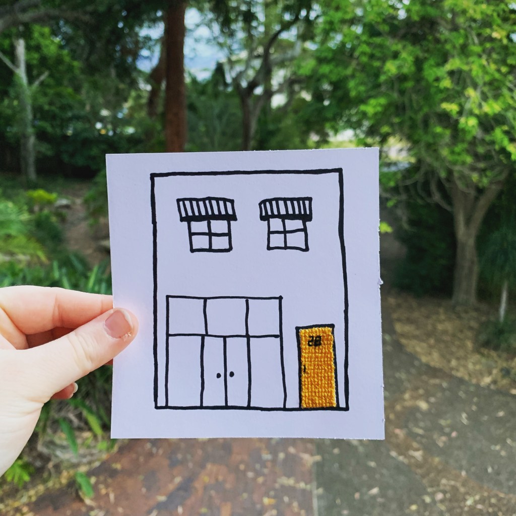
My Artwork
I have to admit this is the most inspiring week so far. I was overwhelmed with options, so I decided to focus on the first thing that caught my eye – the building itself. I love a bright-coloured door so I’ve sketched the outside of the building and cross-stitched its yellow door.
Week 5 Drawing
I have also decided to become part of The Sketchbook Project. I ordered my book and will be waiting so patiently for it to arrive. It gives me some time to think of how I will fill the pages. It is actually quite exciting to think of all the possibilities.
To conclude, this has been a really fantastic week that has inspired me to actually contribute something to a cultural institution! If you want to join the club then you can click here for further information. Otherwise, have a great time browsing the sketchbooks online.
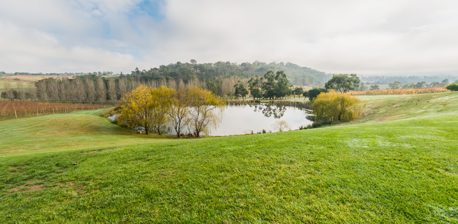
This week, for The Untitled Drawing Club, we are travelling to TarraWarra Museum of Art located in Victoria, Australia. More specifically, you can find this museum in the Yarra Valley wine region – an hour’s drive (approximately) from the state’s capital, Melbourne. This is the first museum the club has visited that I haven’t visited in-person! I have, however, most definitely added it to my list of ‘must visit’ museums. Rather than a tour of an exhibition, we have been sent to explore the grounds and landscape surrounding the Museum. Before sharing the absolutely stunning scenery with you, and my artwork inspired by this scenery, I want to write a bit about the Museum and introduce you to the space.
TarraWarra Museum of Art
The TarraWarra Museum occupies the land of the Wurundjeri people of the Kulin Nation. ‘Tarrawarra’ comes from the Woiwurrung language and can be translated to mean ‘slow moving water’. More broadly, it’s a name given to this area of the Yarra Valley:
The Museum was founded by Eva Besen AO and Marc Besen AC – art collectors who started acquiring Australian modern and contemporary artworks back in the 1950s. Both the building and a significant portion of the collection were gifted to the Museum by the Besens. They were both so passionate about Australian art and focused on collecting the artworks of young and emerging artists including Clifton Pugh, John Olsen and Fred Williams.
Where the Museum is situated today, was purchased by the Besens in 1979. The area, 500 hectares in total, was named TarraWarra Estate. Twenty years later, in 1999, they hired a project manager to build a museum that reflected both the region and their love of modernism. Construction finished in early 2003 and it opened to the public later that year. It is quite a remarkable building, winning the Victorian Premier’s Design Award for its elegant design in 2004.
Since its opening, there have been over 110 exhibitions. It has also become a site for other cultural events such as Australian Chamber Orchestra concerts and TarraWarra Festival.
Museum Collection
I wanted to learn a bit more about the Museum’s collection so I ventured to their website. There is no formal virtual, but you can explore some highlights of the collection by following this link. Since 2002, the collection policy has expanded to include contemporary Indigenous art and to accept gifts of international art. The strength of the collection is its Australian figurative, abstract and landscape paintings from the 1930s to present day.
I want to briefly share a few of my favourite works and I hope this inspires you to discover more.
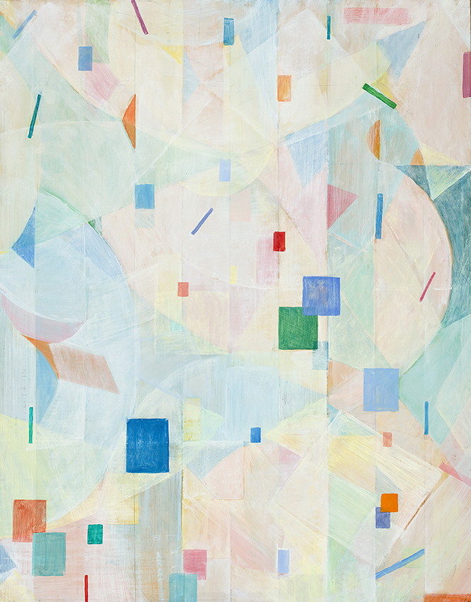
Concerto for Flute & Violins, 1968 by Yvonne Audette
I love the use of colour and shapes in this work. It looks like a pastel modernist dream.
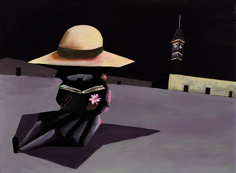
2. There Was, 1953 by Charles Blackman
This artwork manages to be both relaxing yet daunting at the same time. A great balance.
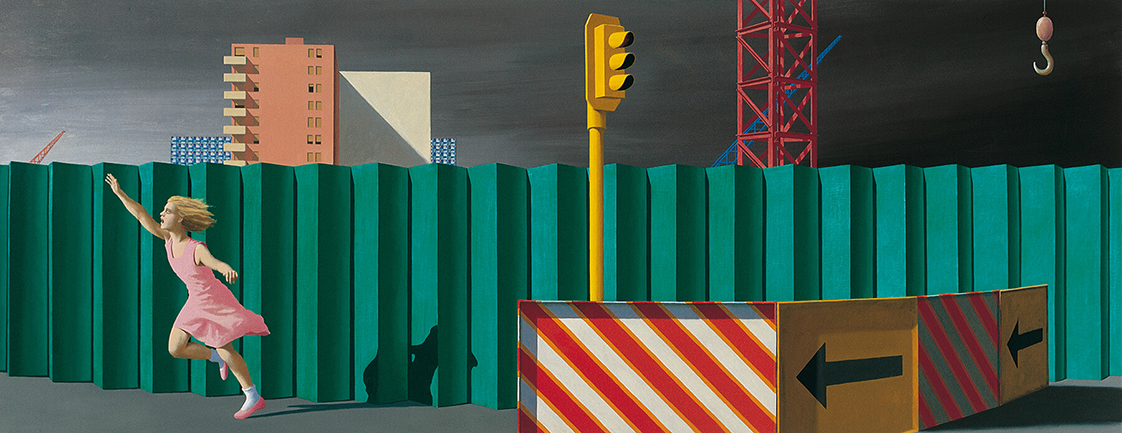
3. The Construction Fence, 1978 by Jeffrey Smart
This work really caught my eye. Is the girl running from something or towards something?
Drawing Club Tour
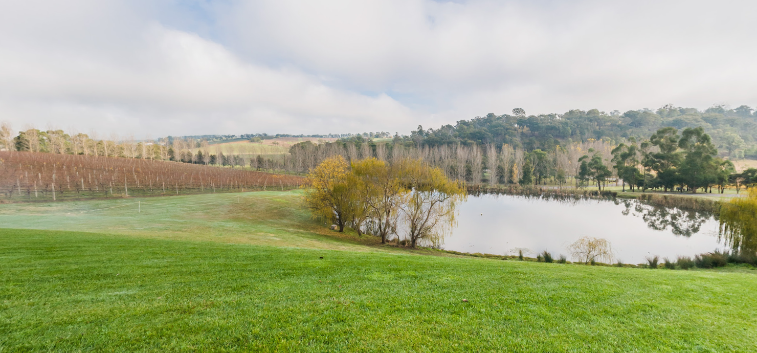
As I mentioned before, the links for this week focus on the surrounds of the Museum. The landscape and scenery is truly incredible. This is literally the view from the cafe:
The club also provides a link to a YouTube video released by the Museum in 2020. It’s called ‘Autumn Vignette at TarraWarra Museum of Art’. If you are looking for four minutes of pure relaxation, then I highly recommend watching this video. I absolutely love autumn and being able to experience it at the Museum through video, images and sound was an amazing way to end a Monday. One of my favourite parts of the video is at 1:55 when you can see kangaroos hopping through the vineyards.
I felt relaxed and inspired after my visit and there was no doubt in my mind as to what my artwork would be for this week.
My Artwork
If you’ve been reading my other Drawing Club posts then the type of artwork I’ve created should come as no surprise. I really want to be consistent because I’m considering stitching them all together to create an artwork-style quilt at the end of the twelve weeks. I haven’t committed to that idea yet.
While wandering around on Google maps, I saw some trees that I subsequently sketched. Then, I cross stitched a few autumnal leaves and a small pumpkin.
Week 4 Drawing
I truly cannot wait to visit this museum. Some day…. For now, it will be added to my ever growing list of museums and galleries I need to visit. Not want, need. I truly miss being able to visit so many incredible cultural institutions. Until I can, being in this club gives me something cultural to look forward to each week and I am truly grateful that a link was sent to me. If you want to join or discover further information about the club then click here.
Welcome to week 3 of The Untitled Drawing Club. As always, a link to the club will be shared at the end of this post. This week, we’re travelling all the way to Copenhagen to visit the Designmuseum. I was fortunate enough to visit this museum back in 2016. If you want to read about my experience, you can follow the link here. I still remember all the wonderful objects on display including a whole raft of mid-century Danish design furniture which filled me with so much joy. As I’ve already reviewed the Museum, I’m going to skip that for this post. Instead, I want to share a bit about its history (I briefly mentioned this in my 2016 post) then focus on the virtual tour. Finally, I’ll share the artwork I created inspired by my visit.
History of the Building
Currently the Museum is closed to the public and due to open in 2022. They have taken the opportunity during COVID to renovate, restore and repair – the perfect time to complete such work. Both the Museum and the building it is housed in have such fascinating histories and I want to share these with you. If/when you visit, you can have this history and these stories at the forefront of your mind!
To start, the Museum was founded back in 1890 by the Confederation of Danish Industries and the Ny Carlsberg Museumslegat in Copenhagen. It opened to the public in 1895. From the beginning, the goal of the Museum has been to ‘communicate the idea of quality within design’ (quoting their mission statement). What does this mean? Well, by displaying some of the finest made Danish products, they are hoping to raise consumer awareness of quality over quantity.
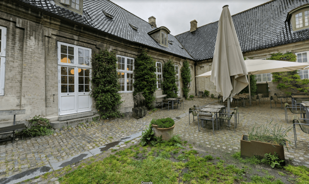
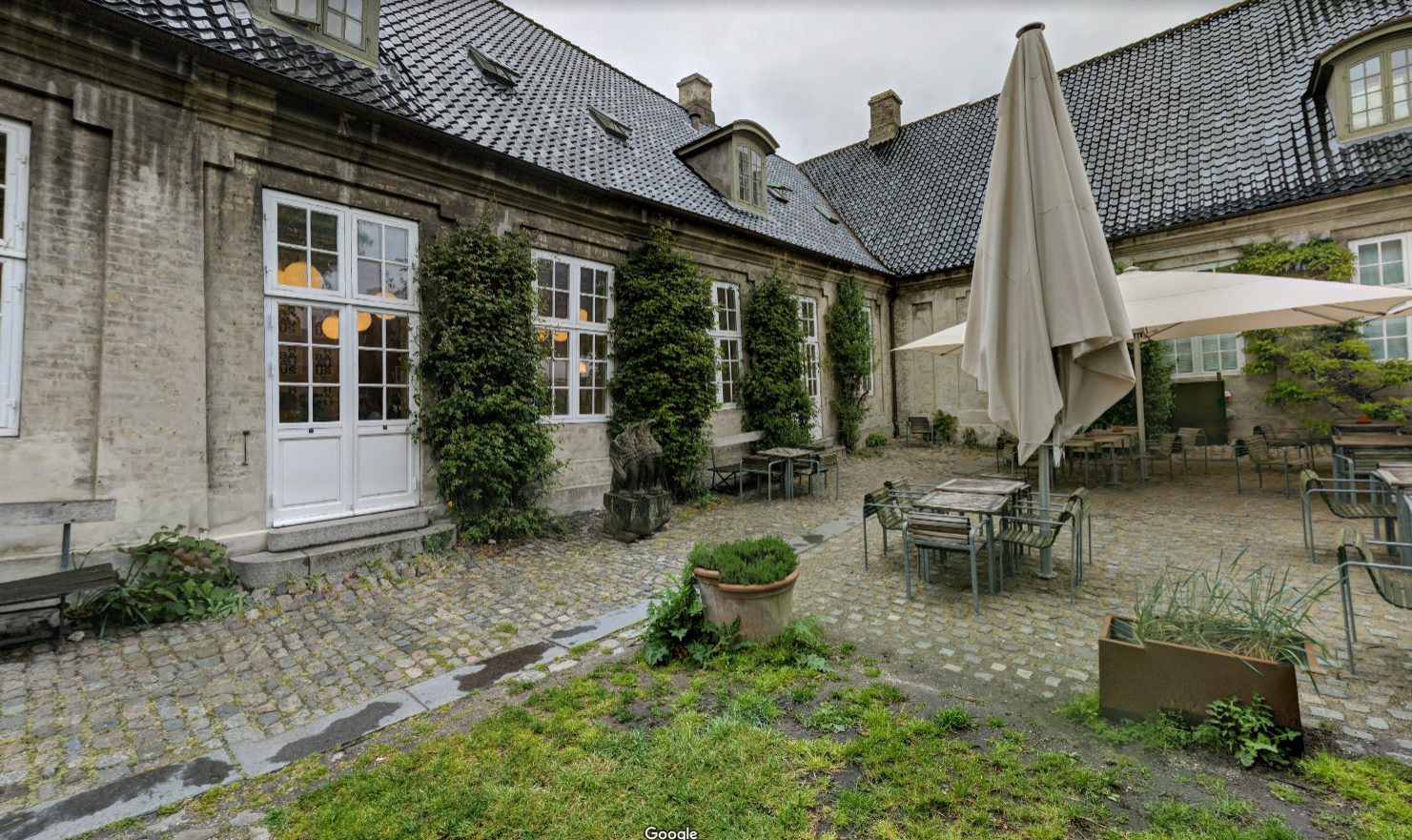
A few decades later, in 1926, the Museum moved into the building where it’s located today (photographed below). This is a classic Rococo-style building that was constructed during the reign of King Fredrik V between 1752 – 1757. After some quick renovations by Ivar Ventsen and Kaare Klint, it became the perfect place to house a design museum. Klint, aka the grand old man of Danish furniture design, even lived in the Museum while working as a lecturer at the School of Furniture Design and Interior Decoration and the Royal Academy of Fine Arts. Personally, living in a Museum is the dream.
I am going to jump back in time to share the most, in my opinion, exciting thing about this building. So it was built in the 1750s and became a museum in the 1920s, but what function did it serve between these years? I want you to have a look at the entrance to the Museum and consider what it looks like.
If you guessed hospital, then you are correct. This building was the first public hospital in Denmark where patients could receive free healthcare. It was officially opened on 31 March 1757, King Frederik’s birthday, and called the Royal Frederik’s Hospital. Funds were raised from the earnings of the Norwegian Postal Service. If you’re thinking, wow that’s random, King Frederik not only ruled Denmark, but also Norway. When you walk through the building there are these long galleries that were originally filled with beds for patients. It was all very systematic and functional in design with each bed positioned near a large window to allow for natural light. Located right in the middle of the building was the Grønnegården, an outdoors space for patients to visit during their stay. Part of the virtual tour actually places you in this garden so it was really interesting to learn about its historical significance. The Assembly Hall, or main entrance to the building, was one of the hospital’s main operating rooms. Those large windows you can see in the photograph above would have allowed the space to be filled with light making it perfect for some 19th century surgery. The hospital closed in 1910 when the new Rigshospitalet opened. For 16 years the building sat empty until the Designmuseum moved in.
Image: frmir, Public domain, via Wikimedia Commons
Virtual Tour
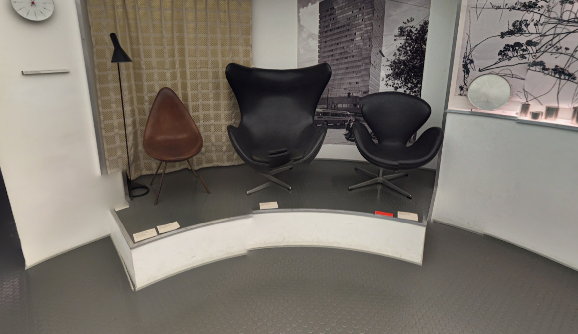
Unlike in previous weeks, this virtual tour isn’t really a tour, but images from Google maps that you can rotate around. You can’t move through the space so you are locked in to one area. The three images we have available consist of two exhibition spaces and the outdoor courtyard and garden I wrote about earlier. My favourite is the room filled with Danish-designed chairs. How they are displayed is so aesthetically pleasing and transforms this functional piece of furniture into a work of art. I also enjoyed spending some time in the garden and could definitely see how it was a relaxing place for those who were recovering in hospital.
The final image places you in an exhibition showcasing the work of Arne Jacobsen. If you are up-to-speed with your Danish designers then this name will probably resonate with you. Every image I found of Jacobsen is of him smoking a pipe. Although Jacobsen achieved so much in the world of Danish design, he is arguably most famous for the three chairs photographed below. They are, from left to right, the drop chair, the egg and the swan. We can also thank Jacobsen for chairs that stack neatly on top of each other. Looking around the room you can also see some cutlery he designed as well as thematic panels and a few photographs.
I can’t really review the virtual tour in too much depth due to its nature. It was enough, however, to inspire me to create some art.
My Artwork
Similar to last week, I wanted to take something I saw and give it life. I love Danish design and I love a good chair, so I decided to draw one of the chairs and make it feel homely. Underneath, I cross stitched a coffee mug resting on a pile of books. On top, also cross stitched, is a cushion inviting you to sit down and relax.
Week 3 Drawing
It’ll be great to see the other works inspired by this virtual visit on Sunday. If you want to join the club or find further information then click here. Until next week, happy drawing!
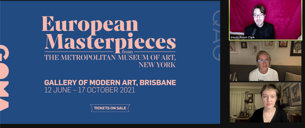
Is there a better way to spend a Sunday night than listening to a talk debating art? For a brief moment, I forgot that tomorrow is Monday. The Great Art Debate was a virtual event that saw classical art and contemporary art go head-to-head to win the hearts and minds of the audience. A huge thank you to the Gallery of Modern Art (GOMA) and the two speakers, Mary McGillvray and Dr Louise Mayhew, for their passionate presentations. To start, I want you to decide which you prefer – classical art or contemporary art. You can’t say both, I want to challenge you. Once you’ve decided, read on and see if either argument can sway your decision. The debate also started by asking the audience this exact question. The result was 42% of people enjoy classical art, 17% contemporary and 43% couldn’t make up their mind. The latter option dropped out at the end when everyone was asked and polled again. At first, I was 100% voting for classical art, but, by the end of the presentations, my mind was in two places and my final vote went to contemporary. There were two rounds – hearts and minds, as well as a final arguments section. Here were the main arguments from those rounds and some final thoughts.
Hearts: Classical
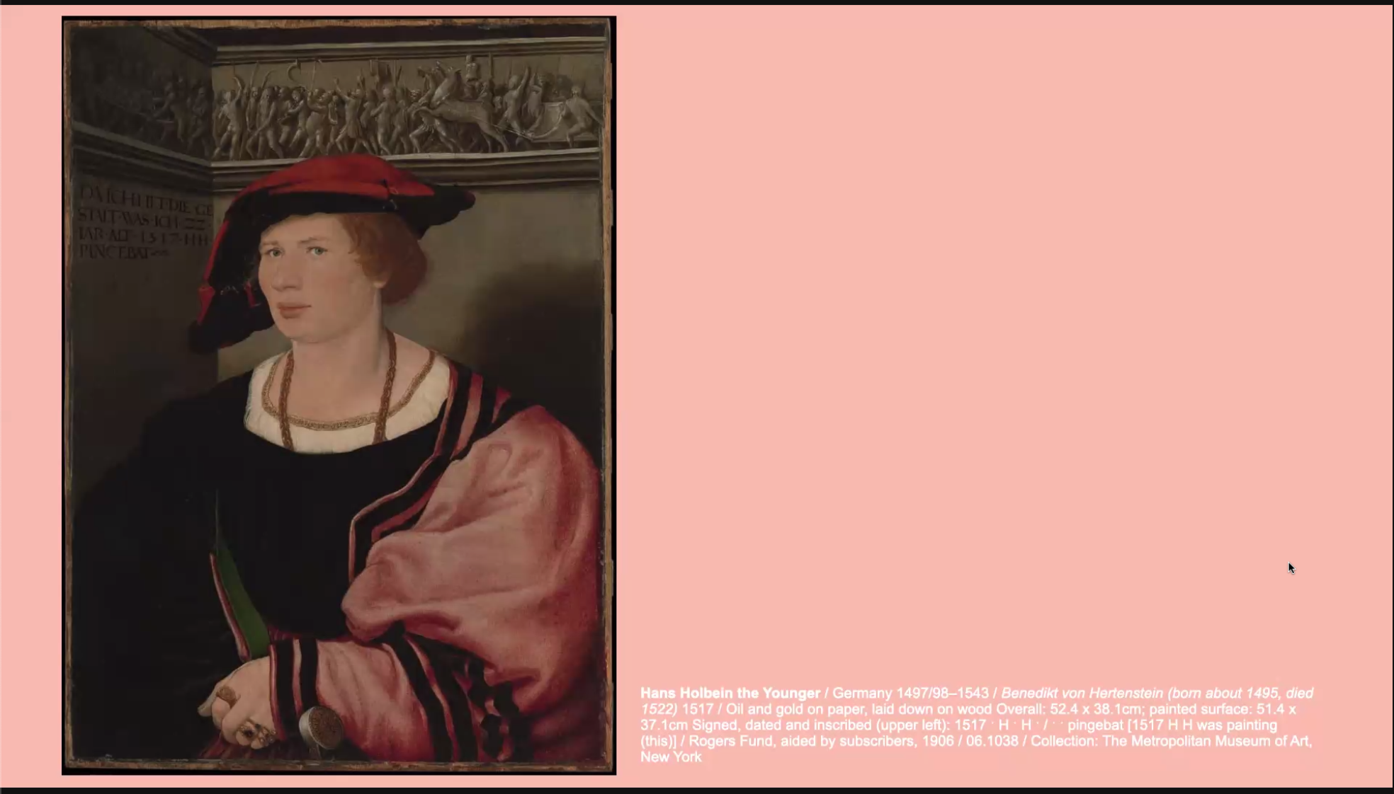
Mary McGillivray, art historian and ‘TikToker’ who believes art is just old memes, began this session by showing a portrait currently on display in the European Masterpieces exhibition at GOMA. Painted by Hans Holbein the Younger, this is Benedikt von Hertenstein, aged 22. Benedikt, wearing his best outfit for this formal portrait, was the son of a very wealthy mayor in Switzerland. Five years after this was painted, Benedikt died in battle. McGillivray argued that this portrait is a visual connection to humanity as we are drawn into the life of this man who looks kind of uncomfortable wearing all that wealthy clothing. Although he lived hundreds of years in the past, we cannot help but feel sympathy for him as we know, just five years later, he would die.
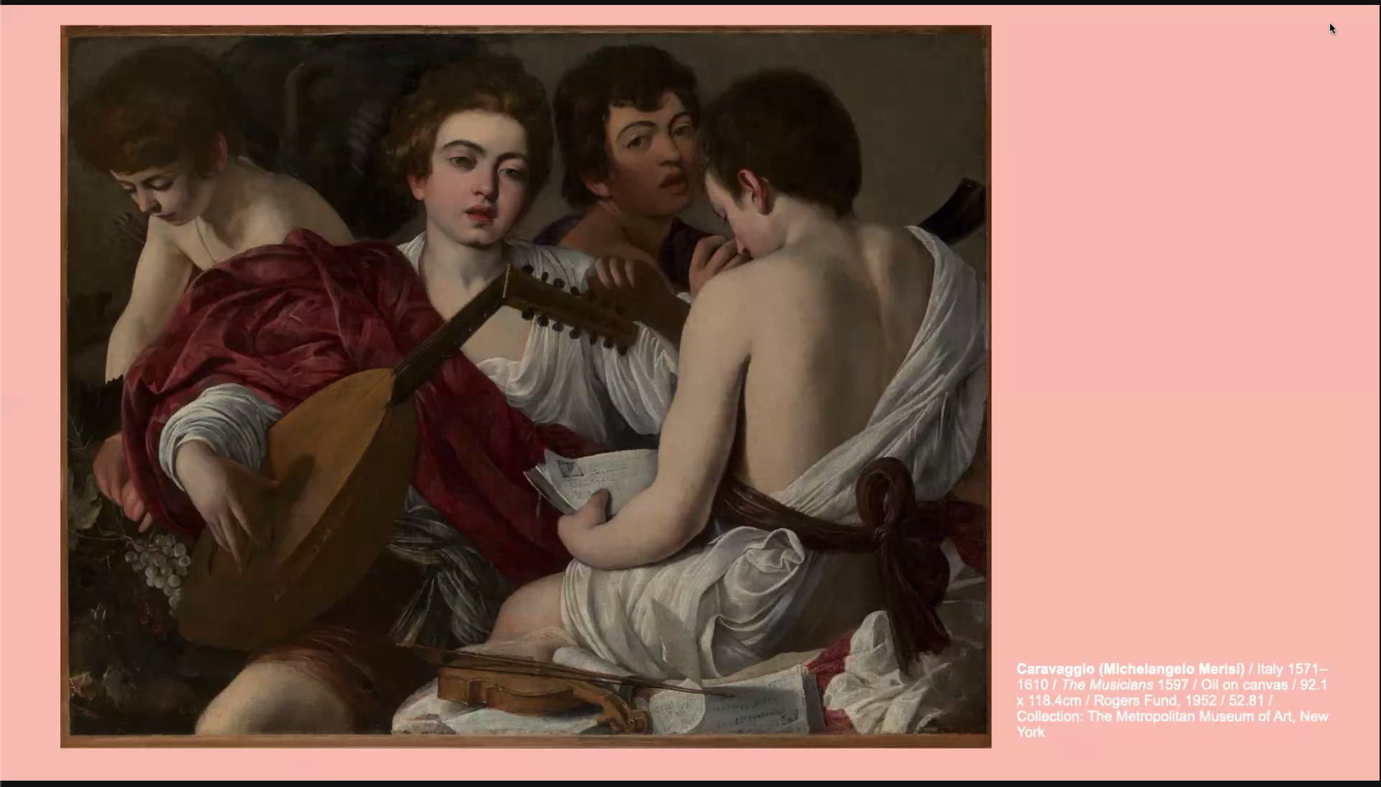
We then moved to Caravaggio and his artwork ‘The Musicians’. Side note, when I visited this exhibition with friends we nicknamed this ‘The Beatles’. Caravaggio is a master of conveying emotions in art. This artwork could represent allegorical concepts or four of the senses, we will never know. What we can see, however, is that this can be read as a sexually provocative painting blurring some of the lines between what is deemed masculine and what is deemed feminine. It is a powerful piece of art for the LGBTQIA+ community as Caravaggio is now known to have been bi-sexual. This artwork speaks to that, representing desire for men.
Next was an artwork by Marie Denise Villers. Originally attributed to a man, this was revised and Villers discovered to be the real artist. It is a stunning portrait with great attention to shadows and light that draws you in. What McGillivray argued with this artwork was how classical art can convey mystery. There is a crack on the window pane. Why is it there? No one knows. It reminds viewers that what we do today is not always universally comprehensible and it is not guaranteed that those in the future will understand its significance.
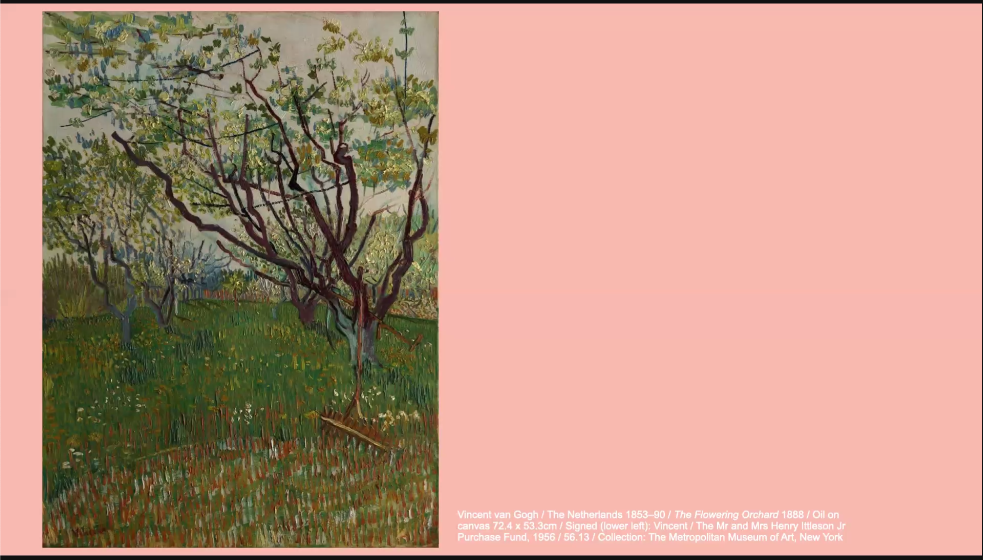
Finally, we had Van Gogh. To quote McGillivray, ‘people froth a Van Gogh’. The colours, the dynamic nature of his art – it’s all so beautiful and inviting. But, there are more reasons why his work has mass appeal. When we see his work, it garners a strong emotional response. We know his tragic life story, his battle with mental health and how he wasn’t appreciated during his time (cue episode of Doctor Who that makes my cry every single time).
All of these artworks remind us of what it is to be human and to have a shared experience. In summary, classical art connects us to the dead, challenges identities, provides us with mysteries and allows us to appreciate beauty – all of which result in an emotional connection.
Hearts: Contemporary
Responding we had Dr Louise Mayhew, an Australian feminist art history and contemporary artist. Similar to McGillivray, Mayhew focused on a few select artworks to argue her point of why contemporary art speaks more to the heart.
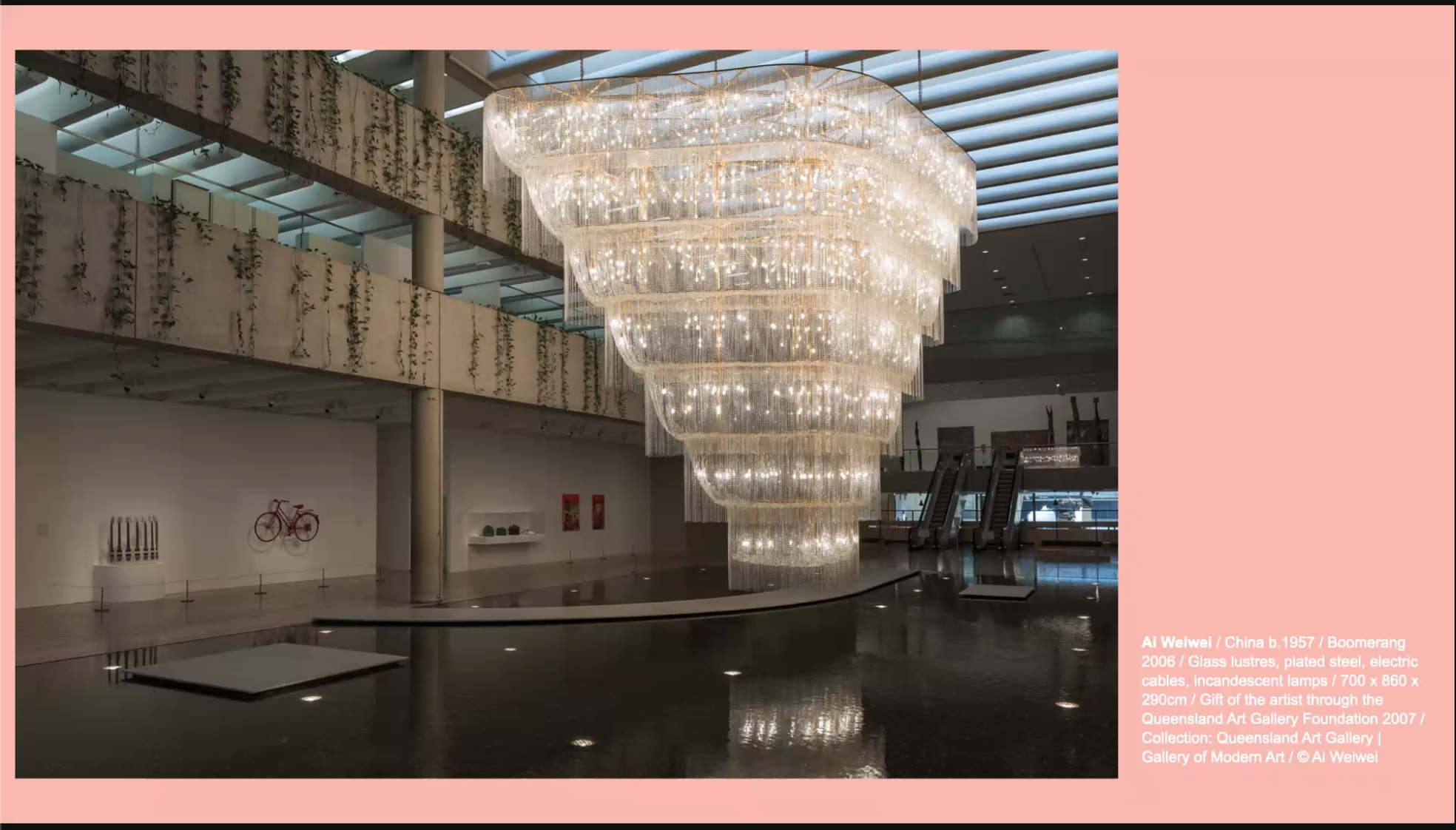
The first artwork is this gorgeous chandelier by Ai Weiwei titled ‘Boomerang’ that hangs in the Queensland Art Gallery. It is a destination artwork, donated by Weiwei when he was right on the cusp of fame. Chandeliers play with light to produce wonder and delight and have been doing so since back in the Medieval days when they were a symbol of luxury and wealth. Why does this artwork draw crowds every year? Because of its beauty and size. You are invited to stand in a moment of grandeur, admiring the art and feeling emotionally connected.
Mayhew then posed the question, if contemporary art is beautiful like classical, what more can it do? The artwork ‘Quantum Memories’ by Refik Anadol can answer this question. Oh how I wish I could see this in real life. You can kind of see from the photograph but this giant canvas combines 200 million images of nature to create a moving painting. It isn’t just beautiful, it manufactures an experience too great for comprehension, or, the sublime. Immanuel Kant argued that art could not produce a sublime experience but, as Mayhew argued, if he was alive today and saw this artwork, he may start to think otherwise.
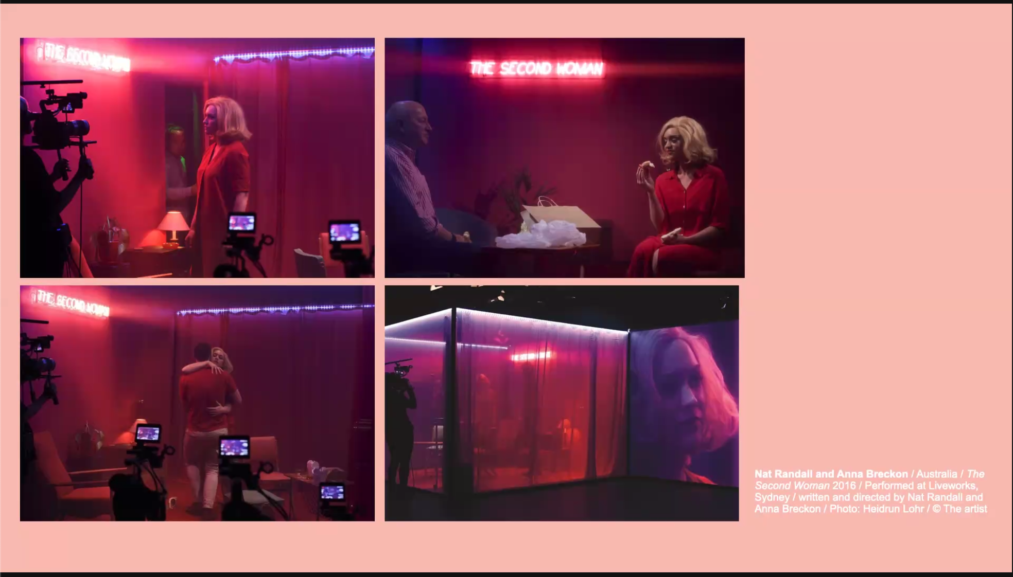
So contemporary art can be beautiful, it can be sublime, but what else? The 2016 installation ‘The Second Woman’ by Nat Randall and Anna Breckon was a show that ran for 24 hours. The premise was a break-up scene with the same woman but different men coming to eat, chat and fight. At the end the man could say ‘I will always love you’ or ‘I never loved you’. Audiences were allowed to come and go as they pleased but you were lured into watching. Unlike classical art that is static, this was alive and excited audiences who were witnessing the show. Between each scene, audience members could speak to each other about what they had just witnessed. Mayhew argued, this was creating a Utopia.
There was one final artwork shared but I am going to jump ahead to round 2, minds.
Minds: Classical
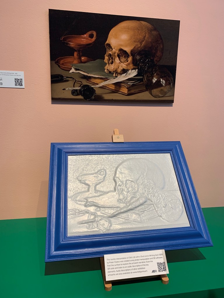
In this round, McGillivray first showed my favourite artwork in the European Masterpieces exhibition, ‘Still Life with a Skull and a Writing Quill’ by Pieter Claesz. There is a skull so it won me over. I had no idea that it was a memento mori painting – or a painting that is created to remind the viewer they will die. Unlike the western cultural understanding of death today (something to be feared) in the 17th century death was not an unhappy talking point but was at the forefront of people’s minds to put things in perspective. This is a very Calvinist way of thinking but reminds you that death is inevitable so make the most of today.
What, however, did classical art reveal about broader social issues? McGillivray shared the portrait by Élisabeth Louise Vigée Le Brun, a female artist who was good friends with Marie Antoinette and the French Court just prior to the French Revolution. Really awesome that she was a female artist at this time earning a living and being well-respected. However, this portrait also comments on the intersection between gender and class. It’s great that she was a female artist, but this opportunity was not open to all women at the time. It draws connections to today where feminism is not equally enjoyed by all and some countries are leaps and bounds ahead of others. Complementing this was ‘The Third-Class Carriage’ by Honore Daumier that shows the realistic lives of the majority – the contrast of rich and poor is pertinent in these two artworks.
Finally, we had a look at Fra Angelico’s ‘The Crucifixion’. This artwork shows the mainstream values and beliefs of its era (14th century). So, in other words, was the pop culture of its day. To understand a society, looking at what is mainstream and/or popular, is just as enriching as viewing what was original and off the beaten track.
Minds: Contemporary
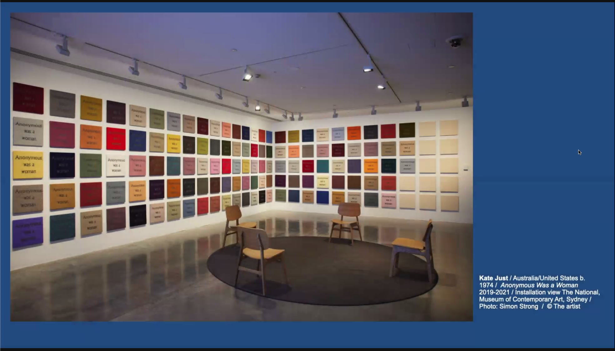
Mayhew had three themes to present in round 2: protest, repair and action. The first artwork she shared, ‘Anonymous Woman’ by Kate Just, is a protest piece, created to celebrate those who have been forgotten. Each square is knitted with the title of the artwork drawing inspiration from Mondrian, craft and the gorilla girls (activists who protested the minimal number of artworks by women in institutions such as the Metropolitan Museum of Art). Over 3500 hours have gone into this artwork and it is dedicated to women throughout history who were marginalized and erased from the history books. It also harks to the way that craft is both feminine and feminist.
For repair, we have the photographs of Fiona Pardington and the installation of Michelle Vine. Pardington sat with life casts taken of Māori people by colonisers for phrenology purposes. She waited until the light was just right and took a photograph, sitting with these complex histories and taking photographs as a way to try and heal. Vine, on the other hand, created a fluffy bathtub where visitors can pop on some headphones and sit in a comfortable meditative place hearing phrases such as ‘you are beautiful’. What a nice way to spend an afternoon.
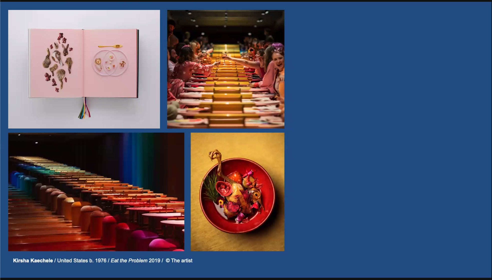
Finally, for action, we had the immersive experience ‘Eat the Problem’ by Kirsha Kaechele. At this dinner party, you are compelled to fix the problem of invasive species by eating them. Gastronomy intersects with eco-activism not only within the walls of the gallery, but at home too. This is achieved through the publication of a cookbook that can influence visitors outside the four gallery walls.
Contemporary art must reach every segment of the population, championing inclusiveness and a call for action. As ‘Creation 2021’ by Deborah Kelly reveals, this is when art truly can touch both our hearts and our minds.
Final Round
To finish the event, both speakers could present closing arguments. For McGillivray, the focus was on needing classical art for contemporary art to exist. Classical art expresses ideas and values that are crucial if we ever want to understand where we were, where we are, and where we’re going. Mayhew, on the other hand, argued we spend too much time looking at the past. So many artists only became famous after they have died. There was a call to action to learn from these mistakes and appreciate the artists in the here and now who work at creating a more vibrant and meaningful life for everyone.
Result
As I said at the beginning, my vote changed from classical to contemporary. In the end, contemporary won the poll with 60% of votes. It was such an enjoyable virtual event to attend and I encourage you all to watch the recording when that becomes live. See if you change your mind throughout the debate and use it as an inspiration to either physically (where you can) or virtually, seek out something creative to enrich your heart and your mind.
Welcome to week 2 of The Untitled Drawing Club. For those who didn’t read my last post, The Untitled Drawing Club has been created by Alexis Winter and transports people virtually, each Monday, to a new museum, exhibition, etc. The aim is to create an artwork inspired by your visit. If you would like to join or find further information, I’ll be sharing a link to the club at the end of each relevant blog post. Also, I’ll take this as an opportunity to remind you/let you know that this blog has an Instagram, @curateyourownadventure. You can find the account by clicking on the social media icon next to this post.
This week, we are going on a virtual tour of the National Gallery of Victoria’s (NGV) Triennial 2020. More specifically, a tour of ‘Hidden Figures’ by Daniel Arsham and Fred Wilson. Before looking at this particular tour in more detail, I want to start broadly by discussing the Triennial and the other associated virtual tours you can experience. Similar to last week, I will be sharing my artwork at the end of this post.
NGV Triennial
The inaugural Triennial was held at the NGV back in 2017. It returned in 2020 filling the galleries with contemporary works that speak to art, design and architecture. According to the NGV website, the exhibition offers a ‘visually arresting and thought-provoking view of the world at this time’. It achieves this through 86 artworks, 34 of which have been commissioned by the NGV and are being displayed to the public for the first time. In total, there are 100 artists represented which is truly amazing.
There is no set theme for this exhibition. Rather, it aims to spotlight accomplished and emerging practitioners from all over the world and question the status quo of art and design. It also provides a space for artists to experiment with digital and emerging technologies and to reflect on how these technologies have influenced the art industry. However, it is not only art on display but also design and architecture. No surprises here, considering the name, but this exhibition will be held every three years and help build art connections between Australia (Melbourne in particular) and the rest of the world.
Virtual Tours
If you would like to explore the virtual tours on offer then click here. Just by looking at the virtual offerings, you can tell that this exhibition would have been amazing to visit in person. I hope that some of you were able to visit before it closed in April this year.
The tour that really caught my eye is titled ‘Natural History, Fallen Fruit’. It is very ‘busy’ looking with different coloured bright floral wallpaper and paintings/sculptures dispersed throughout the gallery. As with the Frida Kahlo Museum virtual tour, you can choose how you move through the gallery in a Google maps kind of way. If you see an artwork you like, you can zoom in on the label. However, it is sometimes impossible to read the label due to the level of blurring caused by zooming in. The labels are not next to the artworks but are on the ground in front of the artworks, which does add to this challenge. This is a bit of a shame as there are some artworks I really want to learn more about but just couldn’t read the label. So, if you’re looking for an overview of an exhibition this is fantastic. But, if you are wanting to engage more with the artworks then this can be quite problematic. If you can make out the title and perhaps the artist, definitely jump on Google and see what more you can find.
I want to share a few screenshots of the ‘Natural History, Fallen Fruit’ exhibition so you can really appreciate its beauty. Firstly, this is my favourite artwork:
I managed to read the label for this work and discovered it was made around 1900 by the Fisher Brothers in Melbourne. The title is ‘Mirror’ and it depicts Queen Victoria acid-etched and silvered onto the mirror.
Here are some more images of just how stunning the gallery looks.
Hidden Figures by Daniel Arsham and Fred Wilson
Our focus for the club is the exhibition ‘Hidden Figures’. To start, I just zoomed around the room getting a feel for the space and the kind of artworks on display. It is an eclectic mix of furniture, artworks and sculptures. It is quite a large space (from what I can tell) with stark white walls and light timber flooring. In the middle is a chandelier which seems to hang perfectly in the space. The sculptures are incredible – very ghostly feeling. Especially the one pictured below that’s located on one of the gallery’s walls.
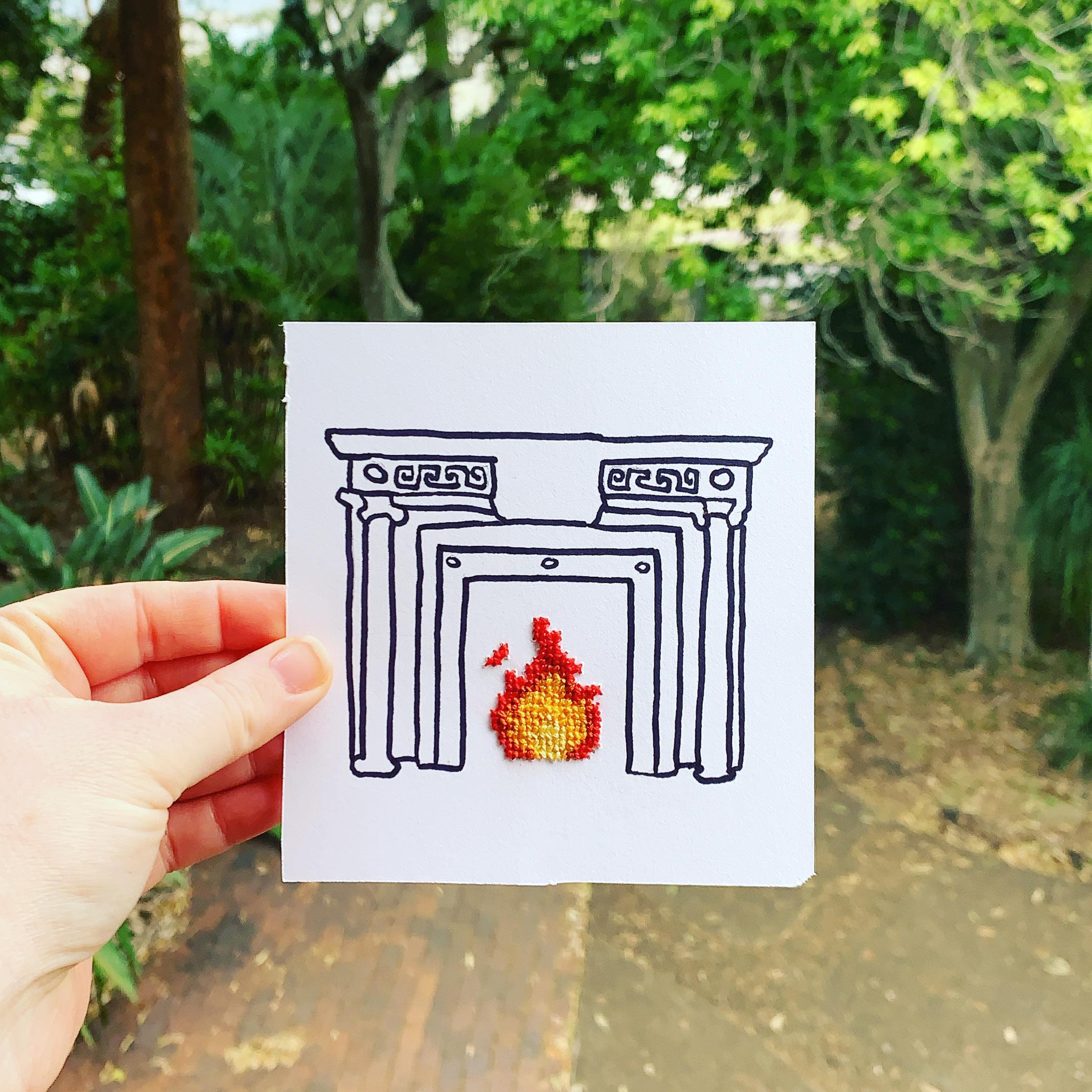
One particular thing that caught my attention, as I was admiring the general space, is this chimneypiece:
As with the mirror, I could zoom in and just make out the artwork label – Chimneypiece from 77 St Stephen’s Green, Dublin. After a quick search online, I actually came across the building this chimneypiece is from on the National Inventory of Architectural Heritage Ireland. Originally owned by William Crosbie (2nd Baron Brandon and 1st Earl of Glandore), the classical Georgian townhouse was purchased in 1911 by the Loreto Order to be transformed into a women’s university hostel. While the interior of the house is, today, quite intact, the two yellow and white marble chimneypieces have been removed. As well as the NGV, Clarence House in London has one in its collection.
If you want to explore ‘Hidden Figures’ click here.
My Creation
Inspired by the chimneypiece, here is my mixed media creation. I wanted it to look more homely and if it was still working, providing warmth on a cold winter’s day.
Week 2 Drawing
I’m looking forward to seeing the other artworks this Sunday (over on Alexis Winter’s Instagram). I’m also excited to see what is next for the club and where in the world we will be sent. To finish, here is the link to the club.
Now that Brisbane is back in lockdown, I have been searching for something to keep my mind occupied that isn’t just watching copious amounts of Netflix and working from home. A lovely friend sent me an Instagram message recently alerting me to The Untitled Drawing Club, run by Alexis Winter. As soon as I clicked on the link to read more about the club, I wanted to join. To start, I will briefly describe the club so you know what I’m talking about. Then, I will review the virtual museum on this week’s agenda. Finally, I want to share the artwork I created inspired by my visit. I’ve never really delved into art since high school so this is not only taking me out of my comfort zone, but will hopefully introduce me to more museums around the world!
What is ‘The Untitled Drawing Club’?
The Untitled Drawing Club is the brainchild of illustrator and educator, Alexis Winter (based in Melbourne, Australia). For the next twelve weeks, on a Monday, a link to a virtual gallery or museum will be shared on the club’s page (link shared at end of blog post). Basically, you follow the link, visit the museum or gallery from the comfort of your own home, and create some art in response to your visit.
Although called ‘Drawing Club’, Winter has made this as accessible as possible stating that you can create ‘in whatever artistic medium you feel most comfortable’. For me, I am a little intimidated by drawing but I do love my cross stitch. With this in mind, I was more eager to join and have some fun.
The museum or gallery is shared on a Monday and artworks are shared on the Sunday of that week. Just make sure to use the hashtag #TheUnititledDrawingClub (yay for accessible hashtags that capitalise the first letter of each new word). This week’s museum is the Museo Frida Kahlo (Frida Kahlo Museum) located in Mexico City.
Virtual Visit
It feels quite strange to comment on my virtual visit as I physically visited this museum back in 2015 (remember when international travel was possible). I was in awe of the museum’s beauty and the vibrancy of the colours that I saw while wandering around. It is a hybrid of a house museum and a gallery with sections set-up to look exactly how they would have when Kahlo was in residence. An assortment of her artworks, clothing, medical devices, etc, are also dispersed throughout.
For some added context, the museum is located inside ‘La Casa Azul’, known as The Blue House. This was where Kahlo lived both with her family and Diego Rivera. You can immediately see why it is called ‘The Blue House’. The outside and inside are painted in such a rich royal blue that really captures your attention. Kahlo wished for the house to become a museum after her death and this became a reality in 1958. Not only is the museum itself wonderful to look through, but the gardens are on a whole new level.
I found the virtual museum experience to be a tiny bit clunky. However, it still provides visitors with an overview of the space and would definitely encourage me to visit in person. The virtual tour is hosted on Google Arts & Culture so feels as though you are using Google maps to look through the museum. When you are in a room, you cannot zoom in to see artworks but you can select them from a ribbon at the bottom of the screen. When you try to zoom in, the image does get a bit blurry but you can still make out what you’re seeing. This does mean that you are unable to read all the labels and if you click on an artwork from the main tour it doesn’t bring up more details.
When you visit the museum’s website they do offer a virtual tour that looks a bit different to the one I viewed. It’s slightly better as I found the images clearer and zooming in was more possible. I’ve provided a link below. My advice is to take your time looking through the garden – it’s where the virtual tour shines.
It is incredible that you can be at home, digitally visiting this museum on the other side of the world. I would love to connect my computer to either a TV or a projector so I could see a much larger image. I believe this would be more immersive. If this is possible, definitely give it a try.
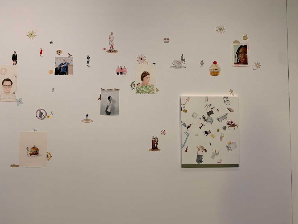
I am going to leave my review there and let you explore the museum virtually on your own. I am very interested in the different ways that museums can offer a virtual experience. Whether that be like this one – literally taking people through a museum digitally – or something else – thinking of one I saw in a Museum Next presentation that just contained artworks and not the physical museum space.
My Creation
Here is what I created for this week’s artwork:
Week 1 Drawing
It is a combination of drawing with art markers and cross stitch. I will never forget the many vibrant colours I saw in Mexico and I hope that this is reflected in my work. I had so much fun experimenting with cross stitch on paper (something I had never done before) and I feel that this is how I will approach all the artworks in the club. Start with a basic drawing then add some cross stitch. I am so excited to see all twelve of my works together at the end. But for now, one week at a time!
If you are interested in joining this club then click the link here for more information.
Yesterday I visited the Gallery of Modern Art (GOMA) to see their new blockbuster exhibition, European Masterpieces from the Metropolitan Museum of Art, New York. With artworks spanning from 1420 to the early twentieth-century, there is quite literally something for everyone. Seeing the works displayed chronologically allowed for a new appreciation of how western art developed over time. It also highlighted the impact of different techniques and the various influences. Similar to my past posts, I am going to start with an overview of the exhibition then focus on some favourite artworks. For this exhibition, I spent the entire time playing ‘I spy’ searching the paintings for dogs.
Overall Thoughts
If possible, I would highly recommend pre-purchasing tickets for this exhibition. It is strange that the tickets don’t lock you in to a date/time. I imagine that’s something to do with the ticketing software, but it would be ideal, especially during COVID. If you go on the weekend, expect there to be a bit of a wait before entering the exhibition. It can be up to an hour, but luckily we only waited around 10-20 minutes. Once inside, it was incredibly busy but never felt overwhelming. I feel this is because of the spacing of the artworks and the amount of free space in the galleries. There is seating available, but the benches are never in the way. We managed to see all the artworks quite easily and only had to wait a few times to get closer.
Overall, the layout is fantastic. To start, you walk through these huge arches that transport you from Brisbane into the world of the European painters. There are arches all throughout the exhibition which linked the galleries together and gave a feeling of consistency.
As for the artworks, the labels are long and informative. There is quite a bit of ‘art language’ that does feel slightly alienating. However, each label has a QR code that links you to further information which I found to be more palatable. I will say that the labels speak to the overall aim of the exhibition – to introduce visitors to the European masterpieces and their artists. The level of information provided is much more than I had experienced in an exhibition and this added to viewing the artworks. In saying this, you would still get a lot out of the exhibition if you just focused on the artworks and didn’t read every single label.
One of my favourite parts of the exhibition is what I like to call the ‘breathing space’. About half way through, you exit the dark galleries into this large, bright, open space where there is a flurry of activity. When we were there they had live music which added so much to the exhibition experience (see cover photo). There is also the opportunity to participate in some still-life drawing. Pencils and paper are provided and there are a few different objects on display (such as a skull, apples, etc) for you to sit down and sketch. At the other end of this space there are two artworks with tactile interpretation panels so you can physically touch the textures in the painting. Finally, there are some photographic interactives where you can place yourself in a masterpiece painting.
Memento Mori Touch Station
Straight after this space is a short 15 minute film showcasing some of the artworks. I feel that the open space and this film are in a perfect place for the flow of the exhibition and I really appreciated the break.
Now onto the artworks – more specifically the artworks containing dogs. Thank you to my friends who were able to spot some of the dogs that I completely missed! So without further delay, here are the dogs – the true masterpieces and all certified good boys/clever girls.
Venus and Adonis, 1550, Titian
This artwork depicts a scene from Ovid’s Metamorphoses – when goddess of love Venus tries to stop her lover, Adonis, from going on a hunt that is certain to kill him. Titian was a significant Venetian Renaissance artist and is most famous for his ‘dynamic interaction of form in his paintings’ (quote from the artwork label). The dogs are joining Adonis on his hunting trip and, hopefully, will survive.
Venus and Adonis
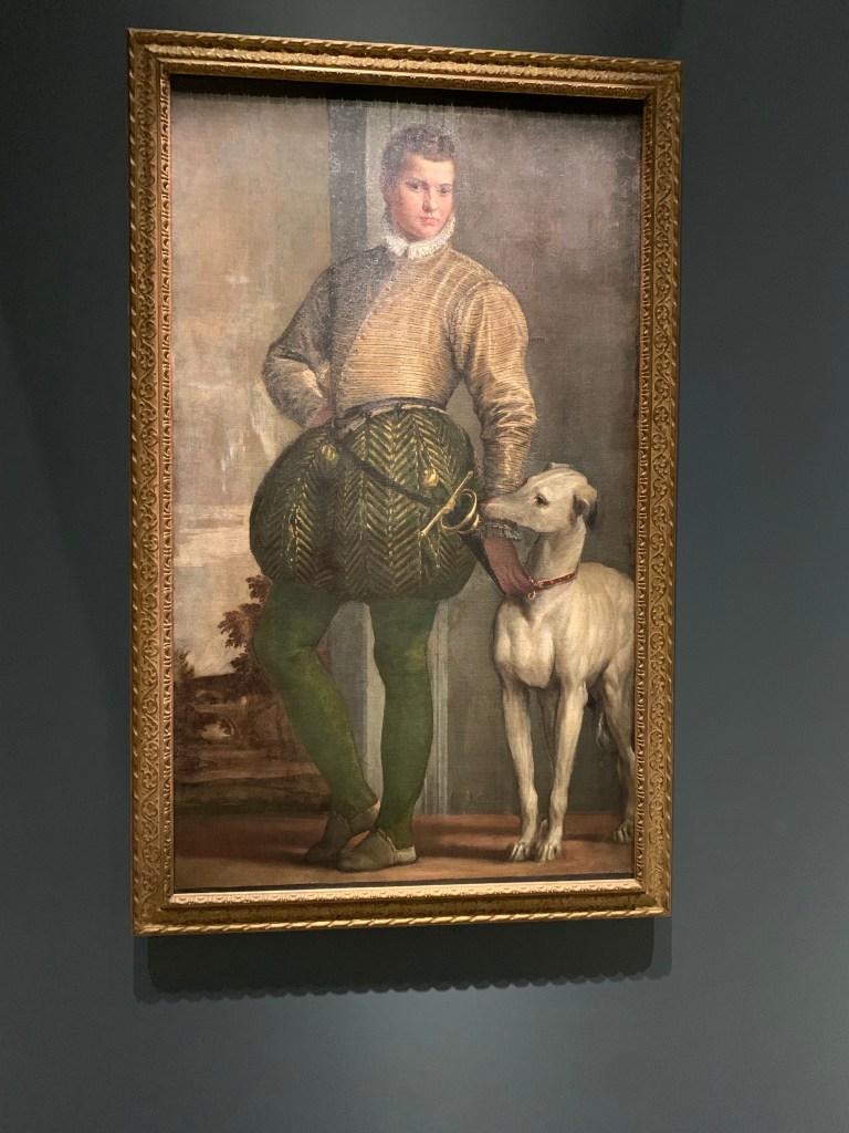
2. Boy with a Greyhound, 1570s, Paolo Veronese
In what is most likely a commissioned artwork, we have a young man in some pretty dapper pants next to a greyhound. It’s difficult to tell what the greyhound is doing. Either resting his head on the boy’s arm or biting it.
Boy with a Greyhound
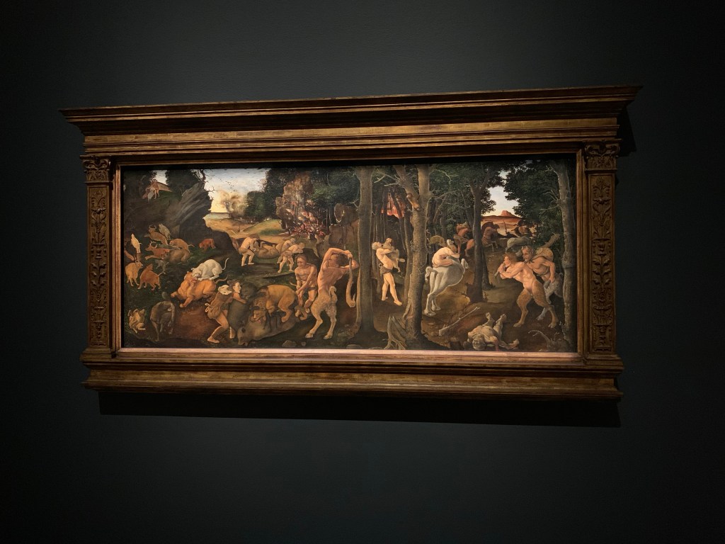
3. A Hunting Scene, 1494, Piero di Cosimo
There is a lot happening in this artwork. We have mystical beings fighting in the foreground with a fire in the distance. Unlike the other artworks from this period, di Cosimo is providing commentary on how the world can be explained by natural rather than divine (religious) causes. My favourite dog in this artwork is the one in the corner rolling around on its back.
A Hunting Scene
4. Equestrian Portrait of Cornelis (1639-1680) and Michiel Pompe van Meerdervoort (1638-1653) with Their Tutor and Coachman, 1652, Aelbert Cuyp
What’s better than one dog? Multiple dogs. And that’s what you can see in this work by Cuyp. Look at those Cavalier King Charles Spaniels – majestic. For some further context, it was commissioned by an affluent family from Dordrecht and depicts two young boys about to head out on a hunt with their tutor.
Equestrian Portrait of Cornelis
5. Paying the Hostess, 1670, Pieter de Hooch
The label states that this is a friendly dog – and this is a friendly dog. What else is great about this painting is how de Hooch has played with light and dark to highlight the social interaction happening in the middle of the artwork.
Paying the Hostess
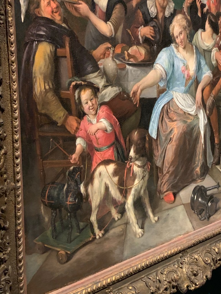
6. Merry Company on a Terrace, 1670, Jan Steen
This is a painting depicting a pretty good party. You can see such a diversity of expressions on the faces of those who have attended the party and perhaps had a bit too much to drink. The quite demonic-looking child in the foreground is next to an adorable dog pulling a horse toy behind it.
Merry Company on a TerraceMerry Company on a Terrace
7. Woodland Road, 1670, Meyndert Hobbema
This is such a beautiful painting of travellers and their dog walking along a forest road. You can see it is a very peaceful painting. This idyllic village scene appealed to those in the city of Amsterdam which, by contrast, was a busy and fast-paced urban centre.
Woodland Road
8. Grainfields, 1660s, Jacob van Ruisdael
Thank you to my friends who spotted this dog for me. Similar to the previous painting, this is a relaxing artwork to view. You really have to zoom in to see the dog walking with its owner along the path.
Grainfields
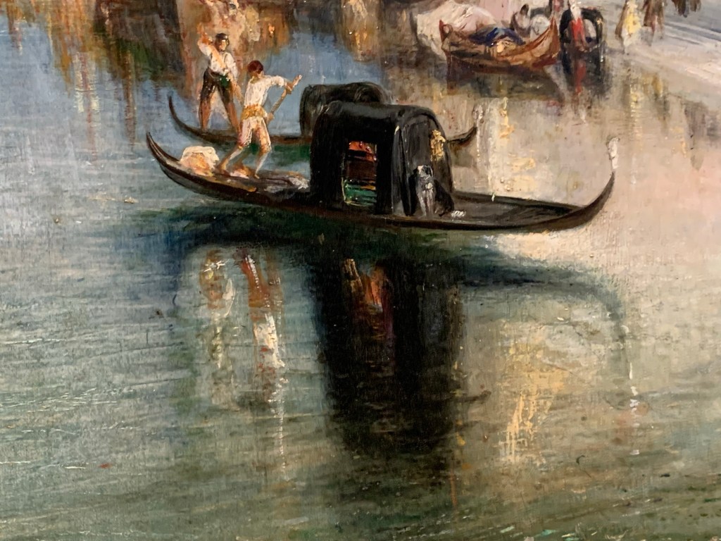
9. Venice from the Proch of Madonna della Salute, 1835, Joseph Mallord William Turner
We’ve seen a lot of dogs on land so for our final dog, we have one on boat. Even though this dog is tiny and virtually disappears into the larger artwork, it is included in the label – so kind of a big deal. Turner was a master of depicting light in his works and you can see the water of the Grand Canal glimmering in the light and reflecting the marble buildings on either side.
Venice from the Proch of Madonna della SaluteVenice from the Proch of Madonna della Salute
Summary
If the dogs don’t sell the exhibition, then I’m sure you can find something else to your taste. European Masterpieces is running until 17 October 2021 so you have plenty of time to get to GOMA (if you can). Even if you have seen some of these artworks, or ones that are similar, I would not miss this exhibition. GOMA is open daily from 10am to 5pm and tickets range in price from $10 for children to $28 for adults. If you want to see this exhibition again and again, then a season pass for adults is $84. The exhibition is accessible.
Finally, I strongly recommend engaging in the public programs that are associated with this exhibition. The Virtual: Draw Along with the Dead is running on July 22 and July 29 and you can find more information here.
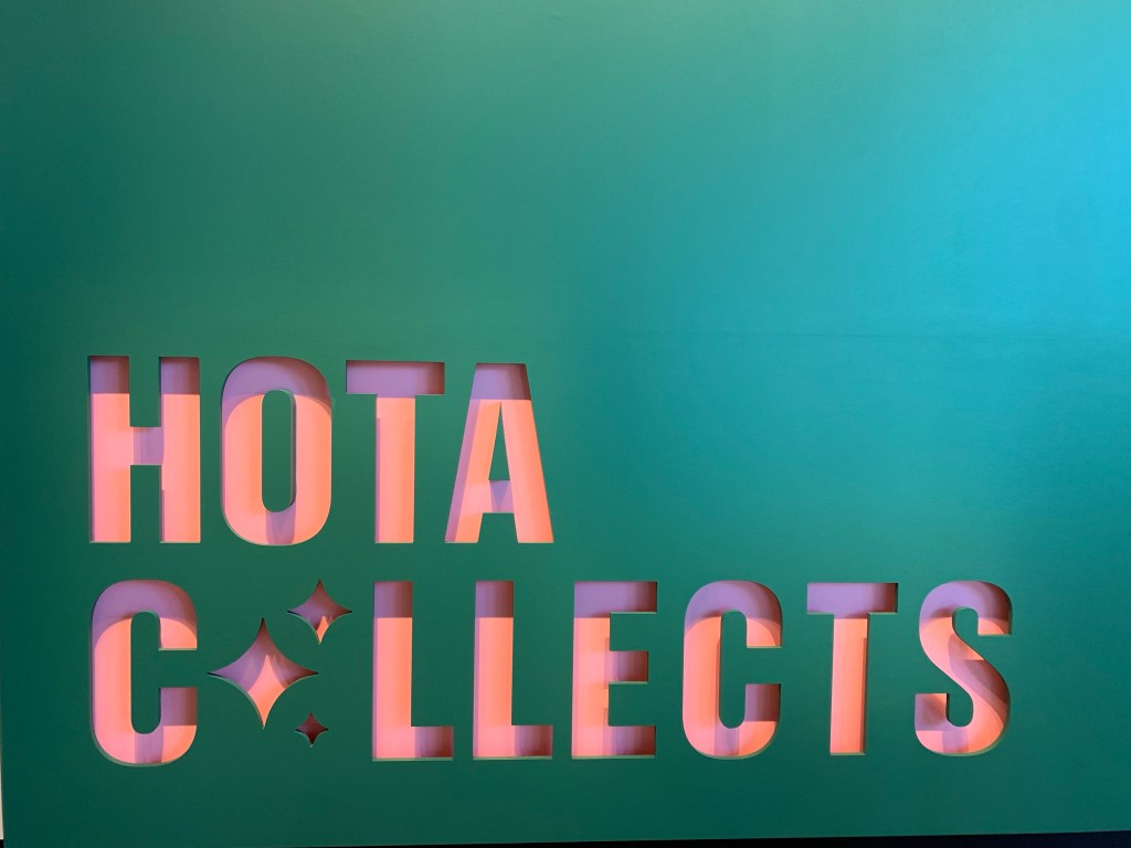
Due to some recent health complications and surgery, I haven’t been able to visit museums or galleries for quite some time. Now that I’m slowly on the mend, we took the opportunity to drive down to the Gold Coast for a mid-century getaway and to visit the new Home of the Arts (HOTA) Gallery. The new Gallery opened on May 8, 2021. As you can see in the image below, the exterior of the building looks like a giant mosaic. This was inspired by the artwork, The rainforest, by William Robinson.
Exterior of the HOTA Gallery
Before delving into my top 8 artworks, I want to talk a bit about the logistics of the Gallery. Firstly, ignore the opening time on Google. We read it opened at 9am but when we arrived at 9am on the dot, we saw the gallery actually opened at 10am. There were quite a few people who had arrived at the same time so make sure you take note of that if you want to visit. Also, make sure you try and navigate the website in advance to book tickets. It is a very clunky and not user friendly website. The cost of entry is free but you still need to book due to COVID.
Once inside, the experience was fantastic. One of the visitor service officers recommended we start at the top and work our way down. This was very helpful advice as the Gallery flows well by taking this route. All of the floors have staff available to answer questions and provide more recommendations. They were all so lovely and informative and this really enhanced our visit.
So now onto the artworks. I am really restricting myself here and narrowing it down to two artworks per floor. This should hopefully give you an idea of the diversity of what’s on display and might even tempt you to visit!
Exhibition Signage
Floor 4:
The main theme for floor 4 is pride and passion – an introductory theme showcasing artworks in the collection made prior to the 21st century. For a bit of context, the Gold Coast has been this increasingly popular and populated city in Queensland. Collecting began in 1968 for a future Gold Coast Gallery as the need for a cultural collection and site became more pressing. Here are my top two picks from this floor.
1. A Painted Page: Myer Christmas Catalogue 1979 by Jenny Watson
A Painted Page
This painting stood out to me as soon as I entered the space. Not only is is quite large, but there is something about the balance of grey canvas and intricate artworks that is aesthetically pleasing. Also, who doesn’t love seeing a creepy doll pop up in an artwork.
2. Manster ‘Dracula’ 1986 by Maria Kozic
Manster ‘Dracula’Manster ‘Dracula’
Speaking of creepy, I had to include this artwork by Maria Kozic. Mostly because I’m a huge Dracula fan, but also because it is a really cool artwork. From one angle, you can see the infamous Dracula in all his vampire glory. From the opposite angle, Dracula just looks like a normal man.
Floor 3:
If you are able to take the stairs between floors then I highly recommend doing so. Between each floor are small landings where you can sit and admire the view of Surfer’s Paradise. On floor 3, you will find a selection of contemporary artworks made during the 21st century.
View of Gold Coast
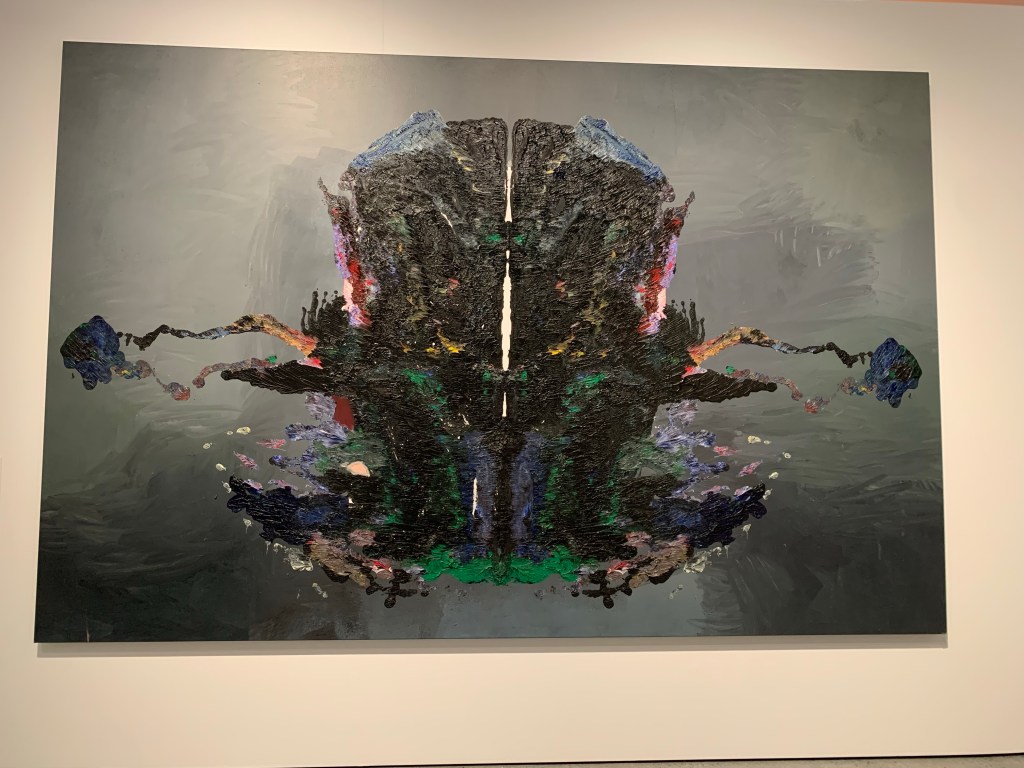
1. Sarah Island, Tasmania by Ben Quilty, 2015
Sarah Island
Mimicking a Rorschach test, Ben Quilty painted a readable image on the right side of this canvas then squashed the painted side to the unpainted side to create the image seen above. The significance of this being that like the psychological test, the character of Sarah Island’s landscape (and Australian history more broadly) needs to be interrogated. For those unaware, Sarah Island is off the coast of Tasmania and was where convicts were sent for hard labour. It was also where the Aboriginal Palawa peoples were sent en route to Flinders Island.
2. Mid Century Modern by Tony Albert – Girramay/Kuku Yalanji/ Yidinji, 2016
Mid Century Modern
These photographs are of a stubbed out cigarette in an ashtray sitting over some kitschy old world tea towel. If you focus on each of the images you’ll see the tea towels depict Aboriginal people in a stereotypical and negative way. These photographs speak to the glamorisation of colonisation posing the question “what does it mean to extinguish a cigarette on someone’s culture?” The image above shows a small number of the photographs on display. They take up an entire wall of the floor and really demand your attention.
Floor 2:
This is the final floor for the HOTA Collects exhibition. The theme is highlighting the Gold Coast and providing an introduction to the people and area.
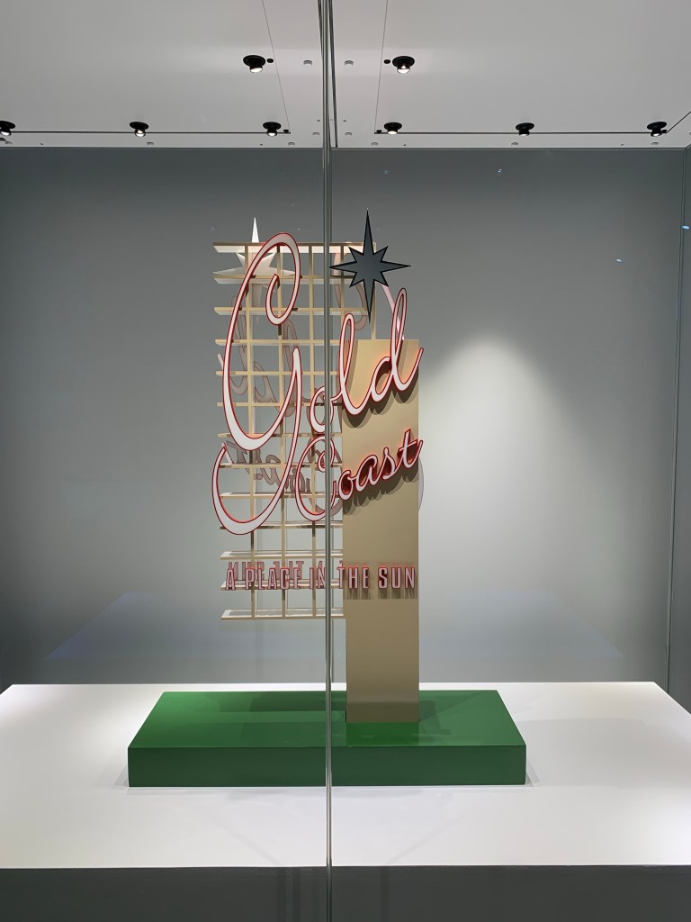
1. Proposal for a Gold Coast Public Sculpture by Scott Redford, 2005
Proposal for a Gold Coast Public Sculpture
I am truly a mid-century girl at heart. Seeing this proposal for a Las Vegas-like sign filled me with joy. The atomic star, the neon – all amazing. That’s all I wanted to say about this sculpture. Just build it, please.
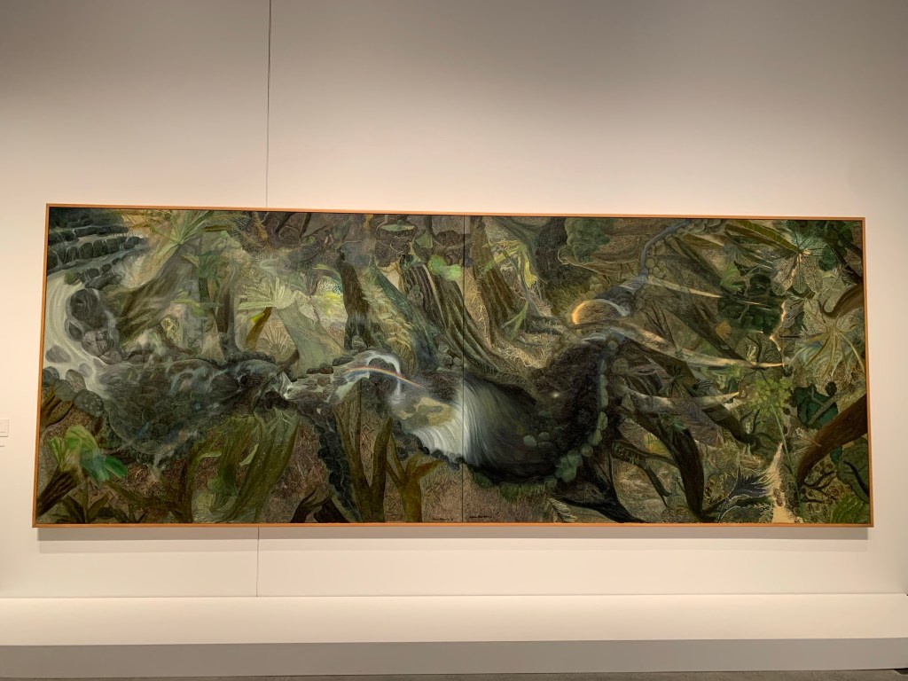
2. The rainforest by William Robinson, 1990
The rainforest
This is probably one of the most famous paintings in the Gallery. In 1990, this artwork depicting the Gold Coast Hinterland won the Wynne Prize at the Art Gallery of New South Wales. Fran Cummings, who was the Director of the Gold Coast City Gallery, embarked on a public campaign to acquire this artwork. Enough funds were raised in the community and it was acquired. There is, however, quite an interesting story about the controversy surrounding the acquisition of this artwork – I encourage you to read about it here. It is a very large painting that really dominates the space. There were a few other artworks I enjoyed on this floor but I couldn’t go past including this significant piece of history for the Gallery.
Solid Gold: Artists from Paradise
The final two artworks I want to include are in the temporary exhibition, Solid Gold. This exhibition showcases artworks by local artists displaying the diversity and expanse of the region.
1. Wonderwall by Kirsty Bruce, 2021
Wonderwall Wonderwall
Who doesn’t love a good collage? They are always a bit of fun and this one is no exception. We spent quite a bit of time looking at all the elements and thinking of how they work together. Kirsty Bruce invites the audience to create their own stories and build their own connections between the cut-outs. I enjoyed the collage mostly because there was a skeleton standing next to a burger. Pretty much my aesthetic.
2. Cloud Drive by Samuel Leighton-Dore, 2020
Cloud Drive
This is an interactive artwork where you can download an app, point your phone at the clouds and read the thoughts/feelings of a stranger. Similar to how many of us store data, these clouds store stories of strangers and encourage visitors to build a connection, even if just for a fleeting moment.
Finally, I want to mention that on the ground floor, near the temporary exhibition area, there is a large glass window for visitors to take a sneak peek at what happens behind the scenes. Look at all the lovely organisation going on here. I love this transparency in museums and galleries and wish that we could see this more!
Collection Storage
That brings me to the end of my post on HOTA. Overall, we really enjoyed our visit to HOTA Gallery. There are some exciting exhibitions coming soon so no doubt this won’t be my last visit. The entire Gallery is accessible. Plenty of parking is available and please remember it opens from 10am to 5pm on all days except Friday when it stays open until 8pm. If you’re looking for a lovely end to your week, have a wander around the Gallery then head to the rooftop bar on Level 5 for some amazing views.
My final MuseumNext blog post will focus on the theme of challenges. Whether that be challenges museums need to face, or staff overcoming challenging scenarios in order to produce content. One particular presentation stood out to me so I’m going to start there and discuss a couple of others later on.
But first, I want to say how much I’ve enjoyed participating in this year’s MuseumNext Digital Summit. One thing that has been mentioned again and again is how digital can expand your audience. Whether that be through removing geographic barriers or making your event more accessible. It has been great to not only attend, but watch videos when I have the time in my day to really focus and give my full attention. This has allowed the content to resonate with me in a way that hasn’t been possible at an in-person conference. I hope that when we go back to having safe, in-person events, digital will remain an option so there is more access to professional development in the sector and inspirational content.
Old People Need Fun Digital Experiences Too! Presenters: Alice Gibbons and Murphy Peoples
This was an amazing presentation by Gibbons and Peoples from Museums Victoria focusing on how to take digital to an older demographic and how this can have a great impact on physical and mental health. Prior to COVID-19, Museums Victoria would travel to aged care facilities to present a reminiscing program. Part of this involved touching objects, viewing images and videos and listening to music. For those who suffer from dementia, these kinds of programs have been encouraged as a way to gently explore the past and not force the present.
So what has happened with this program in the time of COVID-19? Aged care facilities were some of the hardest hit by the pandemic resulting in their occupants experiencing escalating feelings of isolation. While there was a hesitancy surrounding trialling a digital program for this audience, Museums Victoria saw a need. A need for keeping them connected and experiencing joy in their day. This is where the idea for ‘Relive the Good Old Days’ started – an online digital hub that is user friendly and contains reminiscing digital kits on various themes – including sport, disco, board games, etc. Under each theme there are images, Spotify playlists and information on objects held in the Museums Victoria collection.
As Gibbons and Peoples said, museums are so well-equipped to run these reminiscing sessions as we care for objects from the past. The objects can be used as springboards, presenting an opportunity to dive into memories, emotions and, ultimately, stories. I loved how they ended their presentation by reminding viewers that older adults need to have fun too and while museums tend to focus on families, kids and young adults, there is this whole market out there where museum work can make an incredible impact.
2. To Achieve Scale and Impact Think Like a Product Developer Presenters: Lisa Bernstein and Posie Wood
How can museums ensure they are delivering educational content that is both trusted and useful? One solution might be to think like a product developer. Bernstein and Wood spoke about the power museums have in providing students with content that can contextualise their learning and equip them with information to make new content appear not so overwhelming. However, museums can be seen as exclusive and exclusionary places. So, the aim should be to produce educational material to both generate trust and relieve the burden on teachers. They compared current education kits to Ikea furniture – some assembly required. As opposed to something instantly useful and ready to deliver, these assembly-required kits can add more to the plate of a teacher.
How to think like a product developer is to always know who your audience is (and not just what grade you’re pitching too but deeper than that), what problems you can solve and what will delight users. If you can gain an understanding of those three areas, then you can start producing more valuable content.
3. From Virtually Unknown to Virtually Everywhere Presenters: Ed Lawless and Emilie Carruthers
The final presentation I want to touch on was by Lawless and Carruthers from the British Museum. The majority of their talk looked at their digital education programs and how the British Museum adapted to delivering programs during lockdown. However, why I’m mentioning this talk is because right at the end there was a very brief discussion on what the future entails. They want to continue with digital education programs for those who are unable to attend the Museum. For those who can, in-person programs will re-commence.
It highlighted, to me, this re-thinking of accessibility that has been raised due to COVID-19. I mentioned at the start of this post that having more online can open so many more opportunities and extend the reach of the Museum to new audiences. There is still this desire for people to come back to Museums and physically attend programs, education tours, etc. – but is the way forward to just go back to how things were?
This conference has encouraged me to think more deeply about what I can do to strike a balance with my museum in the future. I am looking forward to creating more online opportunities with school groups in particular. Thank you to everyone who was involved in organising the conference and who presented. I love leaving a conference feeling truly inspired about the industry that I work in and the possibilities that are out there. I hope you’ve enjoyed reading my reflections and watch this space for more conference writings this year and perhaps, some museum visits!
Cover image is from the MuseumNext Digital Summit website.