During our time in the Barossa, I wanted to visit one of the historic cemeteries. At the top of our list was the Bethany Pioneer Cemetery. Overall, it is quite a small cemetery. However, a large number of people are buried here. Later in the post, I’ll share a link to the burial registry. In 2002, the cemetery was confirmed as a State Heritage Place in the SA (South Australia) Heritage Register. This is going to be a short post because I want to share my photographs of the cemetery. You get a much better sense of this heritage place through the images than through writing and describing.
Heritage Register Entry
I will share why it was entered into the Heritage Register. According to the entry, the cemetery is a significant site relating to the settlement of Bethany, a town in the Barossa. It also serves as a demographic record, highlighting the German families who immigrated to the Barossa in the nineteenth century. For this reason, it meets criteria a and f.
A – it demonstrates an evolution or pattern in the State’s history
F – it has a strong cultural or spiritual association for the community.
My Experience
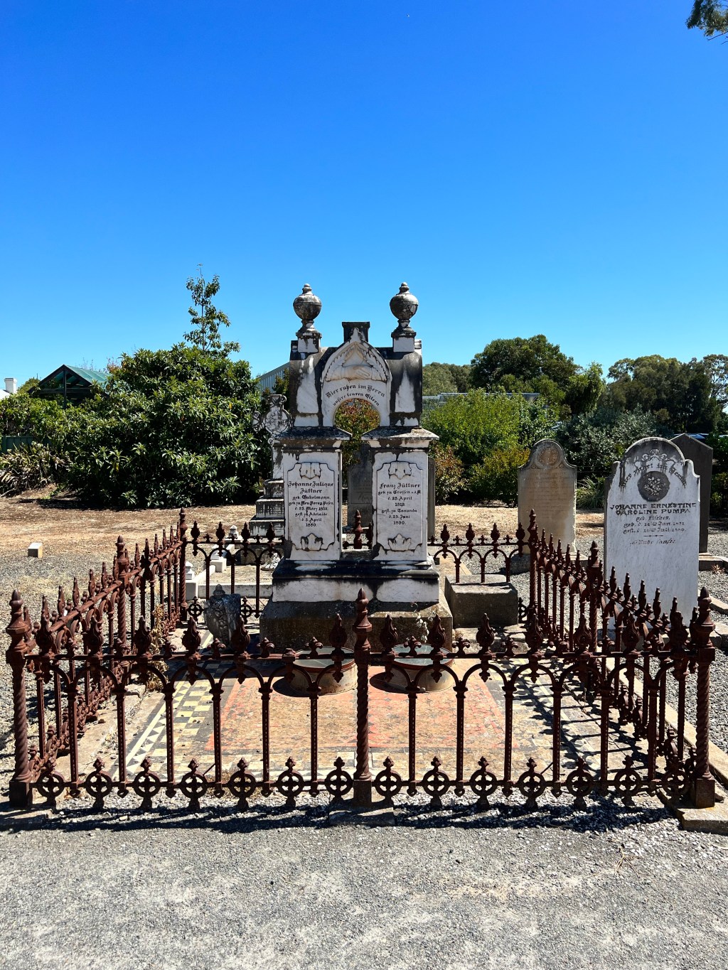
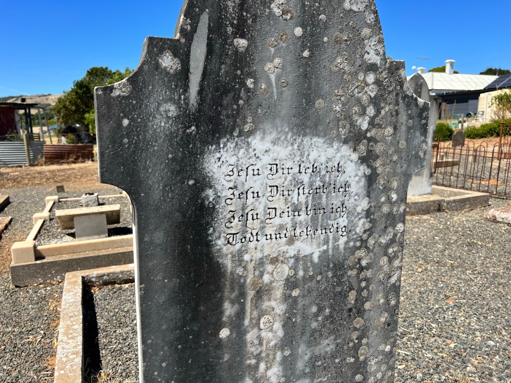
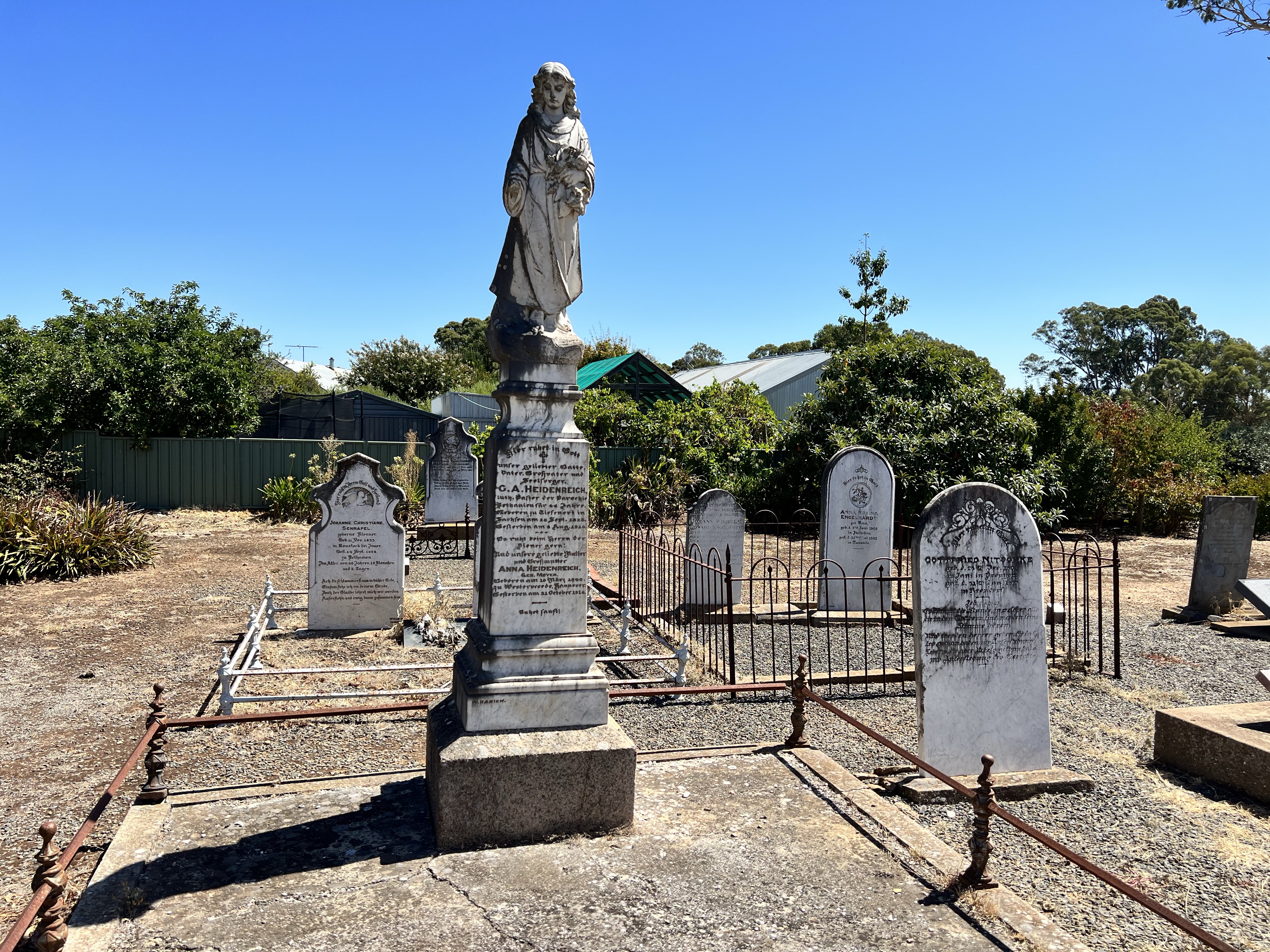
Walking around any cemetery is a humbling experience. They shed so much light on the past and often have insightful information printed on the gravestones. In this cemetery, almost every gravestone has a German phrase printed on the front and back. I spent a while translating each gravestone and taking photos of others to translate later.
These photographs show an overall panorama of the cemetery and a few individual gravestones. For example, there is a gravestone with two hands holding each other in a handshake. This was a very popular nineteenth century carving used to represent husbands and wives. It signifies that even in death the bond of marriage has not been severed.
The rest of the post will be images from my time in the cemetery. Thank you to the dedicated team who upkeep this cemetery. You can find the burial registry here: https://bethanytabor.org/d/ftl6eDLvtXIe5qECgzfd88n1z.
View from StreetEntrance SignHandshake GravestoneGravestonesGravestonesGerman Translation: I live for you, I die for you, I am yours, in death and life.Angel Gravestone
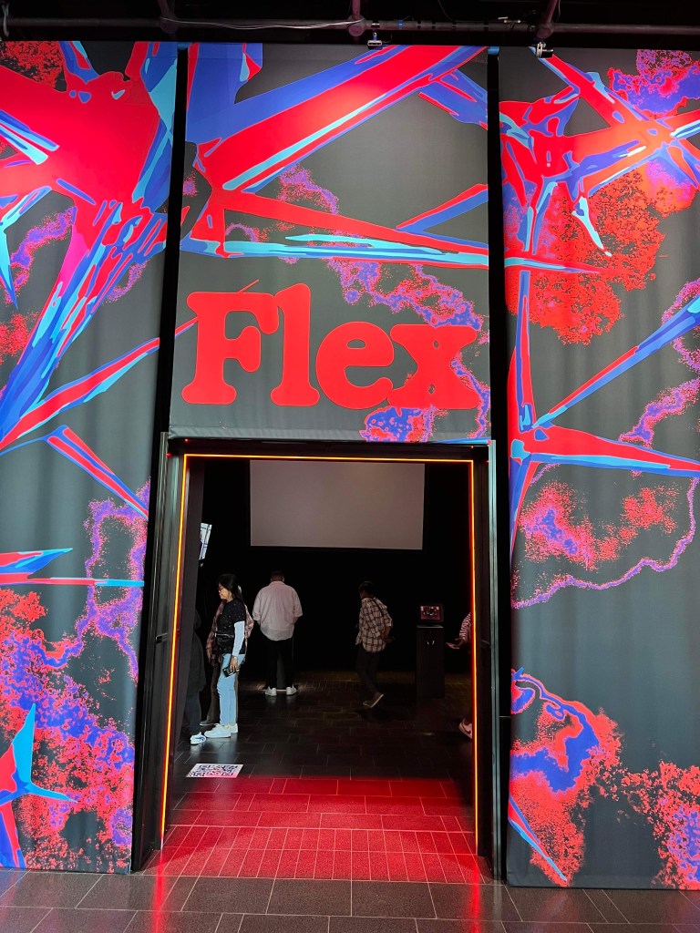
It is such a great time to be in Adelaide. Adelaide Fringe brings this energy and atmosphere to the city that has been wonderful to experience. I’m back in Adelaide as I was very fortunate to have a paper accepted for a writing workshop last Friday. The workshop truly was one of the most insightful experiences that has left me excited to try and publish some of my work! Post-workshop, we’ve been attending some Fringe shows and, of course, returning to museums. MOD. was high on my list because of their new exhibition, Flex. Since I’ve already written a post on the museum overall, I’m going to focus on this particular exhibition and the different themes.
Exhibition Entrance
Overall
To provide some context, Flex is an exhibition that will test you and your ideas. On their website, MOD. poses the question “are limits made to be pushed? We dare you to find out.” Already, I was intrigued. The exhibition is spread across two levels and is really well spaced out. We spent an hour navigating through the space and trying (literally) every single activity. The level of interaction is fantastic. Almost every room has something you can interact with and explore. I’ll cover some examples later. The other highlight is how this exhibition tests your stance on select ethical issues and encourages you to question it in light of new or conflicting information. I’ve selected a few themes from the exhibition to focus on. These were the themes that stood out to me for one reason or another.
Bodification
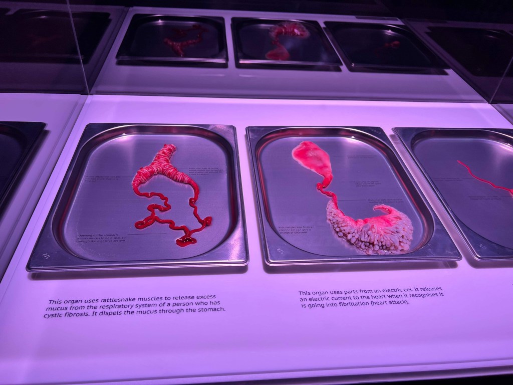
For obvious reasons, this was my favourite theme of the exhibition. Bodification asks audiences to consider how our bodies could be repaired and enhanced in the future. Each display case in the room poses a question relating to the contents inside the case. For example, what if you could engineer your body? Inside this case are three organs, each enhanced by the addition of various animal parts. A part of a leech in the saliva gland to recognise and prevent strokes. A part of an electric eel to recognise and shock heart attacks. Finally, a part of a rattlesnake to release excess mucus in those living with cystic fibrosis. It’s pretty incredible to see and think how our bodies could be better engineered. But, where does this kind of engineering and ethics meet?
Bodification
The second display case I explored poses the question, what if your ability to repair had no limits? There are so many objects to consider in this case including spray on skin and artificial blood. The room left me thinking deeply about our human desire to keep living and the lengths we will go to when it comes to prolonging human life. Not just human life, but a quality of life we have deemed “good”.
Bodification
Pushing Perception
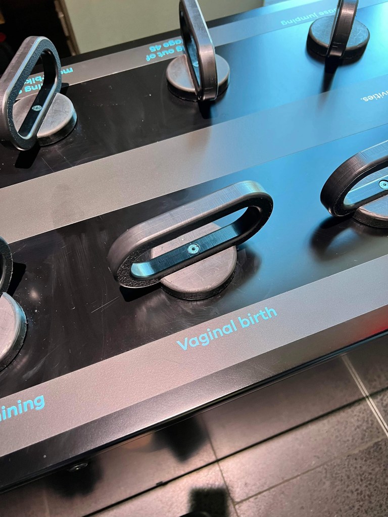
This is one of the most interactive themes in the exhibition. According to the thematic panel, this section is all about pushing limits and realising that decisions we make are calculated. What happens if we change our perception of risk? The first activity is all about micromorts, or units measuring risk defined as a one-in-a-million chance of death. Along both long edges of a case are handles you can pull up to see the rating of a few different activities. Vaginal birth has a micromort rating of 120 (high). Working any job for a year has a micromort rating of 6. Just to give you two examples.
Pushing Perception
After lifting every handle in the case, we walked over to these bright white chairs with a screen inviting us to take a seat. Here, perceptions of pain are measured and tested. Once you have taken a seat, you place your hand on a sensor and begin the experiment. At each stage, you rate your pain. I didn’t mind the hot and cold rods, but I hated the electrical currents. Throughout the experiment, there are distractions and placebos in place to change your perception of the pain. Very cool idea and I can confidently say I’ve never been exposed to this kind of pain before in an exhibition!
Pushing Perception
The last thing I want to talk about for this theme are these little 3D printed balls. These are printed perceptions of pain experienced by young adults. It is a visual representation of how they feel their pain and can be used to communicate this level to others. Really thought-provoking idea.
Pushing Perception
Canopy
The last theme I want to write about is titled Canopy. This is a theme all about ethics and how we make decisions as to what is right and what is wrong. The title refers to the canopy sculpture that hangs in the space. It moves as people fill out a survey on a computer in order to reflect their answers.
Canopy
I spent a very long time with this survey answering a series of questions about my ethical boundaries. Some questions I could answer straight away. Others took time. However, the most interesting questions for me were the ones that I answered immediately but then changed my answer the more I considered what it was asking.
Before leaving this space I filled out one of the activity cards to add to the wall. You can either leave an answer or a question. I asked – in this day and age, how do we define what is human? Additionally, how important is it to have that definition?
Logistical Information
There is, of course, so much more to explore. I thoroughly enjoyed this exhibition and how it tested my ethics as well as my understanding of technology. MOD. is located within the University of South Australia Bradley Building in the CBD. It’s open Tuesday to Saturday from 10am to 5pm. Entry is free and the museum is accessible.
Definitely a museum to add to your list if you find yourself in Adelaide!
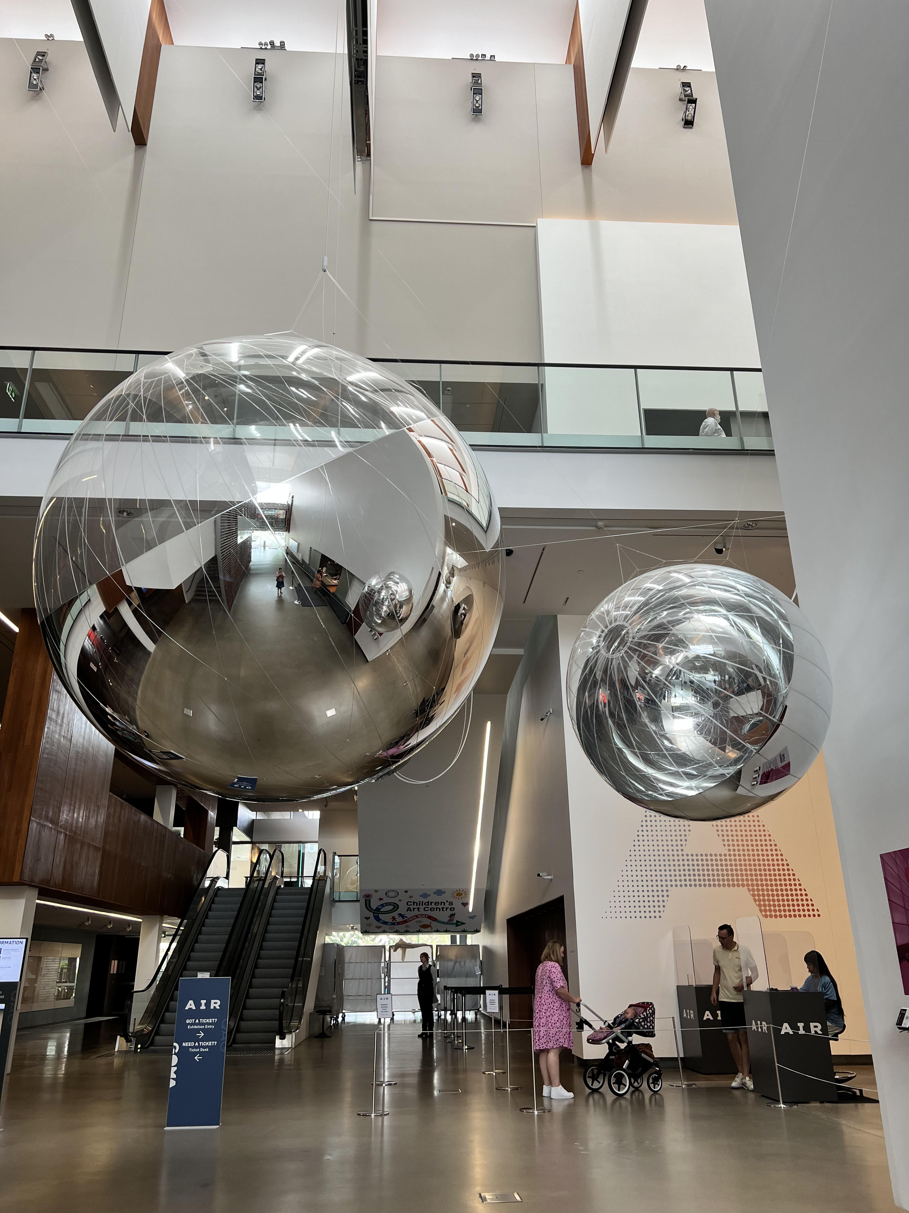
In 2020 I visited the Gallery of Modern Art (GOMA) to see an exhibition titled Water. GOMA’s new exhibition, Air, is the next element in the series. Similar to Water, everything on display links back to an overriding theme in some way, shape or form. Water was definitely the more interactive of the two. A highlight of Water was the room containing an Icelandic riverbed (a work called Riverbed). I am still in awe of the logistics behind its installation. I found that Air was more subtle in its approach to the theme and more about observing rather than interacting. The following blog post will start with the aim of the exhibition and then run through the themes, or chapters as they’re called, I found most engaging. I will start by saying that capturing air in an exhibition is quite a task and while some of the artworks/installations were a bit too abstract for my taste, the overall exhibition is well worth visiting.
Overall Aim
The introductory panel to the exhibition sets the scene by describing how air is vital to life. Fair call. Without air, we would asphyxiate in seconds. Sidenote – searching ‘world without air’ does lead to some very interesting rabbit holes that I will be falling down after writing this post. The panel continues by stating that we think of air as a resource that is infinite. Especially in comparison to water. Our reliance on air and our attitude towards it is really put under the microscope through the works on display. We may not be able to see it, but Air tries to give tangibility to something that is critical for our survival and our interaction with others. There are two overall aims of the exhibition. The first is to give visibility to something that is invisible. I was momentarily concerned the exhibition would be an empty room with a sign saying ‘can you see it? It’s all around you.’ The second aim is to respond to issues such as the COVID-19 pandemic and how sharing air is now so in the spotlight. Another issue it addresses is climate change and how important it is to not taint the air we breathe in every day. I’ve honestly never stopped and thought about air like this before.
After reading the introductory panel I was excited to enter into the space and see exactly how this concept was going to work. The exhibition is divided into five chapters: Atmosphere, Shared, Burn, Invisible, and Change. Each chapter starts with a thematic panel that ties the works together and reflects on the broader theme. These panels are great to read before exploring the works as they build connections that would otherwise be missed. As you move through the chapters, there are changes, such as a change of lighting, to help remind you of which chapter you’re in. The Burn chapter did achieve burning my eyes with a large neon sculpture so I felt that might have been a bit too literal.
By far, my two favourite themes were Invisible and Change. I want to start with the eye-searing sculpture from Burn.
Hot Spot by Mona Hatoum
Hot Spot
This is definitely an installation that stands out. The combination of stainless steel and neon lights makes a pretty clear statement that the world is one giant hot spot at the hands of climate change and climate inaction. The label, however, highlights that the sculpture also represents how conflict zones and struggles for power are worldwide phenomena with effects felt everywhere. It is meant to be quite a large sculpture so you can imagine yourself trapped inside.
Invisible
The thematic panel for the Invisible chapter covers a lot of significant issues. Included: COVID-19, the Black Lives Matter Movement, the Black Summer bushfires, and the destruction of natural habitats. An intense short read that tells us there are things we cannot see which make us anxious, things we choose not to see, and those who are invisible. It is one of my favourite chapters because of the works on display and how thought-provoking it is in the context of the entire exhibition. It is, however, a chapter where you need to take care of yourself and go through it at your own pace.
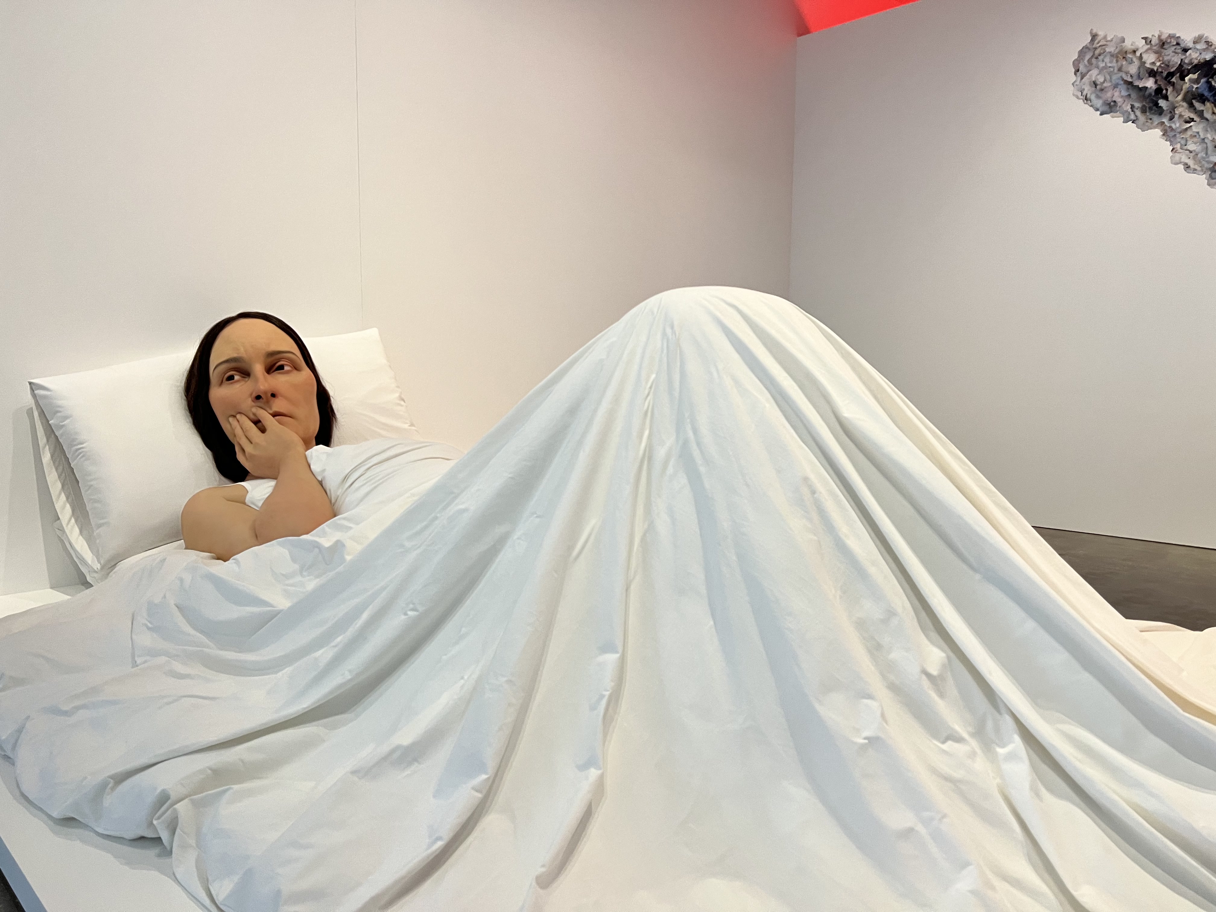
In Bed by Ron Mueck
In Bed
One of the first things you see entering this chapter is a huge sculpture of a woman sitting up in bed. We saw multiple people get a decent shock upon seeing it! There isn’t any context as to what this woman is thinking about or seeing, but she clearly looks puzzled or concerned. The thematic panel encourages visitors to think of what she can see. What invisible presence is causing her to look this way? It is so large and life-like – really dominates the space.
Rainbow Herbicides by Thu Van Tran
Rainbow Herbicides
My favourite work in this chapter was Rainbow Herbicides. Depicted on the canvas is a plume inspired by volcanic eruptions, man-made explosions, and photographs of clouds. You can see towards the top there are six coloured lines layered over the top with spray cans. These are there to represent the rainbow herbicides used by the American military during the Vietnam War – Agent Orange, Blue, Purple, Green, Pink and White. These chemicals were used to defoliate areas of the forest. However, the chemicals had a huge health impact on those exposed. Tran’s work is a reminder of the violence of War and how air can be weaponised.
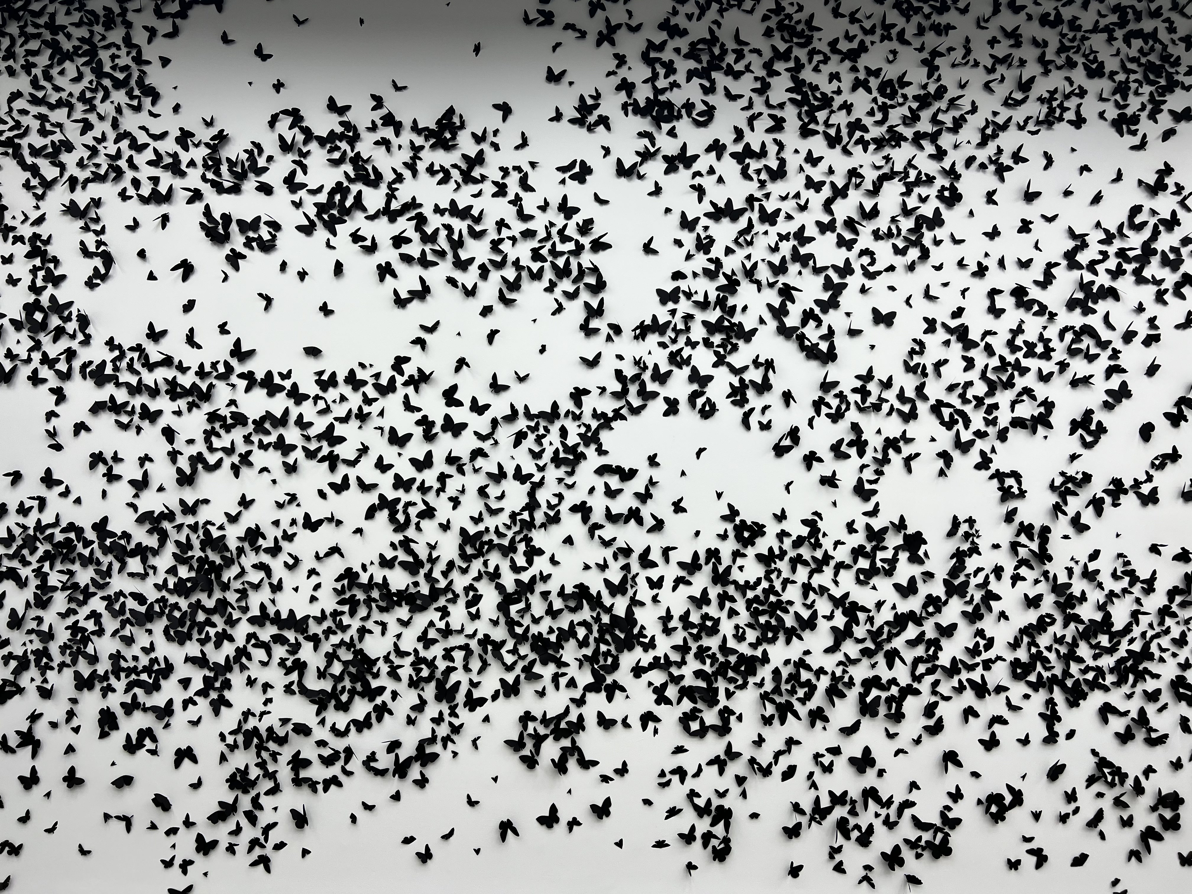
Black Cloud by Carlos Amorales
Black Cloud
The final work in this chapter is a room filled entirely with paper butterfly and moth species cut out from black paper. It is a beautiful room that aims to remind visitors of the fragility of life.
Change
Between Invisible and Change is a huge hall filled with mirrored and metallic hanging spheres of various sizes created by artist Tomas Saraceno. This is meant to create a space for rest and reflection – a breather space before heading into the final rooms.
Change
The thematic panel for Change addresses how air can be used to ‘build, hold and share knowledge.’ There are two works in this chapter I want to focus on: untitled (giran) and the work by Patrick Pound.
Untitled (giran) by Jonathan Jones in collaboration with Dr Uncle Stan Grant Snr AM
Untitled
The word ‘giran’ is Wiradjuri (central New South Wales) for wind. This wall has just over 2 000 sculptures attached representing six tool types. The tools include a bagay (eggshell spoon), galigal (stone knife), bingal (animal bone awl), bindu-gaany (freshwater mussel scraper), dhala-ny (hardwood spear point) and waybarra (the beginning of a woven item). They represent knowledge passed down through generations. The display looks like birds in flight – supported by the wind. Along with the installation is a series of sounds that include bird calls and wind. According to Jones, ‘understanding wind is an important part of understanding country.’
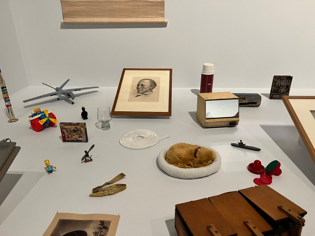
The Air Lock by Patrick Pound
The Air Lock
The final work for the entire exhibition is The Air Lock by Patrick Pound. All the items and artworks relate, in some way, to air. Your task is to work out how. Some are more obvious than others. It was really interesting looking through all the knick-knacks and discovering new ways to think of air. Obviously, the anatomical model of the lung was my favourite. Although the little dog in a dog bed came a close second. A great way to end the exhibition – displaying seemingly disconnected objects that all, however, speak to the central theme.
Welcome to my first blog post for 2023! There are some exciting things on the horizon for this year and, hopefully, excellent exhibitions and museums along the way. This evening I visited the Queensland Museum for their up-late Disney exhibition event. Disney: The Magic of Animation, showcases hundreds of original sketches from a variety of Disney films. From Steamboat Willie to Encanto and almost everything in between. I’ll note here that the exhibition is held in partnership with the Australian Centre for Moving Image (ACMI) in Melbourne. While the website says suitable for all ages, I did find it leaning more towards an adult-interested audience. That’s just my opinion though and I’m sure kids visiting the exhibition have a great time with the children’s labels. As with so many of my posts, I’m going to begin with a brief overview of the exhibition and then focus on a few personal highlights – enjoy!
Overview
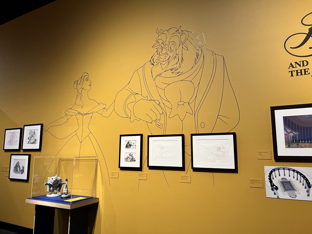
When you first enter the exhibition there is an introductory panel and a large screen showing a selection of Disney film clips. The exhibition’s stated aim is to showcase the talent and innovation of artists and filmmakers through displaying sketches and animations. Overall, I do think the exhibition achieves this goal. As you move throughout the exhibition you are basically following the chronological timeline of Disney. Each area is designed to complement what is on display. For example, the Steamboat Willie room is mostly black and white. Beauty and the Beast has yellow walls, Sleeping Beauty purple, and some walls have large graphics from the animated films covering the surface.
Mickey and Minnie Mouse
Where this exhibition really stands out is through its design. There are subtle (and not so subtle) details in each different area that draw you into the world of a particular film. One area I enjoyed was The Little Mermaid. Lighting effects make it look like this part of the exhibition is underwater. I wouldn’t say that this distracted from the content and sketches. If anything, the exhibition design enhances what is on display. If all the sketches were on a blank wall it would have been a completely different exhibition. Apart from the design, there are two other elements worth noting.
The first is the use of labels. Each film has a thematic panel with a short and sharp overview. The labels for the sketches blend into the wall which I thought worked well in the space. Considering the aim and what is on display, it would have looked out of place to have stark white labels next to each sketch. There isn’t a lot of information on the labels meaning reading fatigue was pretty limited and the sketches do most of the talking.
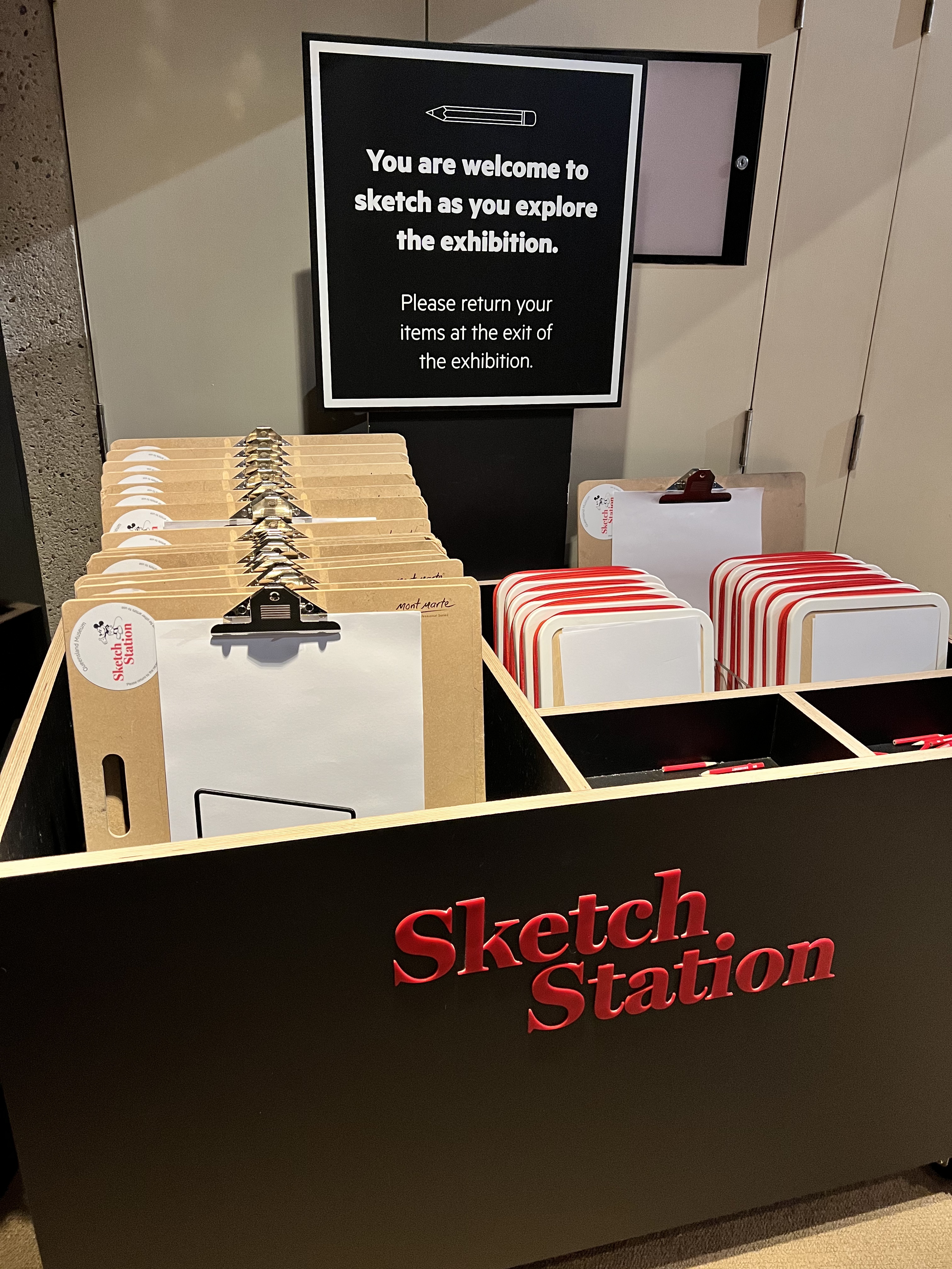
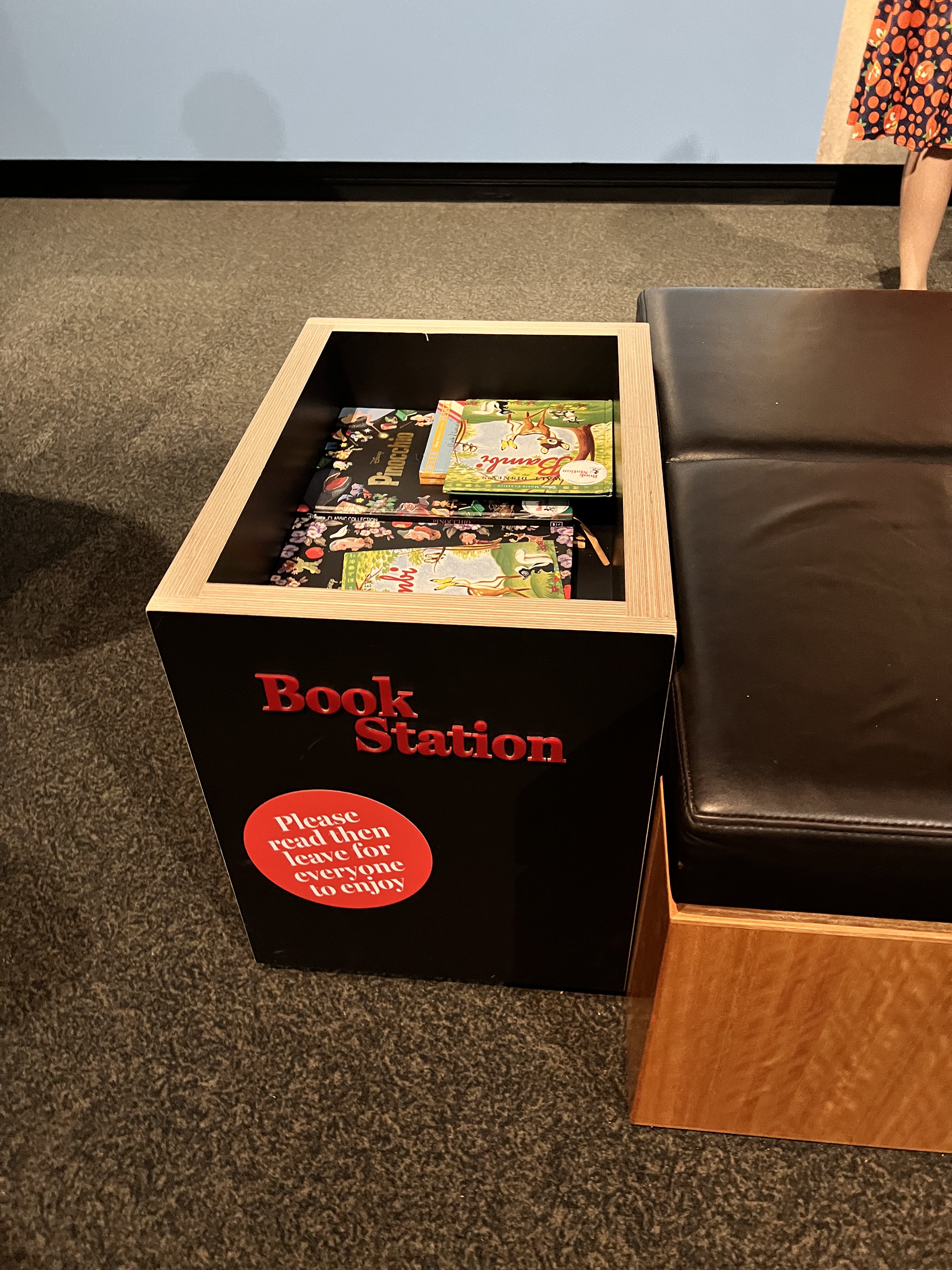
The final element I want to mention is the sketch station. Before entering the exhibition, there is a box filled with clipboards, paper, and pencils. The sign encourages you to take a clipboard and sketch what you see in the exhibition. I thought this was a nice touch that relates directly to what is on display, while also encouraging visitor engagement.
Sketch Station
Selection of Favourite Elements
Here is a list of my favourite elements (sketches, design choices, etc) from the exhibition in no particular order.
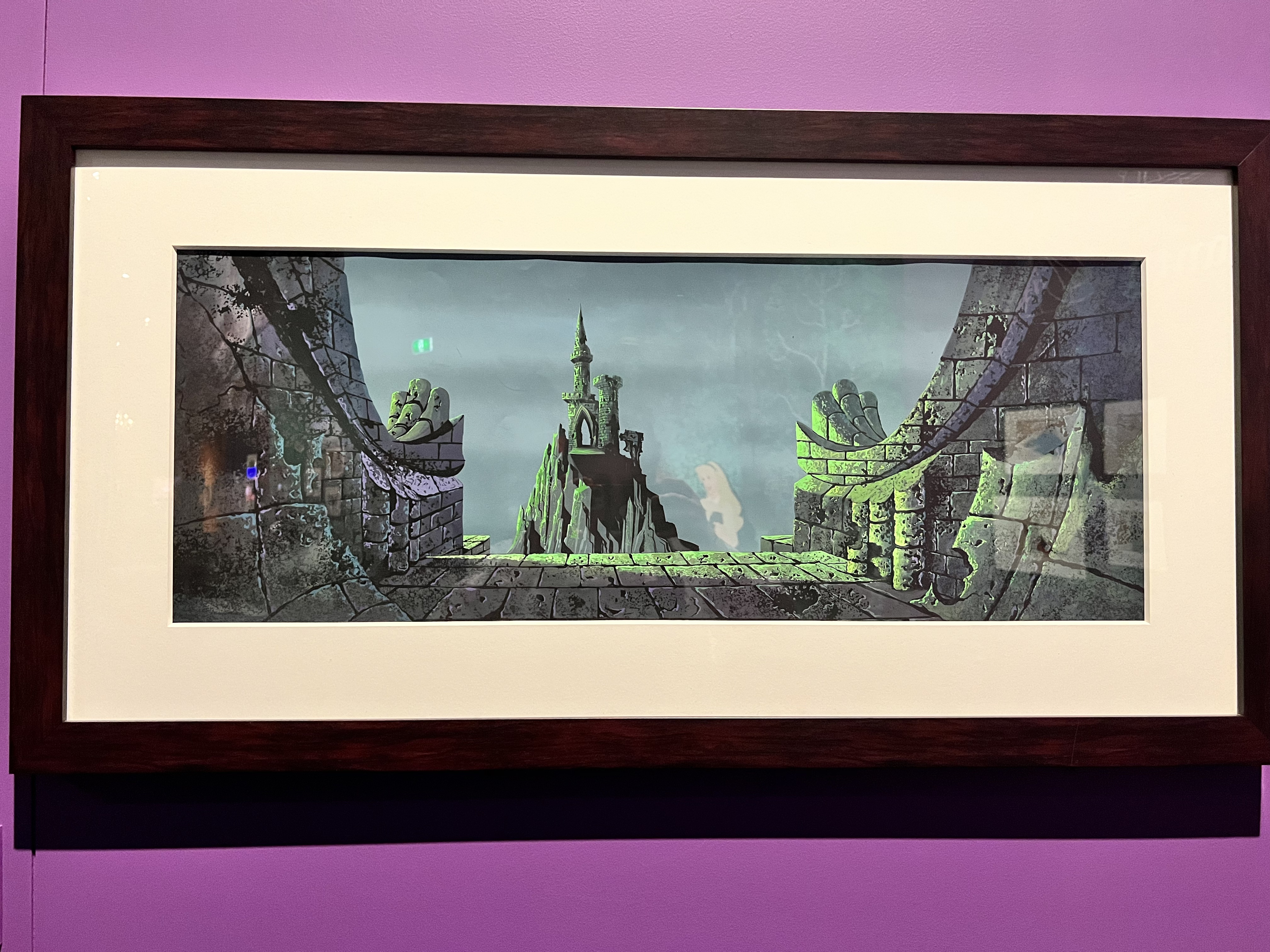
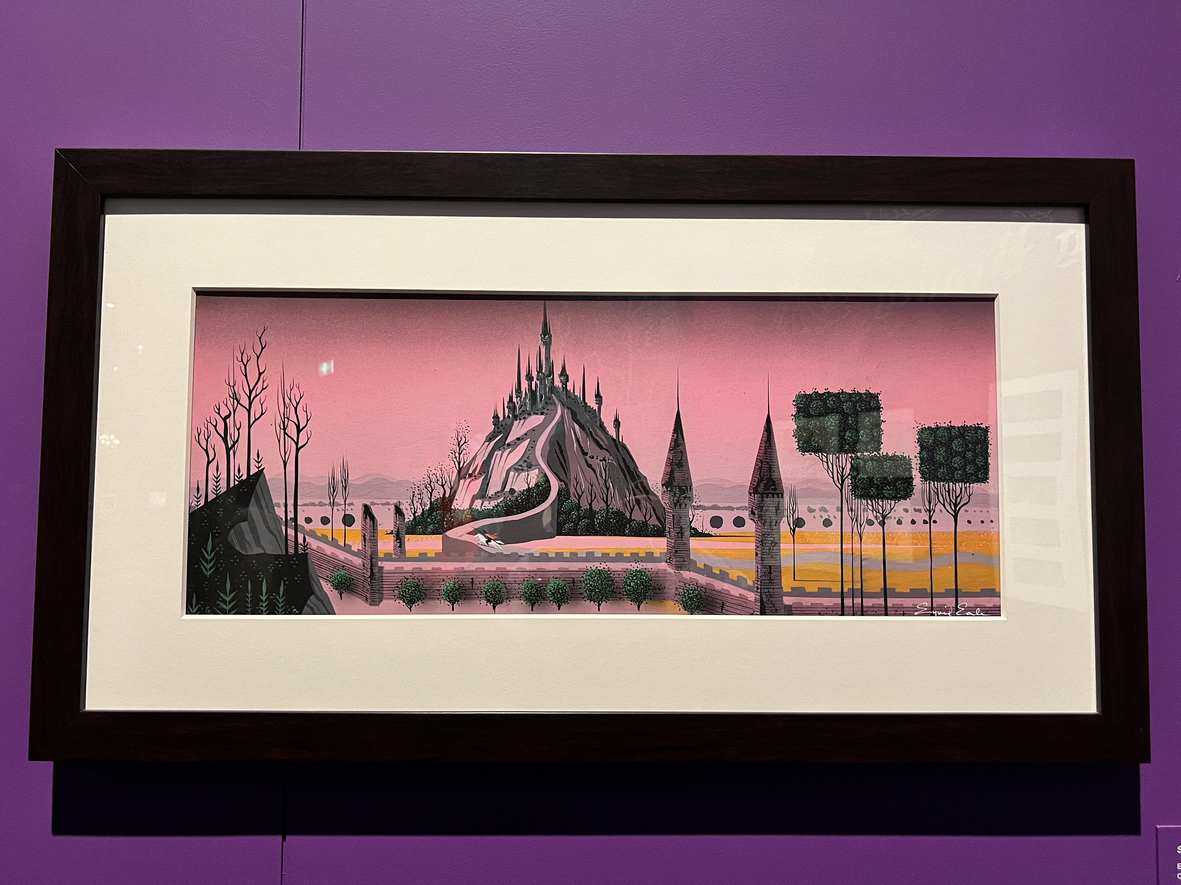
1. The Three Sleeping Beauty Castles
The colours in these three background paintings for the 1959 Sleeping Beauty film are stunning. Two were designed by Eyvind Earle and the third by an unnamed Disney Studio artist.
Sleepy Beauty Castles
2. Animation Desk on Black and White Tiled Floor
In the Steamboat Willie room there is an old animator’s desk sitting on a black and white tiled floor. I mentioned before that this room has a black and white theme so I respect the commitment to including a black and white element. As the label points out, animation has moved away from paper on desks to computers but different elements still need to combine in order to get a picture moving.
Animation Desk
3. Incorporating the Films
There are a few areas that incorporate parts of a film into the exhibition. The talking mirror from Snow White makes an appearance on a small screen that looks like a mirror. Without a doubt, my favourite was the Beauty and the Beast ballroom scene playing on a TV with two large chandeliers (one either side) hanging from the ceiling.
Film Incorporating
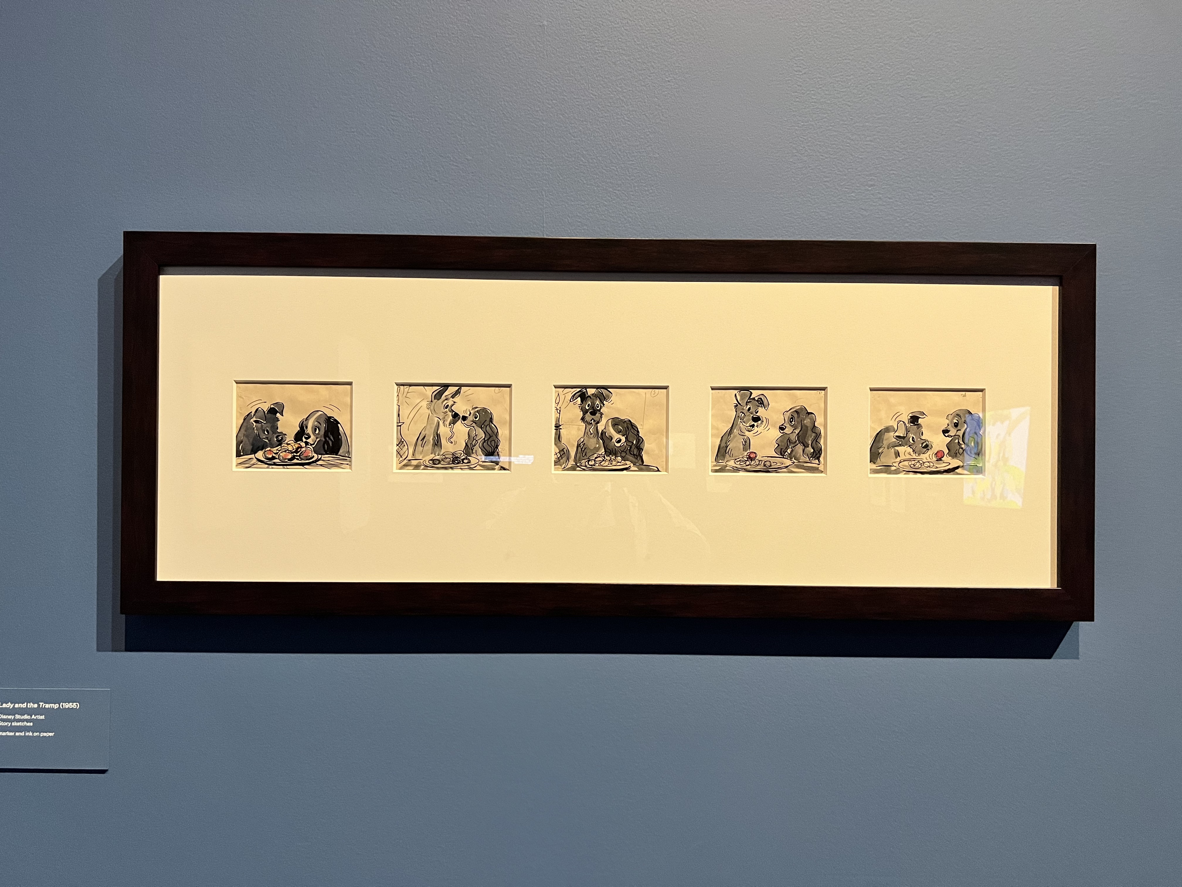
4. Lady and the Tramp Sketches
Has there been a more iconic dog movie scene than the spaghetti eating scene from Lady and the Tramp? I think not. I really enjoyed seeing the original sketches of this scene.
Lady and the Tramp Sketches
5. Baboon Beast
Looking at some of the sketches from Beauty and the Beast, I found myself saying ‘is that a baboon?’ Yes, yes it is. An original concept artwork showing the Beast as a baboon. I am glad they didn’t stick with the baboon concept because that is truly terrifying (no offense to baboons).
Baboon Beast
6. Basic Sketches on the Wall
A few areas have these basic outline sketches on the wall to break up a large section of colour. They are effective!
Wall Sketches
7. Interactives
Last but not least, we have interactives. I was really glad to see that most of the interactives revolved around physical sketching, creating, or reading. For the latter, there are a few book stations throughout the exhibition where you can sit and read a Disney story (or two). There are also what I would term ‘Instagrammable’ interactives, such as large cardboard cut-outs. In my opinion, they didn’t give me gimmicky vibes and just blended into the rest of the exhibition.
There is also a gift shop at the end of the exhibition that has an array of Disney products for sale. I purchased a Snow White inspired bracelet complete with an apple and a skull.
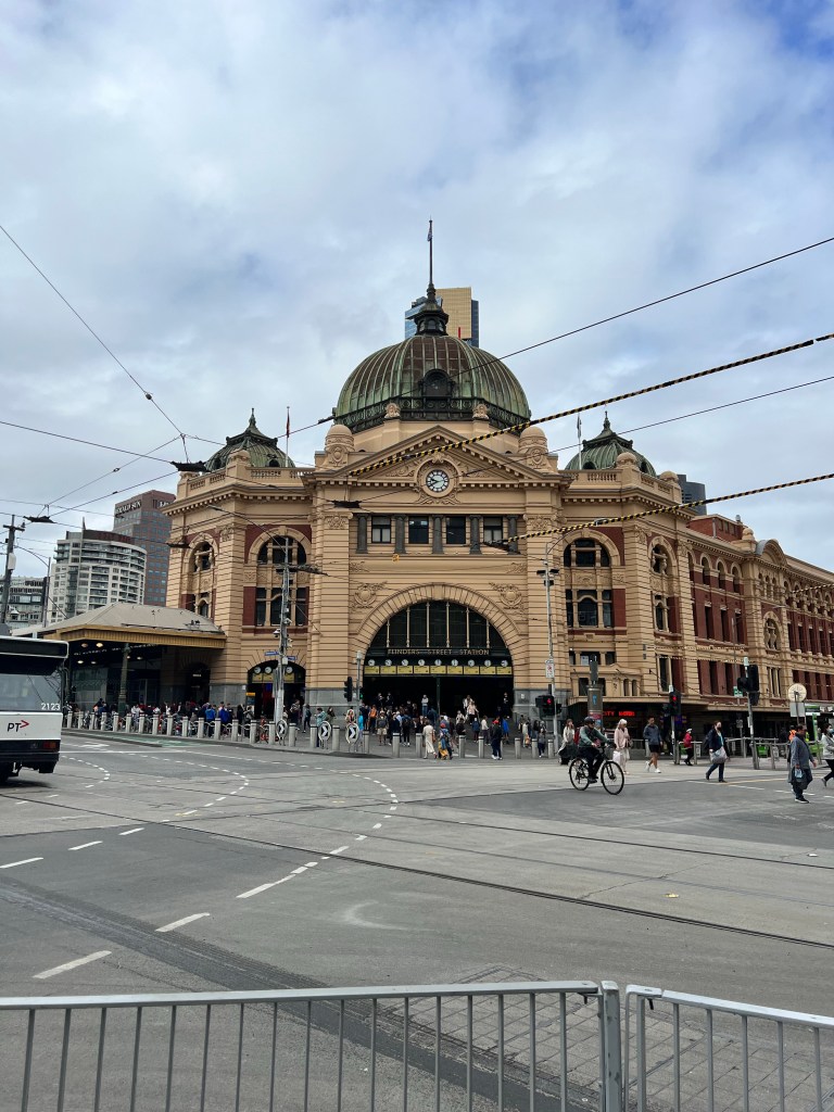
I am back in Melbourne for a short break before we fully enter the Christmas/holiday season. One of the main reasons for flying down was to see TIME by Rone, an exhibition currently on display in Flinders Street Station. It is truly one of the most stunning exhibitions I have ever seen. It combines my love of abandoned places and large-scale installations. All with a sprinkle of nostalgia and feeling as though you have stumbled into a time capsule. According to the main exhibition panel ‘TIME is a nostalgic love letter to mid-century Melbourne and a tribute to one of the city’s great icons.’ This blog post will start with some context. Then, I will take you room-by-room through the exhibition.
Exhibition Context
There is an introductory panel in the space which sets the scene. It is difficult to find, but worth reading. To summarise, the panel reveals the following. TIME takes visitors back to the mid-twentieth century, serving as a ‘vignette of working-class life and an ode to the faded yet enduring beauty of this forgotten place.’ Rather than being a history lesson, Rone has interpreted the space, telling the many stories of the area. It is intended to be an open-ended narrative, experienced differently by each visitor.
In total, there are 11 rooms, each with a unique artwork and a range of objects to suit a theme. There are so many objects in each room. You really could spend hours looking through all the different elements and discovering something new each time. We walked through each room twice and kept finding little objects that had been previously overlooked.
I am now going to share with you my experience of the exhibition. I highly recommend visiting if you have the opportunity.
Setting
The exhibition is held on Level 3 of Flinders Street station. An area that was once reserved for offices as well as leisure activities like dancing in the massive ballroom. I love exploring spaces that have been abandoned or are usually off-limits. So even before entering the exhibition I was excited to see how the space had been transformed and explore somewhere new.
Flinders Street Station
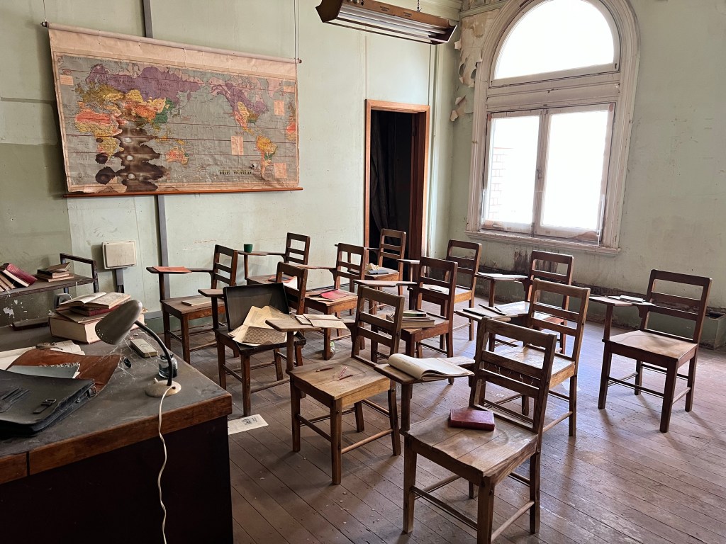
The Classroom
The first room we entered was the classroom. At the front of the room is a teacher’s desk and blackboard displaying the portrait of a woman. In each room there is a different portrait – part of the artist’s style. I was way more focused on the objects in the room than the portraits so I won’t write about them. My favourite objects in this room are all the books and pamphlets on the chairs and desks. It was fun reading them while wandering around.
The Classroom
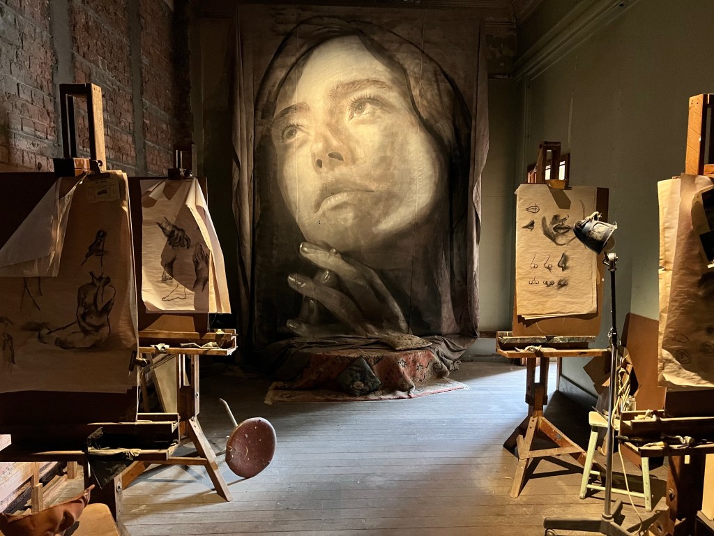
The Art Studio
This is one of the smallest rooms in the exhibition and is connected to the classroom. There are a number of easels set-up, each with a different sketch on the paper. I probably spent the least amount of time in this room.
The Art Studio
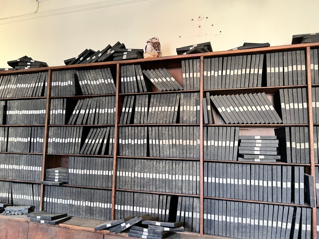
The Library
The library was one of my favourite rooms. It is a large room filled with floor to ceiling book shelves wrapping around the perimeter. In the middle are cobweb-ridden display cases, over-turned chairs, and papers all over the ground. There is even a hidden doorway at the back and spiral staircases connecting the bottom to the top level of books.
The LibraryThe Library
The Pharmacy
For obvious reasons, this was also one of my favourite rooms. I loved all the bottles and tins behind the counter and old magazines and cards at the front. Hidden behind the door and counter is a microscope with some vials beside it. It really feels as though you have stepped back in time into an old pharmacy.
The Pharmacy
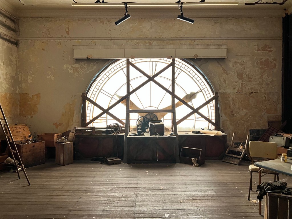
The Clock Room
Behind one of the external clocks at the station is the clock room. There are a lot of bottles of soda and wine in this room and a few pieces of furniture off to the side.
The Clock Room
The Ballroom
Inside the large old ballroom is a huge conservatory filled with green plants and some garden furniture. It fills the space well and adds grandeur to the exhibition.
The Ballroom
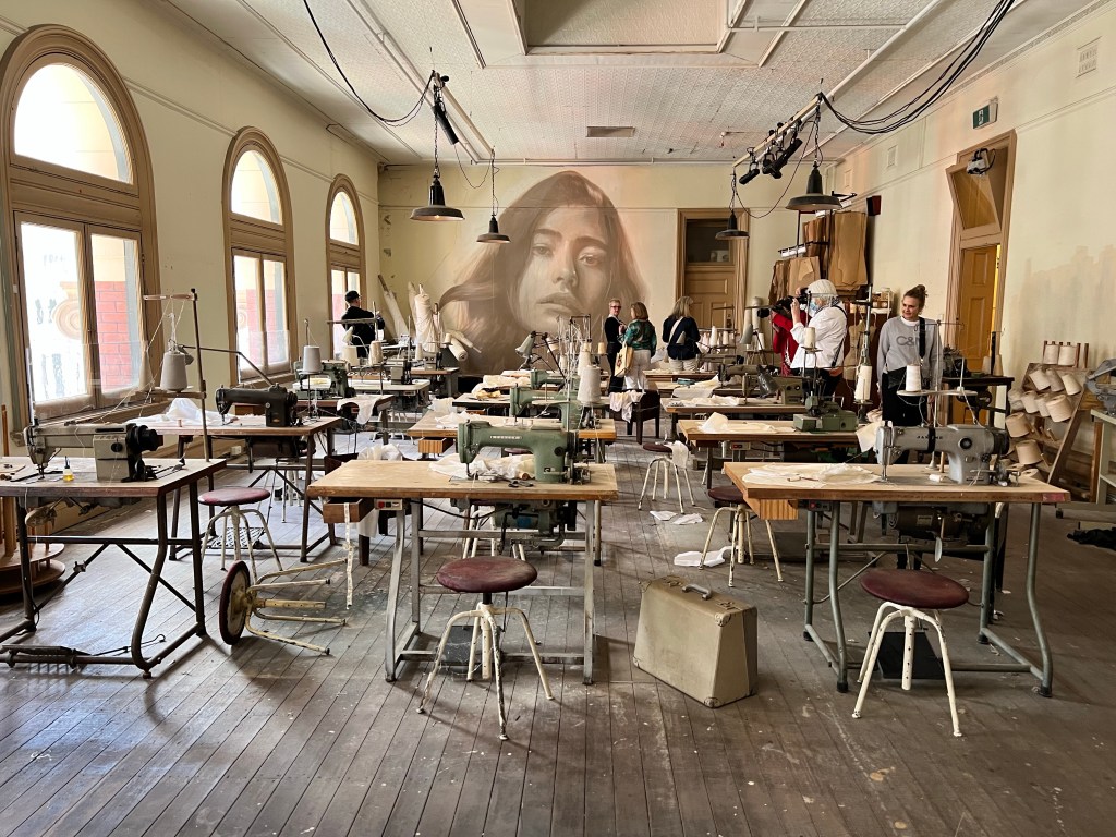
Sewing Room
There are two rooms in the exhibition that have multiples of the same object positioned to look as though work is continuing. This is one of the rooms. Inside are rows of sewing machines with a large fabric cutting table at the back. Along the walls are dressmaker models, patterns and extra thread.
Sewing RoomSewing Room
Post Office
The little post office has original mail bags and mail sorting cabinets on the wall. There are also these little vintage maps of Melbourne suburbs, designed to help with the delivery of mail.
Post Office Post Office
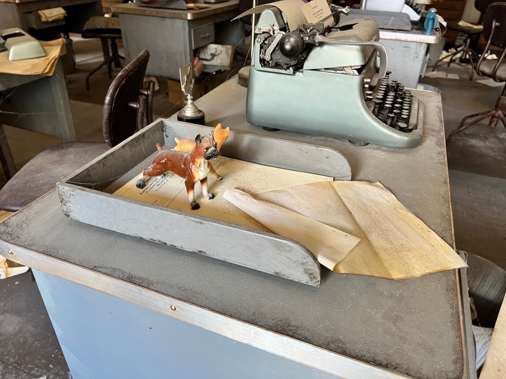
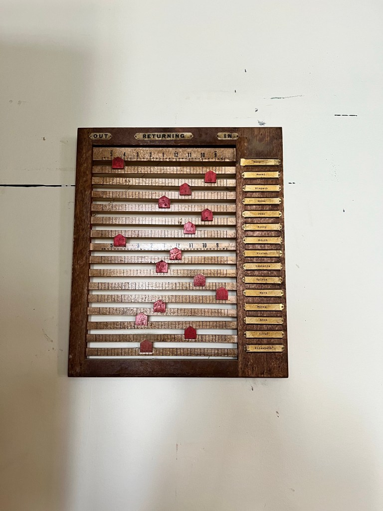
Office
The office space is definitely a highlight. Rows of typewriters are positioned between old office furniture. I loved the attention to detail in this space. The cardigan draped over one of the chairs. The little porcelain dogs in someone’s in-tray. It was my favourite room overall. It also contained my favourite object – this out and in board to keep track of employees.
OfficeOfficeOffice
Head Office & Living Room
I have combined the final two rooms we walked through. Similar to the art studio, I didn’t spend a lot of time in these rooms. I did like the unmarked folders stacked on top of each other and the open purse hanging from the coat hook.
Head Office & Living RoomHead Office & Living Room
Logistical Information
I hope this post and the accompanying images motivate you to visit (if you can). The exhibition is running until April 2023 and tickets cost around $40 with discounts for concession card holders. It is fully accessible.
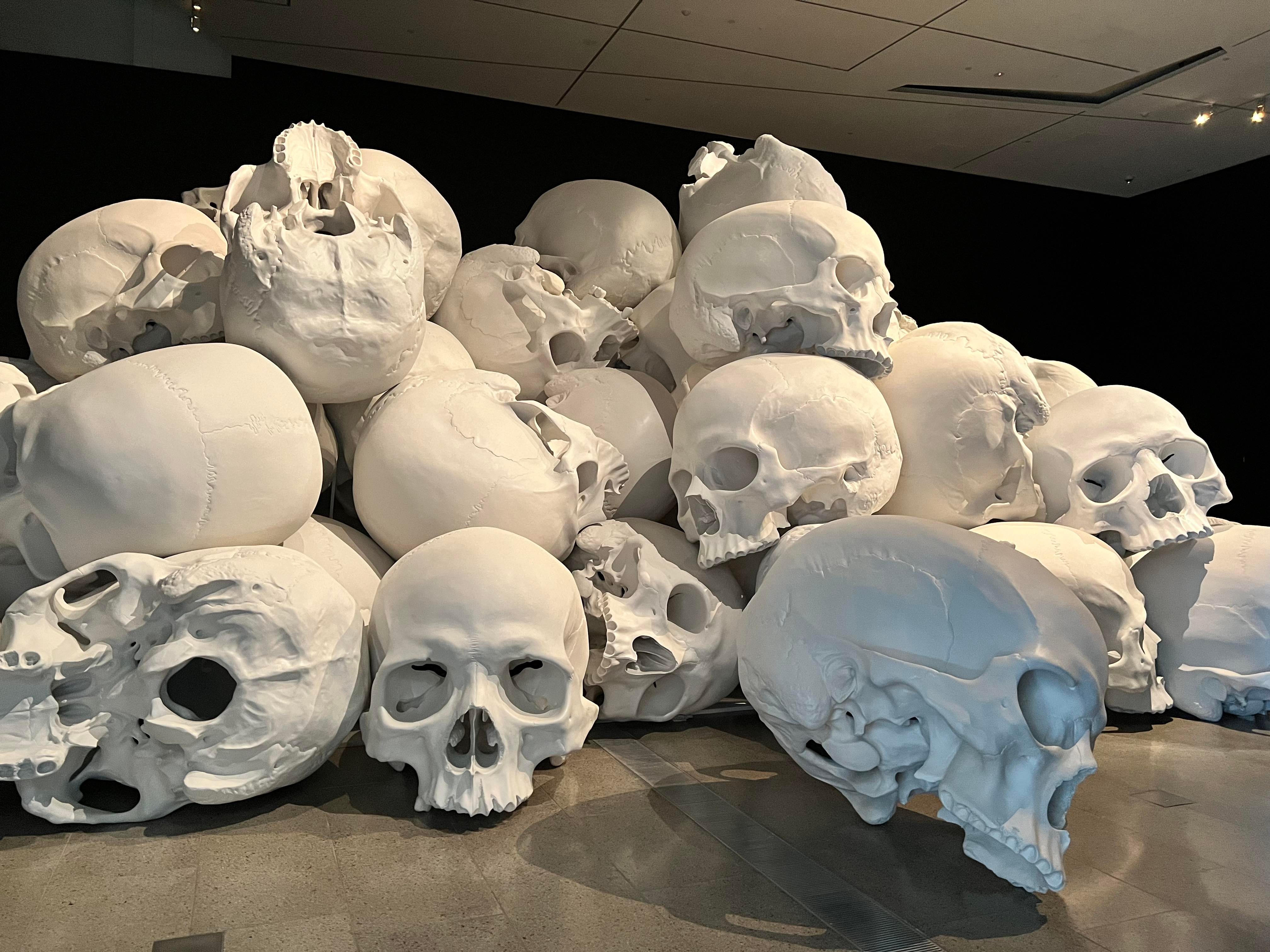
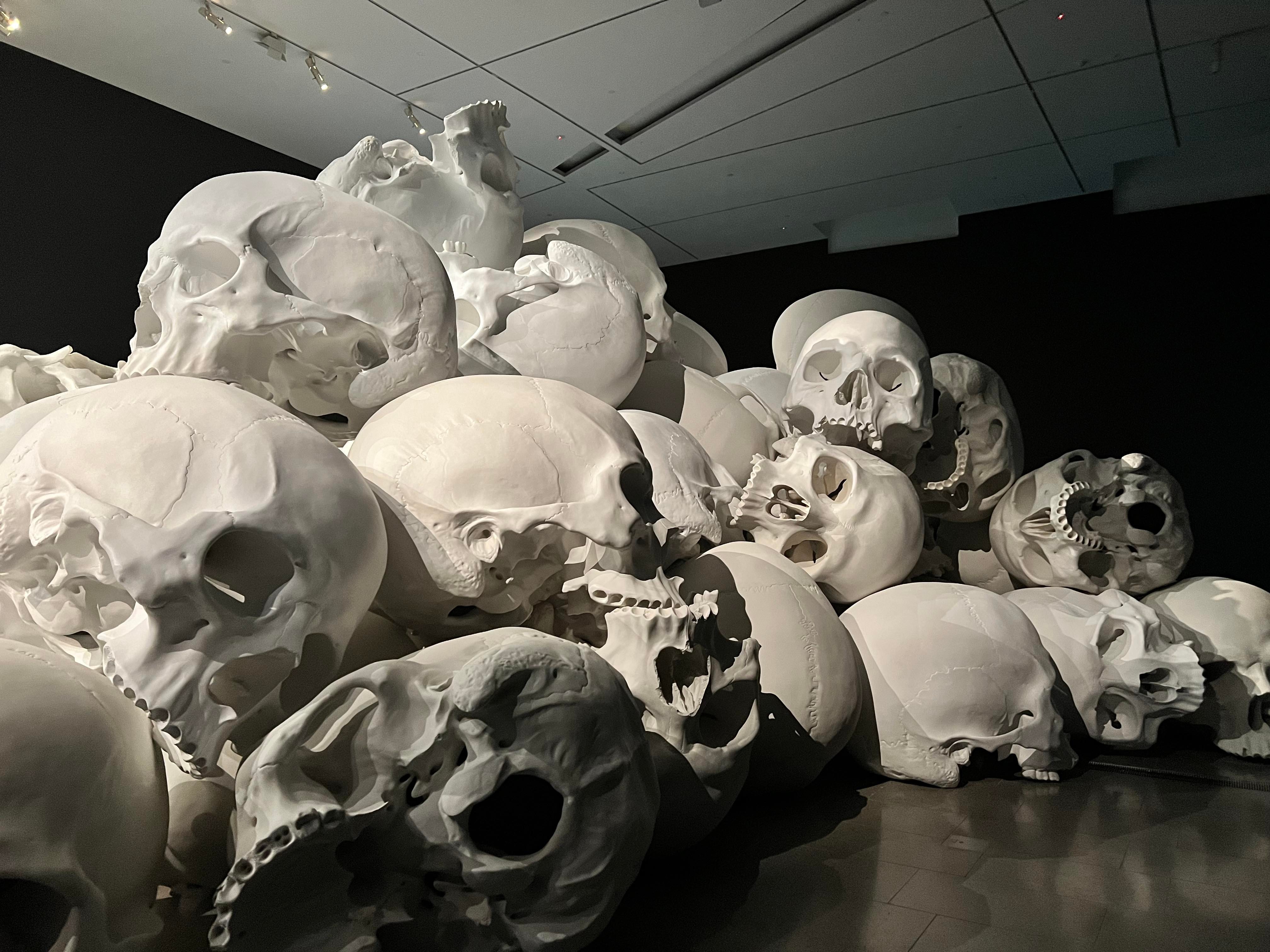
The National Gallery of Victoria (NGV) is spread across two separate locations. The artwork, Mass (by Ron Mueck), is located in The Ian Potter Centre, Federation Square. It’s a great space, showcasing artworks on three quite sizeable levels. I visited with a friend and our primary goal was to see Mass. When you see the photos, you’ll understand why. This post will begin with some context on the artwork. Rather than write a long post, I want to include a gallery of images of the artwork from different angles.
As a side note, I was so excited to see Mass. I had first seen images of the skulls a couple of years ago when I think they were on display at the main NGV location. I was so disappointed to miss out. When I saw the artwork was returning, it became an absolute priority on my Melbourne to-do list.
Mass by Ron Mueck
Mueck is an Australian-born artist who specialises in creating hyper-realistic, figurative sculptures. Aka, sculptures that draw inspiration from real things and look super real. Mueck is particularly known for his use of scale. This is what’s noteworthy about Mass.
First appearing at the 2017 NGV Triennial, Mass is basically 100 large-scale resin skulls. Why skulls? Mueck recognises that skulls are a significant symbol for so many cultures representing everything from ephemerality (lasting a short time, i.e. dying) to Halloween. In Mass, the skulls can be interpreted as representing the mass deaths in our time from, but not limited to, war, disease, and climate crisis.
The artwork is in two rooms. The first we went into had just a couple of skulls here and there. In the second room, there is a tower of skulls, with them all stacked on top of each other. I had a serious ‘memento mori’ (remember you have to die) moment in the space. It’s an amazing space to have discussions about so many challenging and difficult, yet necessary, topics.
Gallery of Images
We did explore more of the NGV but I want to keep the focus on Mass. For this reason, the rest of the post will be an image gallery so you can see for yourself the scale of this work. The Ian Potter Centre is accessible and open daily between 10am and 5pm. Mass is on display until 15 January 2023.
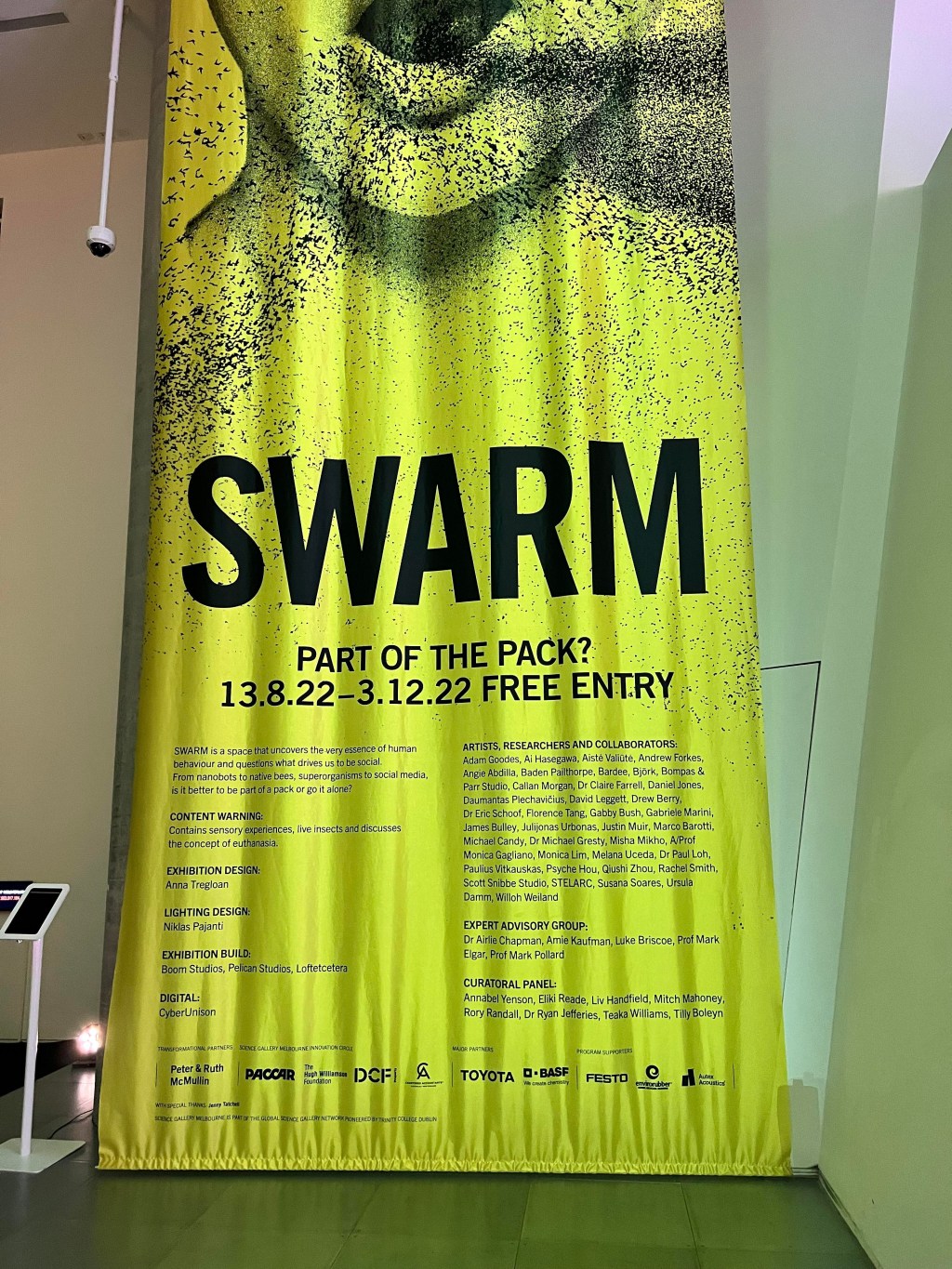
Content Warning: The following post will discuss elements of an exhibition that explore the topic of euthanasia. If you are uncomfortable reading this material, please skip this post.
This was my first visit to the Science Gallery, located within The University of Melbourne. Currently on display is an exhibition titled SWARM, which aims to reflect on our desire to be social. On the introductory banner, the question is posed: ‘is it better to be part of a pack or go it alone?’ I was intrigued by the premise of the exhibition and the kind of themes that would be addressed. The main exhibition space is spread across one level. It consists of multiple stand-alone installations and interactives that all speak to the overarching SWARM concept. Each installation has a digital label displayed on a tablet device providing information on both the work and the artist. For most of the installations, the amount of information was enough to establish context and raise my level of understanding. Roaming the floor are mediators, staff who are also there to help with interpretation and understanding the works. I was very glad that they were there as it added to the experience.
For me, there were some standout works that were either truly intriguing or totally bizarre. I have selected five to focus on.
I was most looking forward to experiencing this installation. The label starts by asking the question ‘what skeletons are in your digital closet?’ Truly this could be the start of a modern horror film. If you dare, you are encouraged to share your Instagram handle and step inside to hear your posts read aloud. My favourite quote from the label is that the installation acts as a ‘mourning poem for the late capitalist hell that makes even the worst of us valuable.’ Talk about a one-sentence critique of society. There are broader themes here of data scraping, digital identity, and critical reflection.
After you’ve shared your handle, you walk inside a room and sit on a bright pink toilet with a speaker hanging above. I can’t quite describe to you what it’s like sitting on a toilet while voices read aloud all the cringe you have written in the past. It was almost like a really bad meditation session. I encourage you to experience this for yourself.
Two. Euthanasia Coaster by Julijonas Urbonas
Euthanasia Coaster
I started this post with a content warning so if you missed reading that and you’re uncomfortable with discussions on euthanasia, please stop reading. Urbonas is a Lithuanian artist and engineer who has dedicated his career to creating extreme simulations. What’s pretty intriguing about this artist is that he was also a director of an amusement park in Klaipeda. All these elements combined to inspire Urbonas to create this rollercoaster. It sparks some pretty interesting ideas and, depending on your cultural background, challenges your ideas of life and death.
Basically, what you are looking at is a rollercoaster that will end your life. It works to humanely end life by depriving the brain of oxygen. All the loop-de-loops and 500m drops contribute to this loss of consciousness and eventual death. I am about to attend a three-day conference on death and deathcare so I am quite comfortable with these types of discussions. I am also glad to see that they are being de-stigmatised in a public space. The final question asked on the label is ‘would you want your last experience to be one final, thrilling ride?’
Three. Synthetic Pollenizer by Michael Candy
Synthetic Pollenizer
I liked this installation because it’s all about saving the bees. Bees are awesome, they play such a vital role in our ecosystem, and they need to be saved. If we can achieve this through creating robotic flowers designed to secrete nectar, then great. These robotic flowers can create a safe environment for bees to thrive. Happy bees for a happy planet.
Four. Planet of People by Julijonas Urbonas
Planet of People
We are back looking at a work by Urbonas that once again tackles the broader theme of death. This time focusing on how overpopulation is leading to a shortage in space for burials and holding human remains. The solution? Shoot people’s bodies into space so they can form their own planet. After entering space, your body would float amongst the stars then join with other bodies to create a giant blob planet. If you are wondering what that might look like, you can step in between the screens, be 3D scanned and see your body digitally join the blob.
Five. The Egg by Marco Barotti
The Egg
Similar to the previous work, this one also addresses overpopulation. This egg is a sculpture that speaks to the impact of overpopulation. It uses kinetic sound to indicate when there is a new birth in the world. This is driven by real-time data generated by the World-o-meter. Although you can’t hear the sound, the bass of it causes a subwoofer to vibrate and the egg looks like it has ripples going over the surface.
Along with these five installations, you can also have a tree follow you and ‘open up a dialogue between human and shark that has never been experienced before.’ If you are looking for a morning/afternoon filled with new experiences that may or may not challenge your beliefs, then go and see SWARM.
Logistical Information
The Science Gallery in Melbourne is open Tuesday – Saturday between 11am and 5pm. It is completely free of charge and accessible. Located near the CBD, it is also easy to find and there are plenty of transport options available.
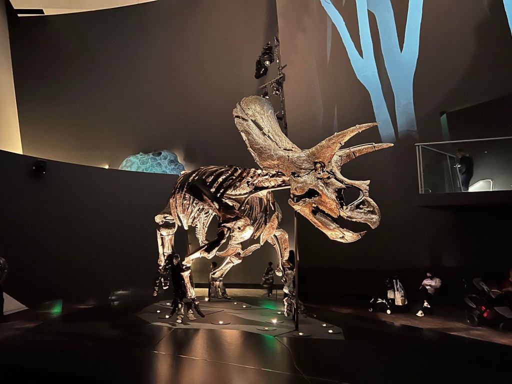
I’m in Melbourne for a week to both attend a conference and enjoy a bit of holiday time. My first stop was Melbourne Museum to see Horridus, the new Triceratops skeleton. I absolutely adore dinosaurs so I was excited to see the skeleton and the accompanying exhibition – Triceratops: Fate of the Dinosaurs. This is going to be a very short review as I only want to cover this exhibition and provide a bit of context.
Horridus Context
First things first, Horridus is called Horridus as the full species name for the Triceratops is Triceratops horridus. It is estimated that this skeleton is about 85% complete with the skull an incredible 98% complete. When I first heard about Horridus I thought, where did the skeleton come from and why is it in Melbourne? To answer the first part of the question, Horridus was discovered in 2014 in Montana. A small part of the skeleton’s pelvis was discovered poking out of the sandstone in Hell Creek. Once excavations had taken place, palaeontologists could confirm it was one of the most complete Triceratops skeletons ever discovered. Horridus was purchased by the Museum and began its journey from Montana to Melbourne in eight shipping crates. Once it arrived in Australia, the bones were measured, 3D scanned, then placed on display. The most intact dinosaur skeleton I had seen before Horridus was Sue the T-Rex at the Field Museum in Chicago. It was amazing to see the skeleton of another dinosaur species almost complete.
Skeleton of Horridus
Before writing about the accompanying exhibition, I want to first focus on the skeleton. Although it’s not the first thing you see, clearly the entire exhibition has been designed around Horridus. After walking through a couple of rooms showing cartoon-like video footage on the walls, you exit to see the skeleton standing in the middle of a large room. The first thing that really struck me was just how massive Horridus is in real life. The images online don’t do it justice. The skeleton is about seven metres long and two metres tall. It’s standing on a raised plinth with plenty of seating area surrounding it so you can just sit, relax and stare at the skeleton.
Horridus
This is a really well planned out part of the exhibition. So much space to see Horridus from every angle and even when it’s busy, you don’t feel overcrowded. Not only can you observe the skeleton from this level, but there are two viewing platforms on the second level so you can see the skeleton from above. Well worth going to all vantage points as you start to see little pieces here and there that you might have overlooked or couldn’t see from where you were standing. I spent the majority of my time in this exhibition looking at Horridus and how all the bones connect together. There is, however, much more to the exhibition.
Wider Exhibition
I entered the exhibition on the ground floor after walking through the old dinosaur gallery. This is a nice way to start your visit as you first walk through a couple of rooms with video footage projected onto the walls. Room one has footage of a riverbank, Hell Creek swamps. Watching the screen you see soft-shelled turtles, salamander and crocodiles moving across. You then walk through the deep forest and see a T-Rex and Triceratops foraging around. These two rooms set the context for the skeleton and, from my observations, were really popular with young children. There is a didactic in each room providing some information but the use of video as opposed to interpretive text was a wise decision.
Video
Surrounding Horridus are a couple of display areas. My favourite related to the 3D scans they took of Horridus when the skeleton arrived. For a more tactile experience, visitors can feel 3D printings of different parts of the skeleton. Even a rough print out of the brain, determined by the empty space in the skeleton’s skull. Just from one CT scan, they can tell that the Triceratops most likely made a low, deep sound and listened for footsteps of large dinosaurs. Amazing what technology can reveal!
HorridusHorridus 3D Printed Brain
I did not spend a long time on the second level of the exhibition. It mostly displays some further contextual information such as the ecosystem of Hell Creek. There was a standout interactive teaching visitors how fossils are formed. It was in constant use while I was there so I didn’t get the chance to explore it in more depth. I will say that the graphics of the exhibition are fantastic. It is a bit heavy on the digital side including static digital screens of cartoon-like dinosaur figures that worked well in the space, but caused some digital screen fatigue. It wasn’t overwhelming, just something I can now reflect on.
Fossil Form Display
The exhibition does cater to different learning styles and accessibility levels. Not only with the 3D printed tactile elements, but the use of sound too. There is a small section where you can go into little hub spaces, each representing a different ecosystem, and listen to the birds that would have existed in these spaces.
Overall, I enjoyed walking around the exhibition and interacting with the different elements. It certainly provided a technologically enhanced, modern exhibition experience while not overwhelming the skeleton and its impact on visitors.
Logistical Information
Melbourne Museum is now home to Horridus so there is no rush to come and see the skeleton. The Museum is open daily from 9am to 5pm (closed Good Friday and Christmas Day). Entrance to the exhibition is included in general entry fees – adults: $15, seniors: $10, children/members/concession card holders: free. The Museum is accessible and there is heaps of great information on their website to help plan your visit.
On Thursday I visited the Gallery of Modern Art (GOMA) in Brisbane to see Chiharu Shiota’s exhibition, The Soul Trembles. I am somewhat familiar with Shiota’s work having seen an installation in the Art Gallery of South Australia. Shiota is a Japanese-born, Berlin-based artist who experiments with performance art and large-scale installations. This is the most comprehensive exhibition of her work to date showcasing around 30 years of practice. It has been curated by the Mori Art Museum in Tokyo. It is a truly spectacular and stunning exhibition that has been curated with such care. To give you an idea of the scale and diversity of Shiota’s works, I have selected eight of my favourites from the exhibition. There is, of course, so much more to explore and I strongly recommend you visit if you are in Brisbane. I’ll provide some visitor information at the end of the post.
Butterfly on the Sunflower, 1977
Butterfly on the Sunflower
This is the first artwork you see when entering the exhibition. It is a painting Shiota made in 1977 when she was only five years of age. There is something about it that really resonated with me. I don’t think I’ve ever seen a solo exhibition begin with a work created in childhood. It is really sweet and clearly shows how art has been central in her life since the beginning. So much so, that this artwork has been treasured and kept for many years. It also set the scene of the exhibition as something truly personal. As you will see, the artist’s voice continues to be central as you move throughout the space.
In Silence, 2002
In Silence
The first large-scale installation in the exhibition is titled In Silence. It is a room filled with black thread covering the ceiling, a burnt piano, and burnt chairs. Inspiration for this work came from a fire Shiota witnessed when she was nine years old. The house next to hers burnt down and the only thing standing at the end of the fire was a burnt piano. The artist statement written in both English and Japanese explains how Shiota reacted to the fire and how it became such a memory. As she states ‘there are things that sink deep into the recesses of my mind.’ The longer you spend in this space the more you begin to appreciate all the elements. Especially the chairs. Some are almost unrecognisable, burnt down to their foundations. The others appear new, barely touched by a flame.
Reflection of Space and Time, 2018
Reflection of Space and Time
This installation uses the same thread as the previous. However, in the middle are two white dresses. There was no further information on the label but I did manage to find a bit more on the GOMA blog. According to Shiota, we have our human skin then our clothing creates a second skin. In this instance, the dresses symbolise a second skin. They are suspended in the thread to convey a ‘presence in absence’. What stood out to me with this work was the beauty of the dresses, suspended and floating amongst the threads.
A Room of Memory, 2009
A Room of Memory
This was my favourite work in the exhibition. Not only because it had great impact, but because of the context. These were all collected from construction sites in Berlin – window frames that had been discarded. It reflects the separation of Berlin into east and west. What were the people who once stared out of these windows thinking? What was happening in their individual lives? It is taking something so traditionally viewed as structural and adding that social and cultural layer.
Connecting Small Memories, 2019
Connecting Small Memories
This is a lovely installation connecting dollhouse furniture and toys together with string. It’s adorable and we spent quite some time looking at all the pieces and how they were connected. I took an up-close photo of the piano and chair. As my friend pointed out, it looks inspired by the In Silence installation.
Uncertain Journey, 2016
Uncertain Journey
This work is in the middle of the exhibition. The red thread looks as though it is pouring into or out of some boats made from metal. Rather than a literal journey, it represents a mental journey and how it can become tangled and intertwined.
A question of perspective, 2022
A question of perspective
This work was commissioned by GOMA. It looks at the themes of absence and, more generally, existence. In the middle is a desk with a flurry of paper rising above it, suspended in black ropes. As you can see, it is very impressive. The aim of the installation is to reflect the same sense of mystery and wonder that the artist experienced while visiting Uluru back in the 1990s.
Accumulation: Searching for the Destination, 2014
Accumulation: Searching for the Destination
Last, but certainly not least, is this installation of suitcases suspended from red ropes. It is quite a remarkable installation as some of the suitcases have motors inside causing them to move. According to Shiota, when she sees suitcases, she thinks of the human lives behind them. Why do people leave their country? The one quote I love on this label is, ‘I think back on the feelings of these people on the morning of their departure.’ That feeling of anticipation and joy or maybe nervousness and fear.
Final Quote
To finish, I want to share one of the final quotes from Shiota. It comments on death and our relationship to death. It is a beautiful and meaningful quote that I’ve found myself reflecting on a couple of times since seeing the exhibition.
This post contains medical imagery. If you do not wish to view this content please don’t continue reading.
My (tentative) final post for Adelaide will focus on the Art Gallery of South Australia. We also visited the South Australian Museum but I’m not sure yet if I want to write about it – watch this space. During our visit to the Gallery, we walked around the permanent exhibition space and visited the two temporary exhibitions on offer – Robert Wilson: Moving Portraits and Archie 100 (100 Years of the Archibald Prize). For each of the three exhibitions, I am going to highlight my favourite works and write a little bit about the layout.
Permanent Exhibition Spaces
The permanent collection of the Gallery is impressive. There are multiple exhibition spaces organised by theme. In all rooms, sculptures are in the middle and the paintings are displayed as a salon-style hang. It did become quite difficult to locate the correct labels for each of the works. The sculptures, in particular, didn’t always have obvious-to-find labels. There were a couple of times when we had to walk around the perimeter of the room just to try and find them. Having the labels off to the side can work well when there isn’t a salon hang, but it did feel a little overwhelming. The following were my favourite sculptures and paintings in the permanent exhibition spaces.
Ricky Swallow – The Exact Dimensions of Staying Behind
The Exact Dimensions of Staying Behind
No prizes for guessing why I liked this sculpture. It is made from laminated lime wood and is so detailed. It really does convey someone who has been left behind – sitting and waiting for so long. The cloth over the back of the chair looks so light and flowing. It really stands out in the space and invites you to look closer.
Alex Seton – My Concerns will Outlive Yours
My Concerns will Outlive Yours
I’m going to include the label for this work so I can talk about the accessibility features. On a few labels, there are QR codes you can scan for extra accessibility. You can see this in the photograph above on the side of the plinth. When scanned, you have access to, for example, Auslan services and alt text. Great to see in the space.
I was drawn to this work because I love marble sculptures that don’t look heavy. You can immediately recognise the marble as sculptured to look like a sheet or tarp covering a body. The title of the work is interesting and I wish there were more details available. I interpreted it as concerns being set in stone that will live forever.
Chiharu Shiota – Absence Embodied
Absence Embodied
I really hope to see Shiota’s work at the Gallery of Modern Art in Brisbane soon. This is such an immersive work. You walk into a room with wool covering the ceiling and walls, all attached to these body parts on the floor. I really enjoy works on this scale.
Thomas Hirschhorn – Twin-subjecter
Twin-subjecter
Not a lot of information available for this work but it is certainly a piece that warrants a second look. Not every day you see life-sized human sculptures covered in nails. Reminds me so much of Hellraiser (classic horror film).
Yayoi Kusama – THE SPIRITS OF THE PUMPKINS DESCENDED INTO THE HEAVENS
I always enjoy the contemporary work of Kusama. It has a fun interactive element and always seems to demands total focus. For this work, you step into a room with bright yellow walls, floor and ceiling, and large black dots covering all surfaces. In the middle is a mirror. It speaks to the aesthetics of accumulation and obsession.
THE SPIRITS OF THE PUMPKINS DESCENDED INTO THE HEAVENS
Robert Wilson: Moving Portraits
This is quite an interesting exhibition showcasing the digital portraits by Robert Wilson. Accompanying these portraits are pieces from the Gallery’s collection that complement the portraits. The complementary works have been so carefully selected and always work well in the exhibition. The layout of the exhibition has nice large gaps between the works and a huge area to walk around so you never feel crowded. However, I will say that it is a bit of a sensory overload with so many sounds competing in the space. Something to be aware of if you’re not ok with lots of loud noise.
Robert Wilson – Lady Gaga: Mademoiselle Caroline Rivière
Lady Gaga: Mademoiselle Caroline Rivière
This digital portrait is of Lady Gaga dressed and posed like Mademoiselle Caroline Rivière. The original portrait was painted by Jean-Auguste-Dominique Ingres in the 19th century at the request of the Rivière family. Caroline died one year after the portrait was painted so Wilson has introduced a single tear running down Gaga’s face. It’s a gorgeous work juxtaposing the old-fashioned clothing and hairstyle with a modern-day celebrity.
Timothy Horn – Gorgonia 5
Gorgonia 5
Next to the portrait is this stunning sculpture by Horn created from nickel-plated bronze and mirrored blown glass. It looks like you are zooming in on some coral and finding giant pearls amongst it. It works so well in the space. Similar to the digital portrait it appears to be juxtaposing the old with the new.
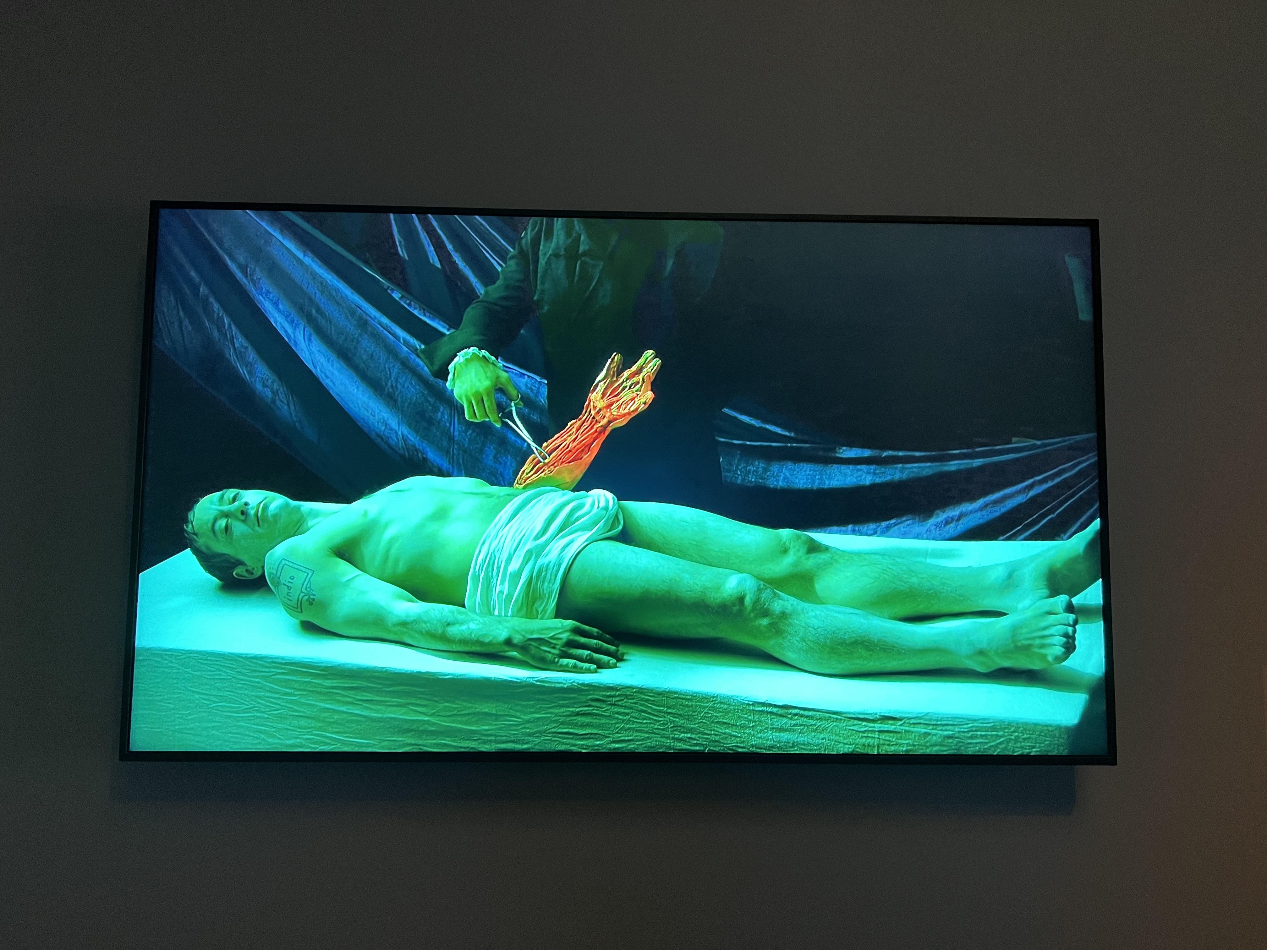
Robert Wilson – Robert Downey Jr, Actor
Robert Downey Jr, Actor
As soon as I saw this digital work I thought of the painting by Rembrandt titled The Anatomy Lesson of Dr Nicholas Tulp. It has, in fact, been inspired by this work. Downey Jr’s left arm is a dummy being operated on to show the internal structures of the arm and hand. If you watch the video closely, you can see him breathing and his eyes occasionally opening and closing.
Tim Noble and Sue Webster – The Gamekeeper’s Gibbet
The Gamekeeper’s Gibbet
Without a doubt, this is my favourite work in the exhibition. The two stick-like bushes have been created using solid sterling silver gilded in pure gold. When the light hits the sculpture, it creates a shadow on the wall of two faces. Such a beautiful work that is in the same space as a digital portrait of Winona Ryder. Anything selected to complement Winona Ryder is a win in my books.
Archie 100: A Century of the Archibald Prize
When you buy a ticket for either Robert Wilson or the Archibald exhibition the other is automatically included. Similar to the Robert Wilson exhibition, the layout of Archie 100 works well. Big gaps between works and it never felt too crowded despite being very busy. When I saw the Archibald in Sydney a few years ago I wrote a blog post focusing on the dogs of the exhibition. I thought I might as well do the same here. However, very few dogs feature.
Julie Dowling – Sister Girl – Carol Dowling
Sister Girl
Julie Dowling was the first Aboriginal woman to have work selected for the Archibald. This piece was displayed in 2001 and depicts her twin sister. She is holding their family dog, Daisy. It combines European portraiture with Aboriginal iconography and symbolism.
Marc Etherington – Me and Granny
Me and Granny
This work depicts the artist, Marc Etherington, with his imagined pet dog. He has wanted a whippet for some time now and is keeping a close eye on the animal shelters for one to appear. When the day comes, his son insists they call the dog Granny.
Kate Beynon – Self-Portrait with Guardian Spirits
Self-Portrait with Guardian Spirits
In this work, the artist, Kate Beynon, has painted a self-portrait with two green lion-dogs. They are there to reference her Staffy-cross Tudo.
Logistical Information
The Art Gallery of South Australia is open Monday – Sunday between 10am and 5pm. The permanent exhibitions are free. Robert Wilson and Archie 100 are paid exhibitions on display until October 3, 2022. For more information on ticket prices follow this link: https://www.agsa.sa.gov.au/visit/plan-your-visit/. The Art Gallery is accessible.