The last time I visited MONA was back in (approximately) 2011/2012. It was during a German summer school and I was in a group tasked with guiding others in the program through the Museum. It was a much more relaxing visit yesterday and I was able to admire more of the architecture than I had the first time. There were, however, elements that I found problematic – I will discuss these later. I will say that from beginning to end, visiting is quite an experience. This post will follow that experience and highlight things along the way. To start, we are going to catch the ferry to MONA.
Ferry Ride
You can drive or get an Uber/taxi to MONA but you can also arrive in style via the MONA ferry. Either join the ‘posh pit’ or the plebs in the back for your journey. The ‘posh pit’ is a more expensive ticket that includes some food and drinks. Considering the ferry ride is only 25 minutes, you might want to save some money here.

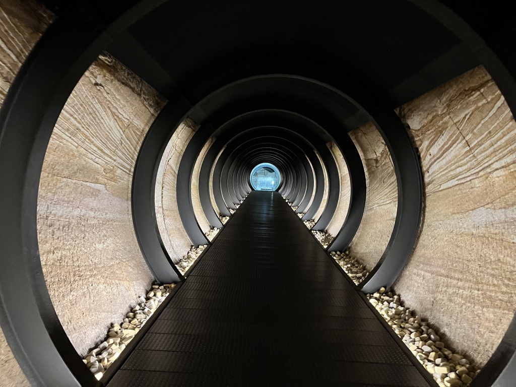
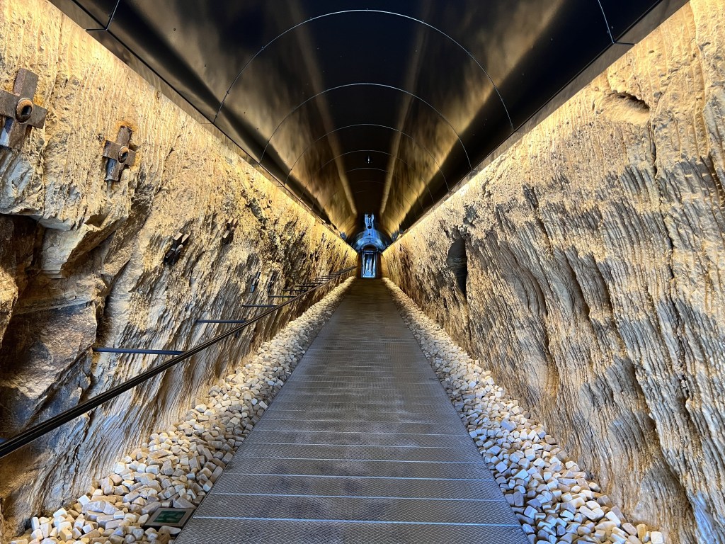
Overall, we found the ferry ride relaxing. This is despite there being a delay that almost cut into our museum visit time. I would have liked some narration on the ferry since we were travelling past some interesting-looking sites. Not a necessity, just a nice addition. It was a smooth ride and when we arrived, easy to navigate to the Museum. There are 99 steps from the ferry to the Museum but there is a tunnel you can walk through, straight into a gallery space, if you have accessibility requirements.
The ‘O’ App
I remembered the app from last time and the frustration it caused. I am all for an app supplementing and/or augmenting the experience, but I am not a fan of an app replacing almost everything. In terms of a positive, the map function is useful. On the other hand, the app replaces on-the-wall object labels. This means you spend most of your visit looking at your phone. I definitely think increasing labels and interpretation within the space would work a lot better.
Linking in with this is the lack of wayfinding signage. There are times when you need to go to another level in order to find a different set of stairs to go back to your original level. It is very hard to find where to go and more signage would have been appreciated.
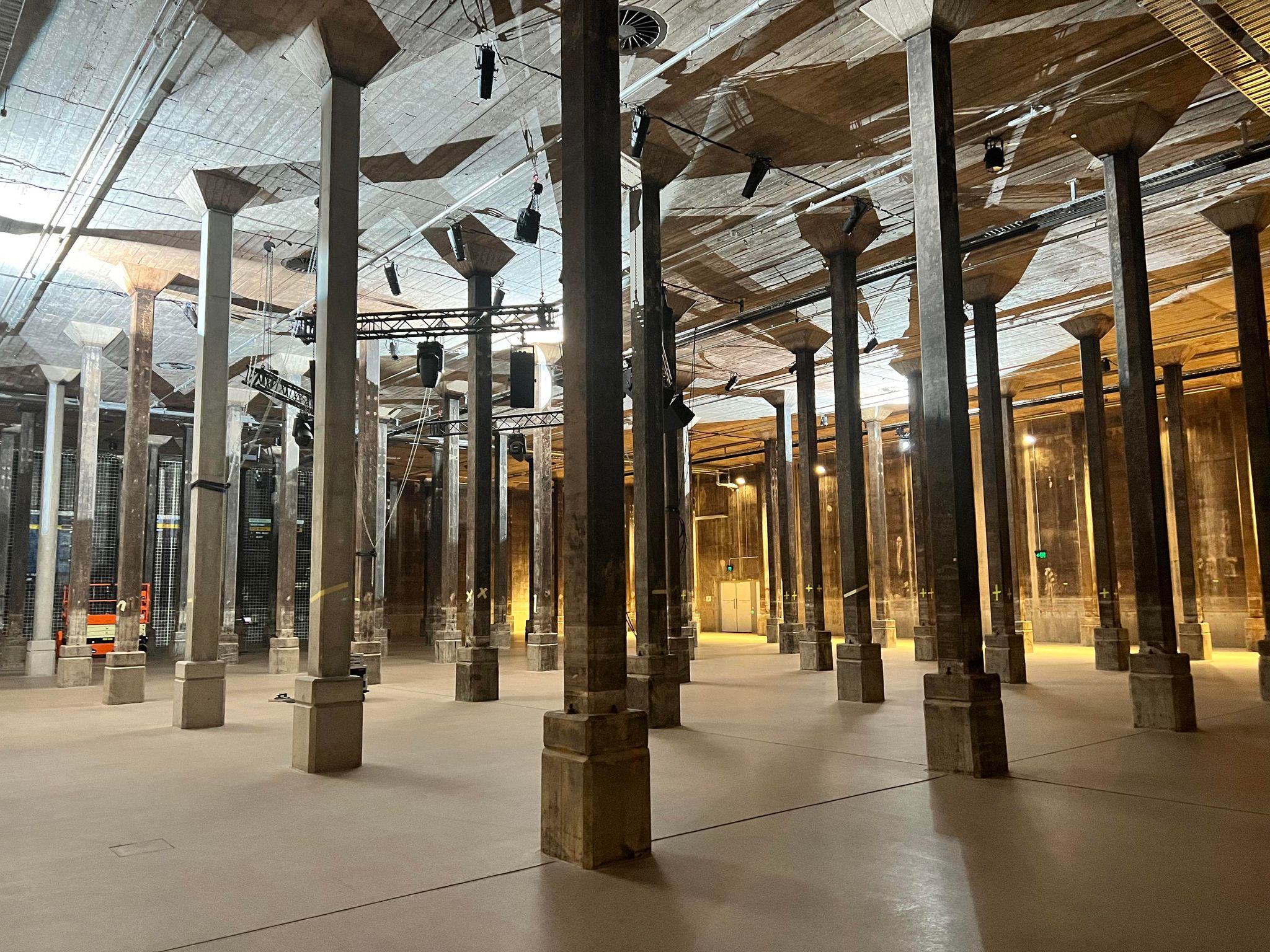
Basement 3
We entered the Museum on level Basement 3. This was my favourite level of the Museum with a couple of highlight installations. The first, bit.fall, is a work by German-artist Julius Popp. You can hear this work before you see it. Water droplets drop from a platform to the ground spelling out words on the way down. These words have been sourced from live news feeds and are constantly being updated. It is a fascinating work and one that you can really spend time watching.

We then made our way to a new work by Jónsi titled Hrafntinna (obsidian). This was my favourite work in the entire Museum. Basically, you sit in a dark room and experience a volcanic eruption. It is a beautiful work that utilises both light and sound in order to create an experience. We spent around 15 minutes just listening to the music and taking a moment to sit down.
Last but not least, we have 20:50 by Richard Wilson. With this work, you individually walk down a little runway surrounded by water. This water reflects the square pattern creating the illusion that the squares go on forever.
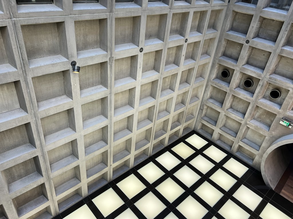
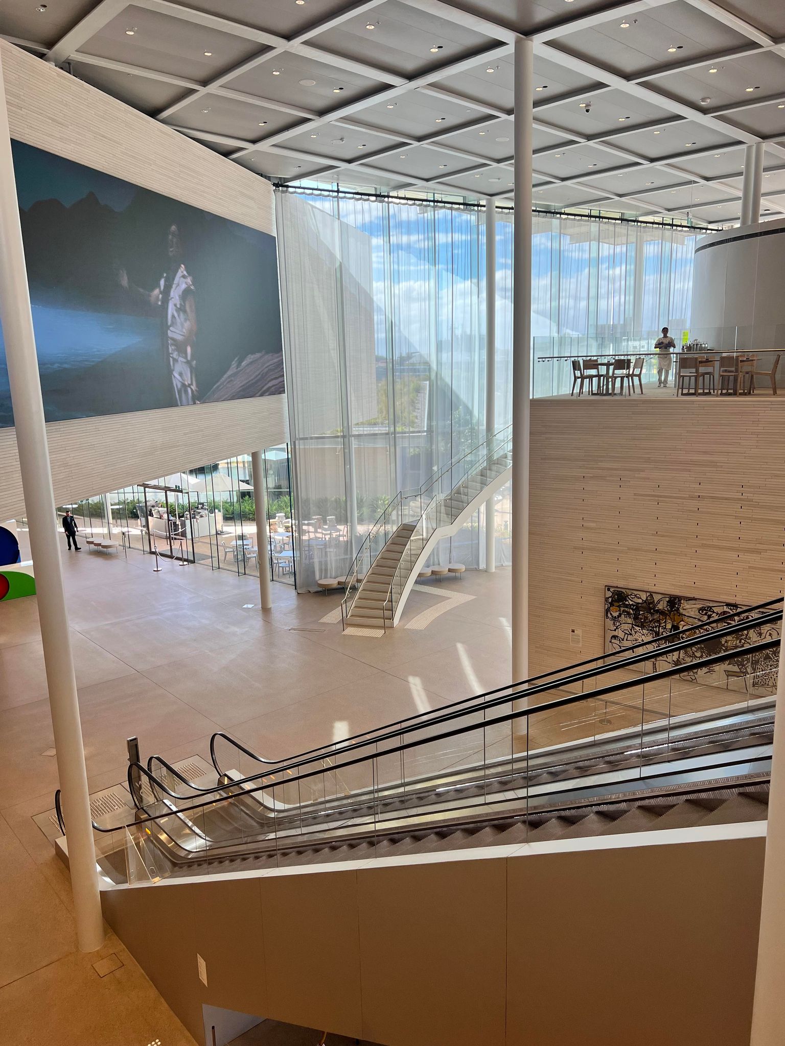
Architecture
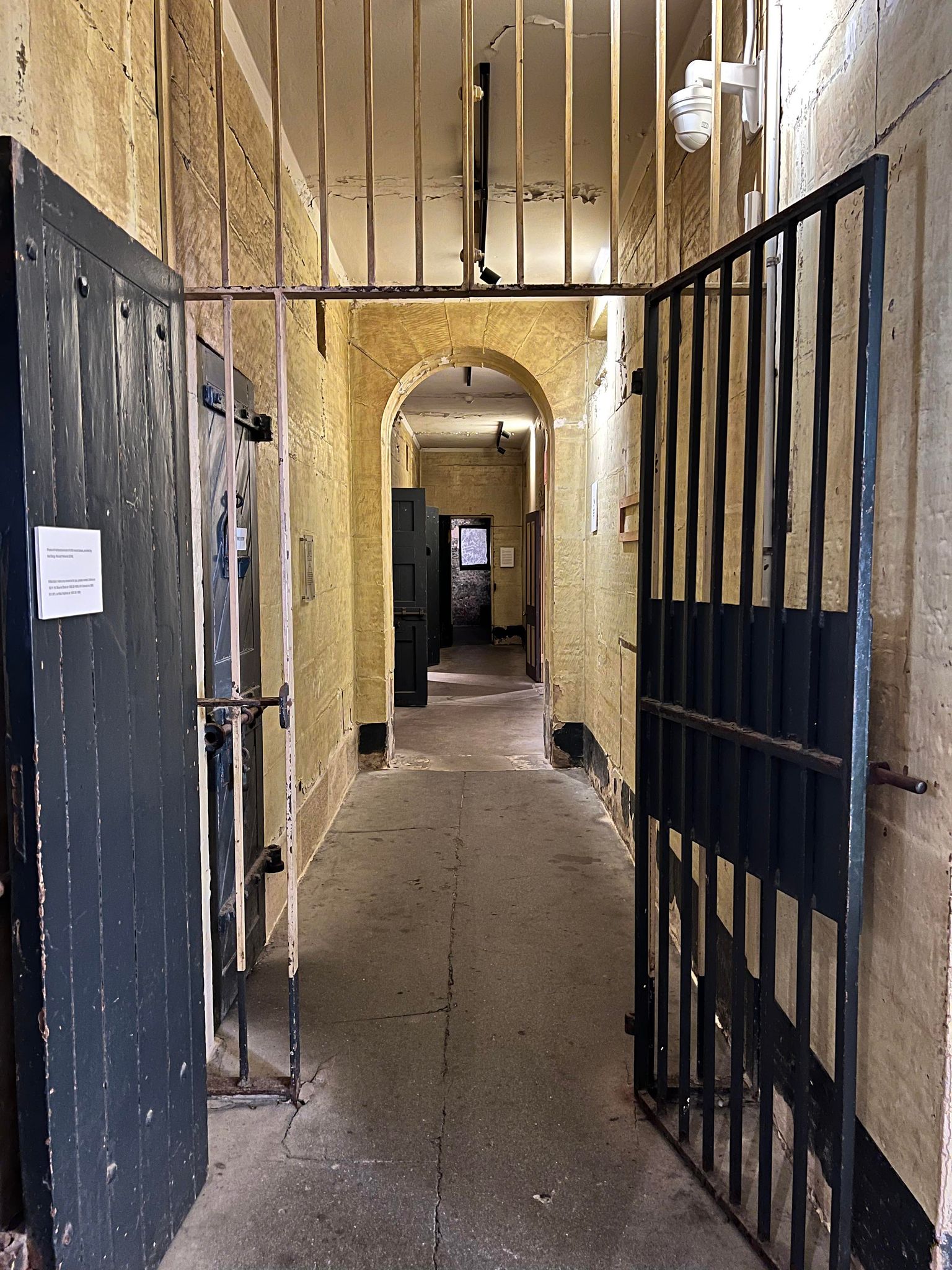
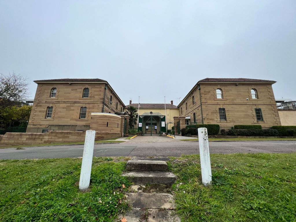
Between Basement 3 and Basement 2, we really started to appreciate the architecture. Large sandstone blocks and long atmospheric tunnels truly make this museum an architectural marvel. This alone is a good reason to visit.

Basement 2
We didn’t spend long in Basement 2. It was initially difficult for us to find an accessible way to get there but we finally did and just had a quick walk around.
Basement 1
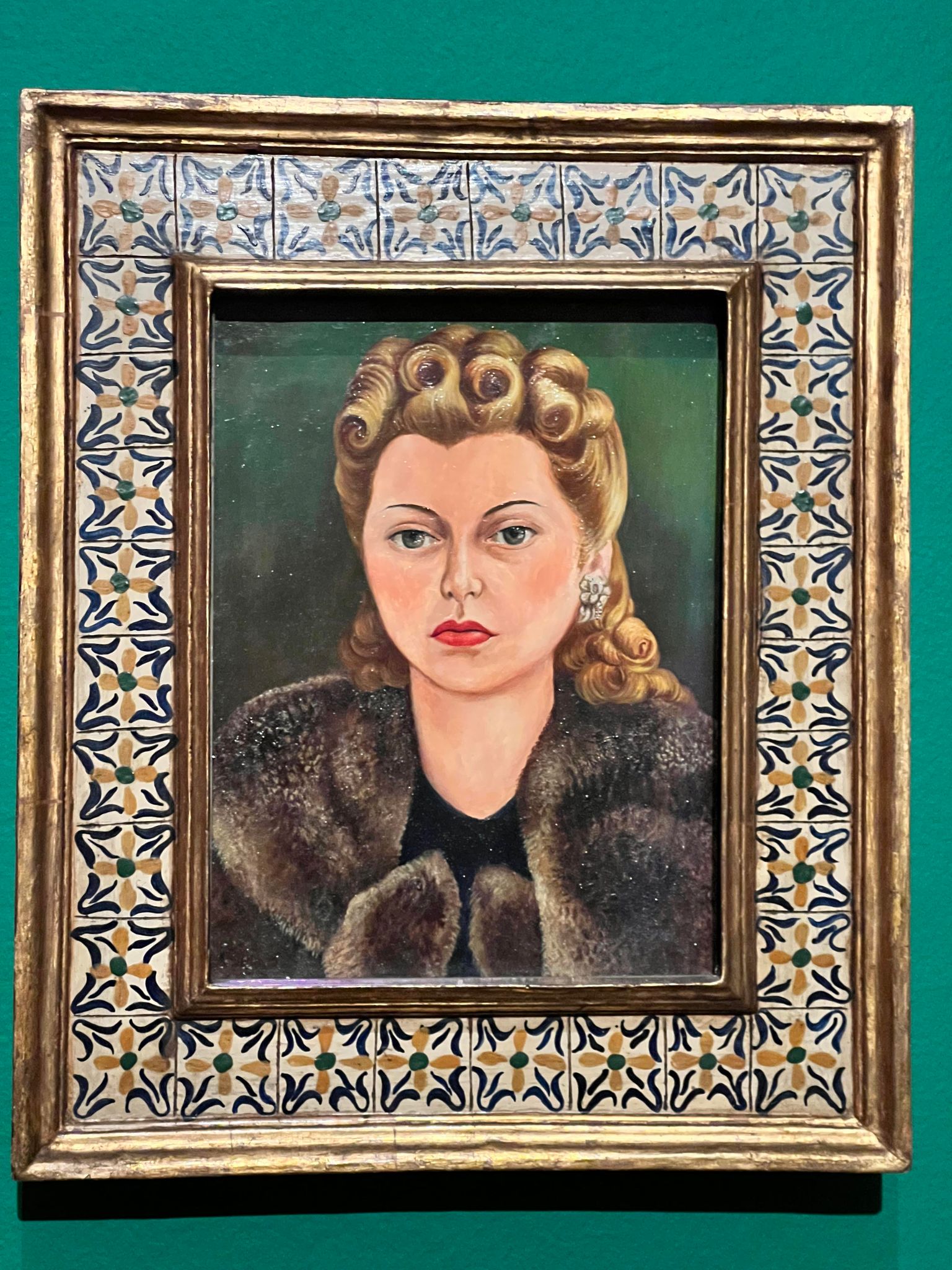
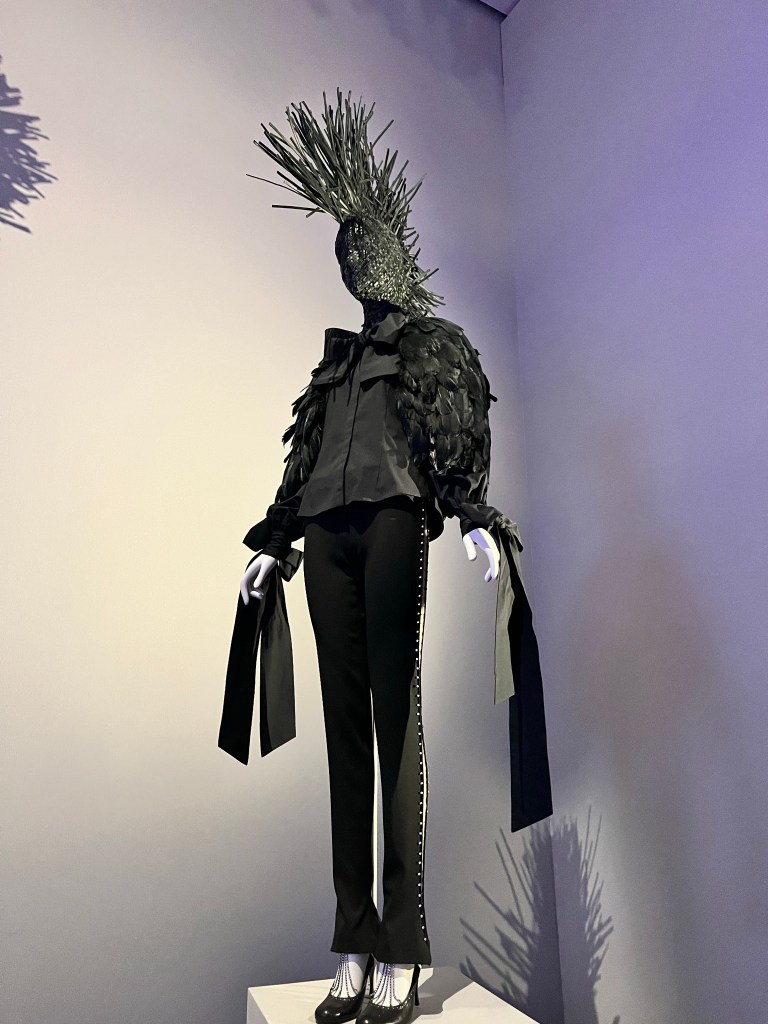
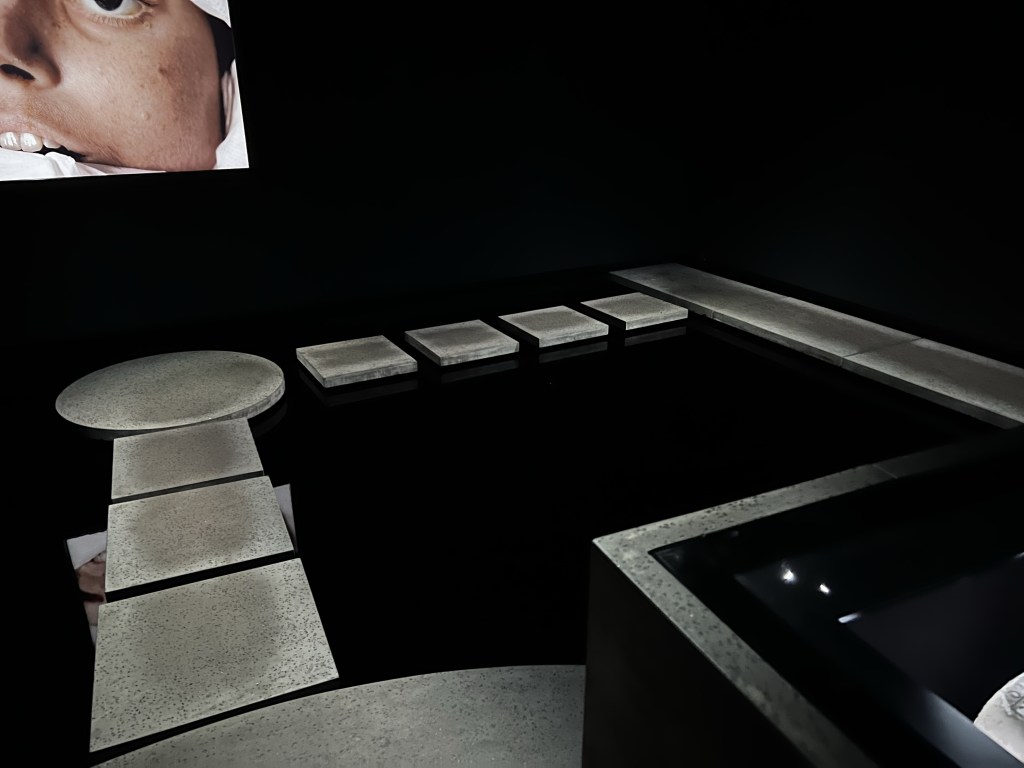
The second last level of the Museum is Basement 1. The first thing we did was join the queue to see Museum and Coffin of Pausiris. While we were waiting for our turn, we walked through the other exhibitions on this level.
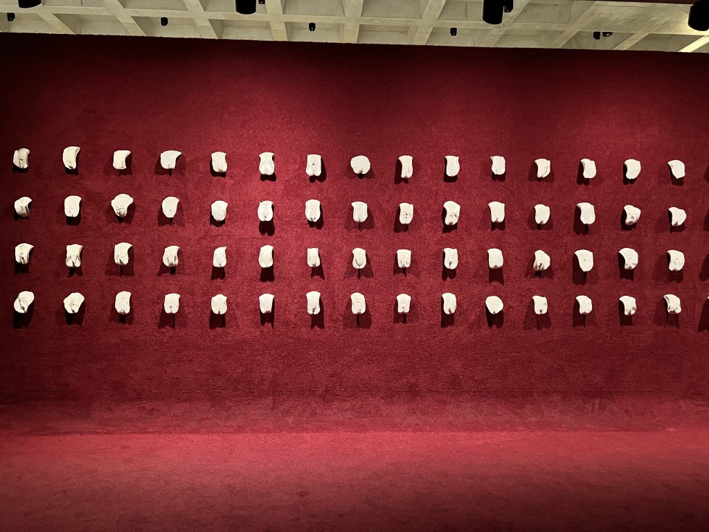
An artwork on everyone’s ‘must-see at MONA’ list is titled Cunts….and other conversations by Greg Taylor. Displayed on the wall are around seventy seven ceramic sculpture vulvas that were created from sketches of real models. The work aims to celebrate the diversity of women through de-stigmatising this organ. Each sculpture is fixed to a red wall. In front of the wall is a pink plush carpet and lounge chairs. It forms part of the Ladies Lounge that can be accessed by male visitors. The other part of the Lounge is strictly women only (I did like this section!).
It was then time to go back and see the mummy. A maximum of two people per session are allowed as the display contains a lot of water. I spent most of my time inside worried I would fall into the deep water. You must navigate across step stones in order to see the mummy on a central platform. Here there is a stone sarcophagus containing the mummy. I felt very uneasy seeing these human remains so I didn’t spend long looking at the other works on the wall.
Ground Level
Before boarding the ferry back to Hobart, we visited the gift shop on the ground floor. There are a few interesting things to buy including some pretty epic tote bags. I do love a tote bag so purchased a couple as souvenirs.
And that was the end of our day!

Overall Thoughts and Logistical Information
Overall, there were some amazing works on display and we did enjoy our experience. While there are a few frustrating elements, it is definitely worth visiting for the works and architecture. When you add up the cost, a trip to MONA is quite an expensive endeavour. If you are a Tasmanian resident, you can visit for free (excluding ferry). It did make me question how truly accessible this museum is and consider who is excluded because of the cost.
For all your logistical information, including booking links and price information, follow the link: https://mona.net.au/visit.