
Welcome to my first blog post for 2023! There are some exciting things on the horizon for this year and, hopefully, excellent exhibitions and museums along the way. This evening I visited the Queensland Museum for their up-late Disney exhibition event. Disney: The Magic of Animation, showcases hundreds of original sketches from a variety of Disney films. From Steamboat Willie to Encanto and almost everything in between. I’ll note here that the exhibition is held in partnership with the Australian Centre for Moving Image (ACMI) in Melbourne. While the website says suitable for all ages, I did find it leaning more towards an adult-interested audience. That’s just my opinion though and I’m sure kids visiting the exhibition have a great time with the children’s labels. As with so many of my posts, I’m going to begin with a brief overview of the exhibition and then focus on a few personal highlights – enjoy!
Overview
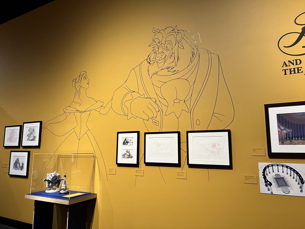
When you first enter the exhibition there is an introductory panel and a large screen showing a selection of Disney film clips. The exhibition’s stated aim is to showcase the talent and innovation of artists and filmmakers through displaying sketches and animations. Overall, I do think the exhibition achieves this goal. As you move throughout the exhibition you are basically following the chronological timeline of Disney. Each area is designed to complement what is on display. For example, the Steamboat Willie room is mostly black and white. Beauty and the Beast has yellow walls, Sleeping Beauty purple, and some walls have large graphics from the animated films covering the surface.

Where this exhibition really stands out is through its design. There are subtle (and not so subtle) details in each different area that draw you into the world of a particular film. One area I enjoyed was The Little Mermaid. Lighting effects make it look like this part of the exhibition is underwater. I wouldn’t say that this distracted from the content and sketches. If anything, the exhibition design enhances what is on display. If all the sketches were on a blank wall it would have been a completely different exhibition. Apart from the design, there are two other elements worth noting.
The first is the use of labels. Each film has a thematic panel with a short and sharp overview. The labels for the sketches blend into the wall which I thought worked well in the space. Considering the aim and what is on display, it would have looked out of place to have stark white labels next to each sketch. There isn’t a lot of information on the labels meaning reading fatigue was pretty limited and the sketches do most of the talking.
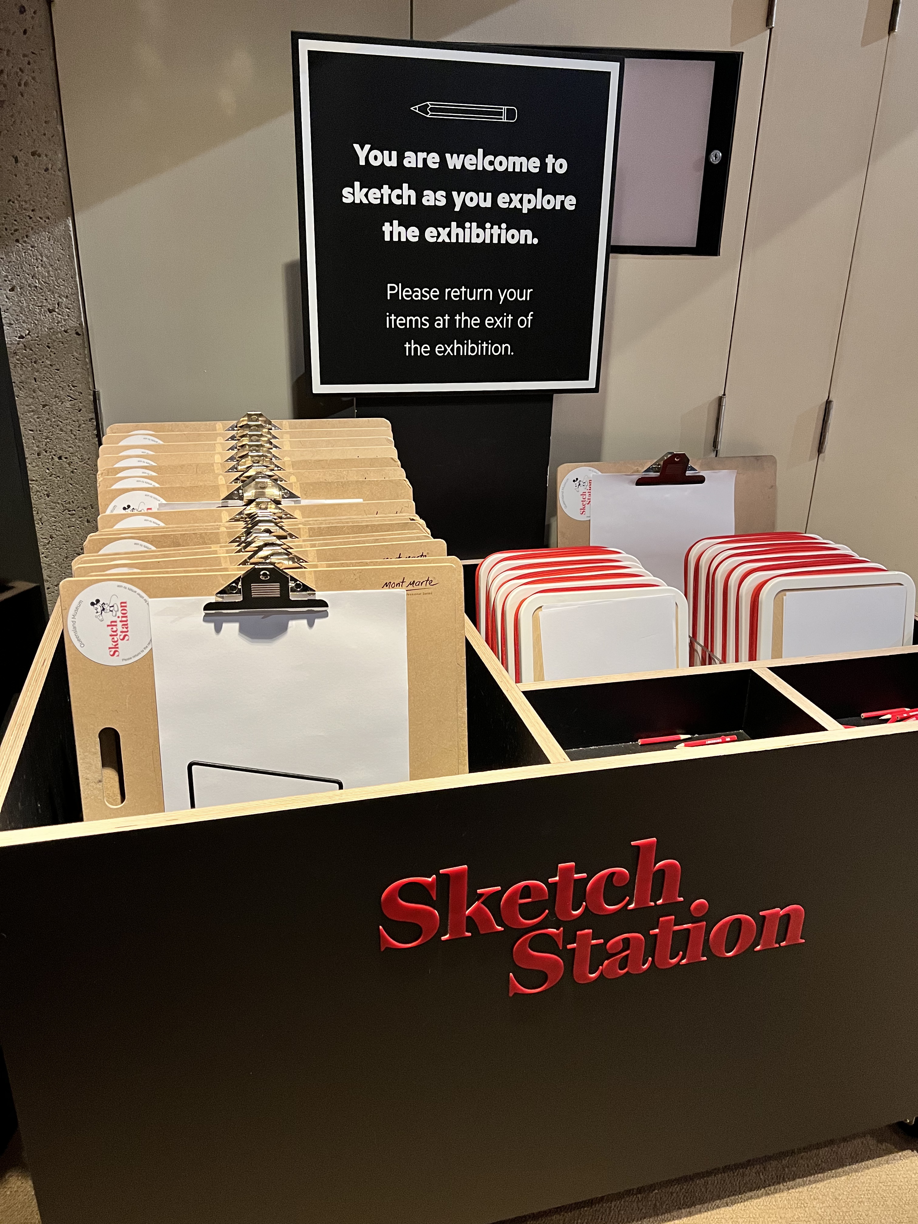
The final element I want to mention is the sketch station. Before entering the exhibition, there is a box filled with clipboards, paper, and pencils. The sign encourages you to take a clipboard and sketch what you see in the exhibition. I thought this was a nice touch that relates directly to what is on display, while also encouraging visitor engagement.
Selection of Favourite Elements
Here is a list of my favourite elements (sketches, design choices, etc) from the exhibition in no particular order.
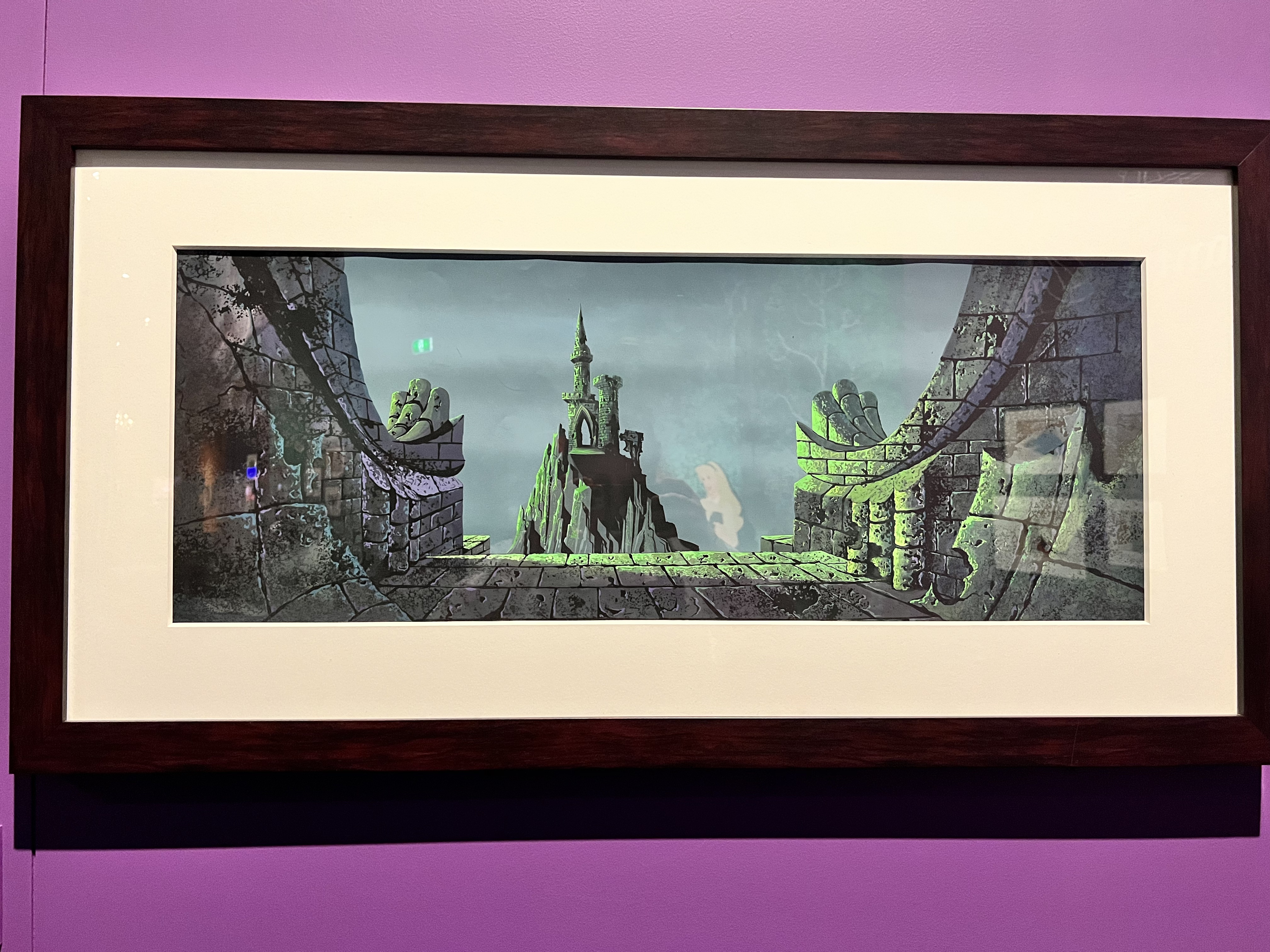
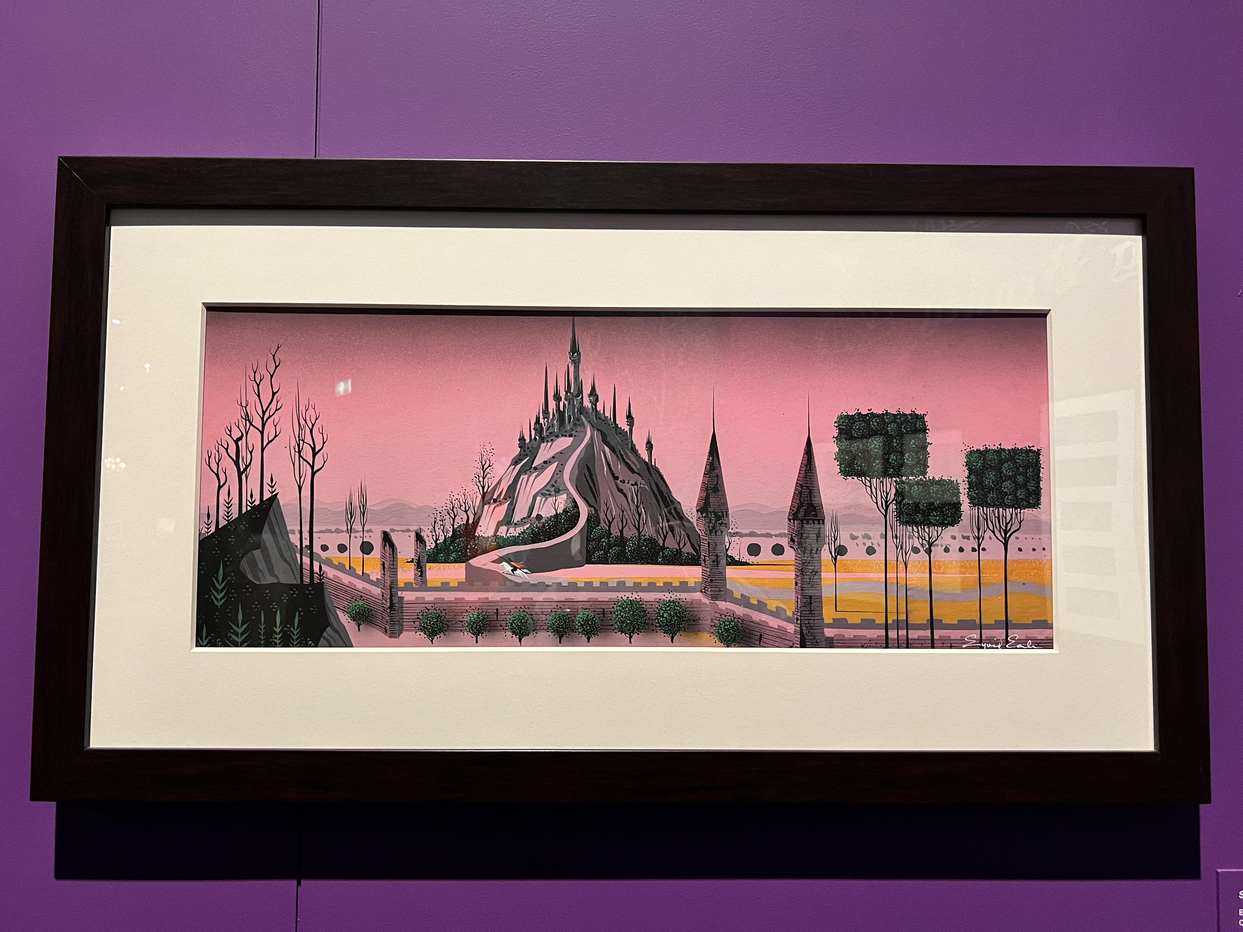
1. The Three Sleeping Beauty Castles
The colours in these three background paintings for the 1959 Sleeping Beauty film are stunning. Two were designed by Eyvind Earle and the third by an unnamed Disney Studio artist.

2. Animation Desk on Black and White Tiled Floor
In the Steamboat Willie room there is an old animator’s desk sitting on a black and white tiled floor. I mentioned before that this room has a black and white theme so I respect the commitment to including a black and white element. As the label points out, animation has moved away from paper on desks to computers but different elements still need to combine in order to get a picture moving.

3. Incorporating the Films
There are a few areas that incorporate parts of a film into the exhibition. The talking mirror from Snow White makes an appearance on a small screen that looks like a mirror. Without a doubt, my favourite was the Beauty and the Beast ballroom scene playing on a TV with two large chandeliers (one either side) hanging from the ceiling.


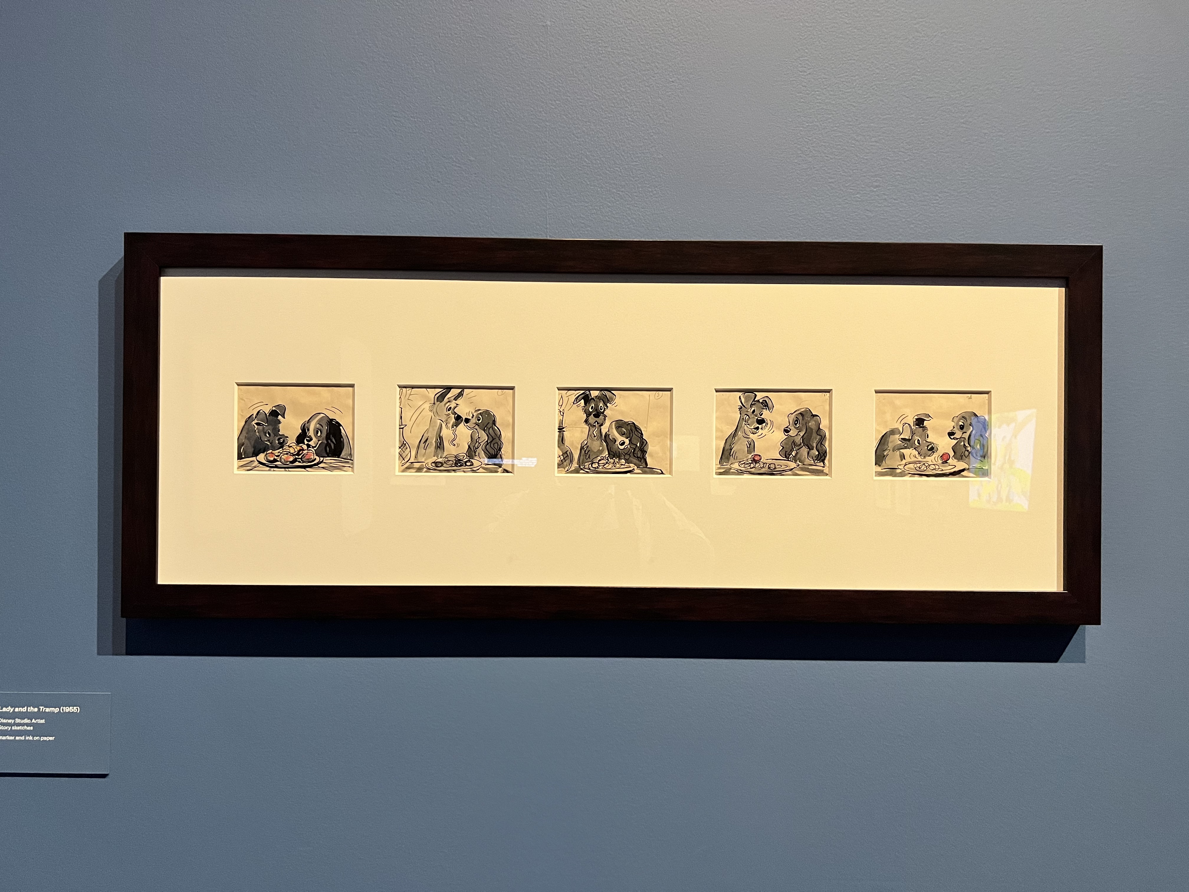
4. Lady and the Tramp Sketches
Has there been a more iconic dog movie scene than the spaghetti eating scene from Lady and the Tramp? I think not. I really enjoyed seeing the original sketches of this scene.
5. Baboon Beast
Looking at some of the sketches from Beauty and the Beast, I found myself saying ‘is that a baboon?’ Yes, yes it is. An original concept artwork showing the Beast as a baboon. I am glad they didn’t stick with the baboon concept because that is truly terrifying (no offense to baboons).

6. Basic Sketches on the Wall
A few areas have these basic outline sketches on the wall to break up a large section of colour. They are effective!
7. Interactives
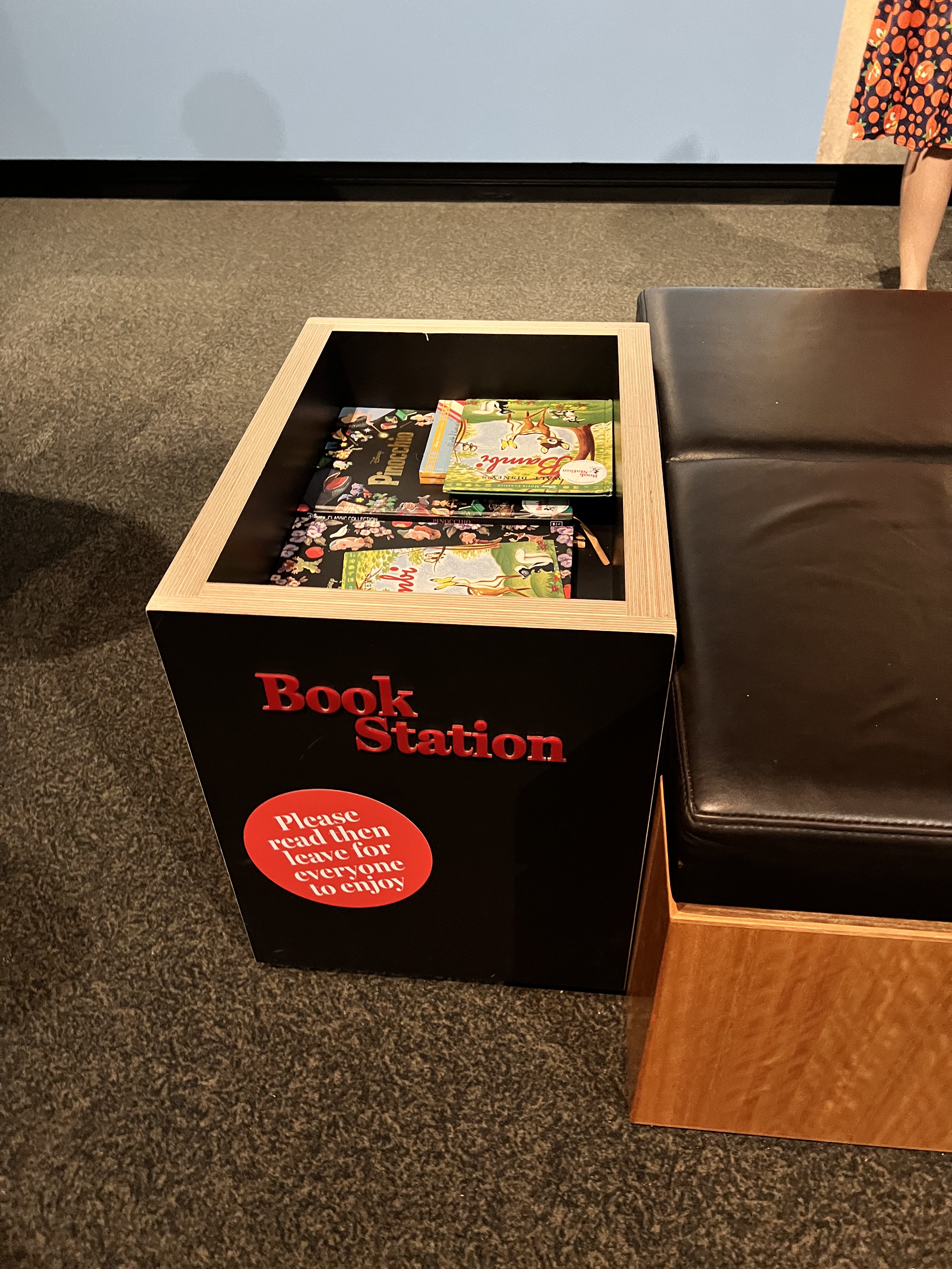
Last but not least, we have interactives. I was really glad to see that most of the interactives revolved around physical sketching, creating, or reading. For the latter, there are a few book stations throughout the exhibition where you can sit and read a Disney story (or two). There are also what I would term ‘Instagrammable’ interactives, such as large cardboard cut-outs. In my opinion, they didn’t give me gimmicky vibes and just blended into the rest of the exhibition.
Logistical Information
Unfortunately, this exhibition closes on Sunday, January 22. There is still time if you are in Brisbane! For some further information, including ticket prices and opening hours, click this link: https://www.museum.qld.gov.au/queensland-museum/whats-on/disney-the-magic-of-animation. It is a fully accessible exhibition.
There is also a gift shop at the end of the exhibition that has an array of Disney products for sale. I purchased a Snow White inspired bracelet complete with an apple and a skull.

Leave a comment