
I am now en route to Boston for the International Symposium on the History of Anaesthesia. While in the States I will be visiting as many museums as possible in Boston, Philadelphia and Washington DC! In other words, prepare yourself for numerous blog posts and, of course, lots of photographs.
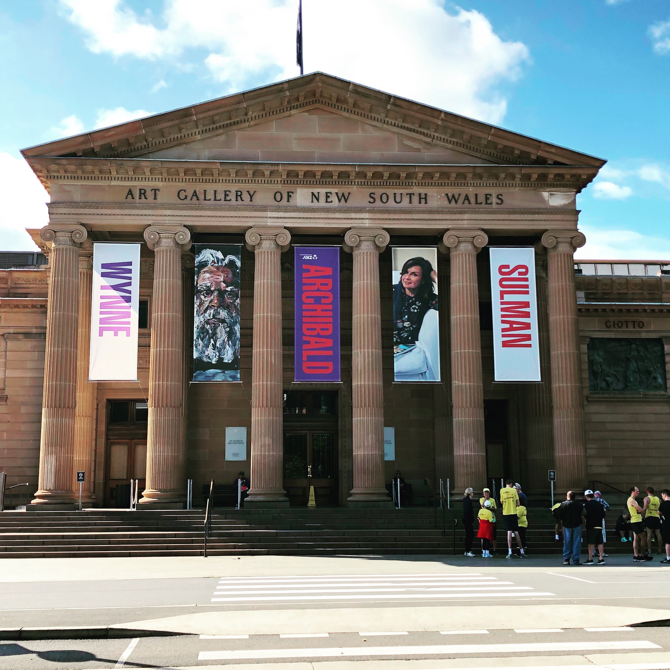
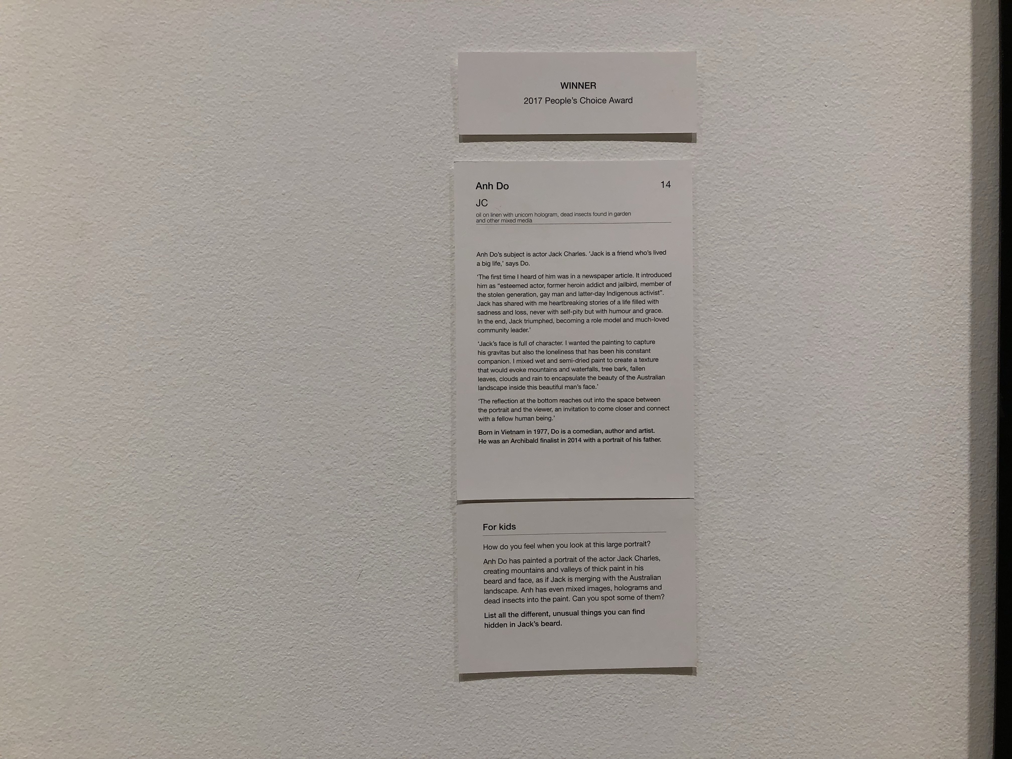
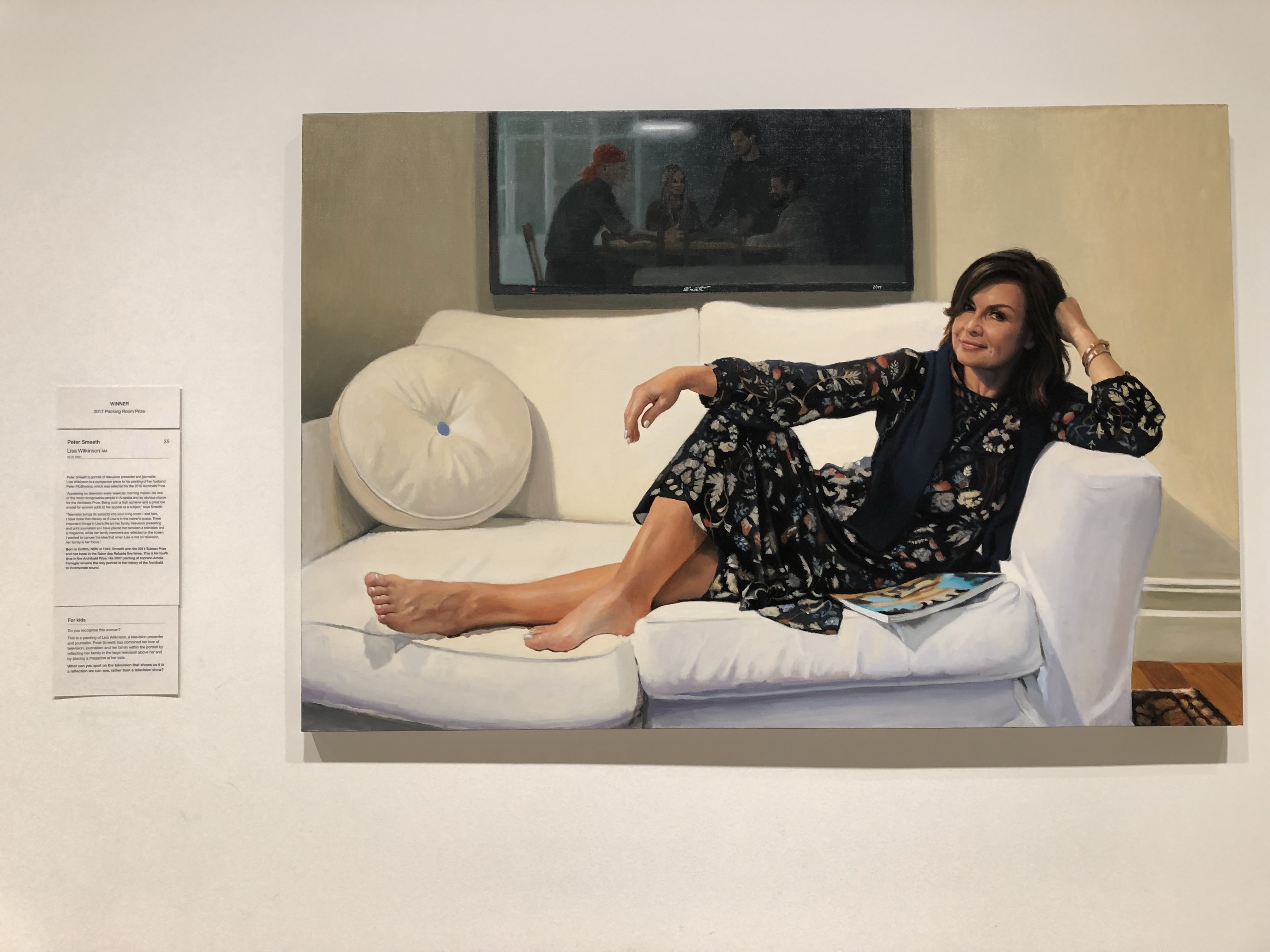
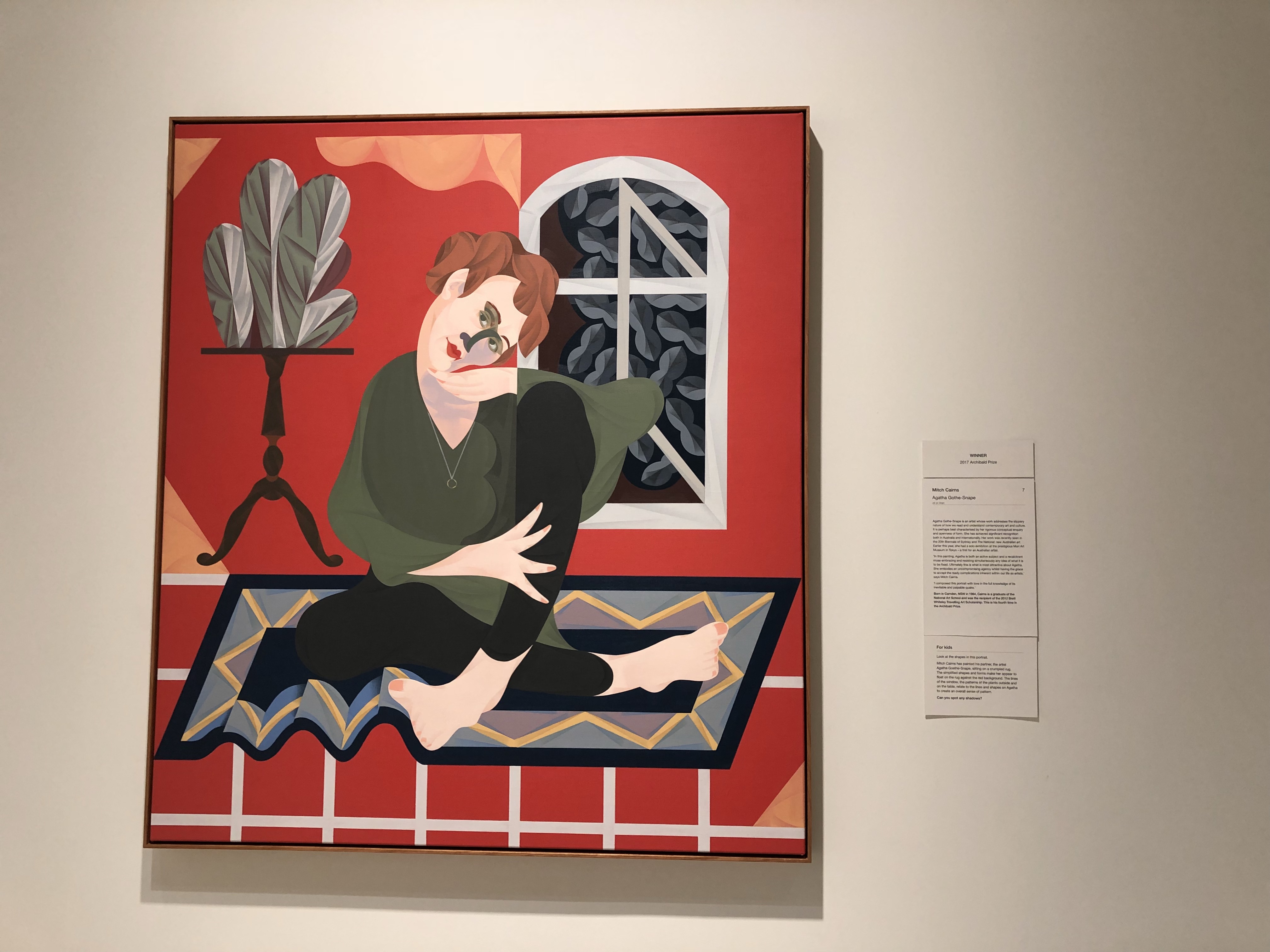
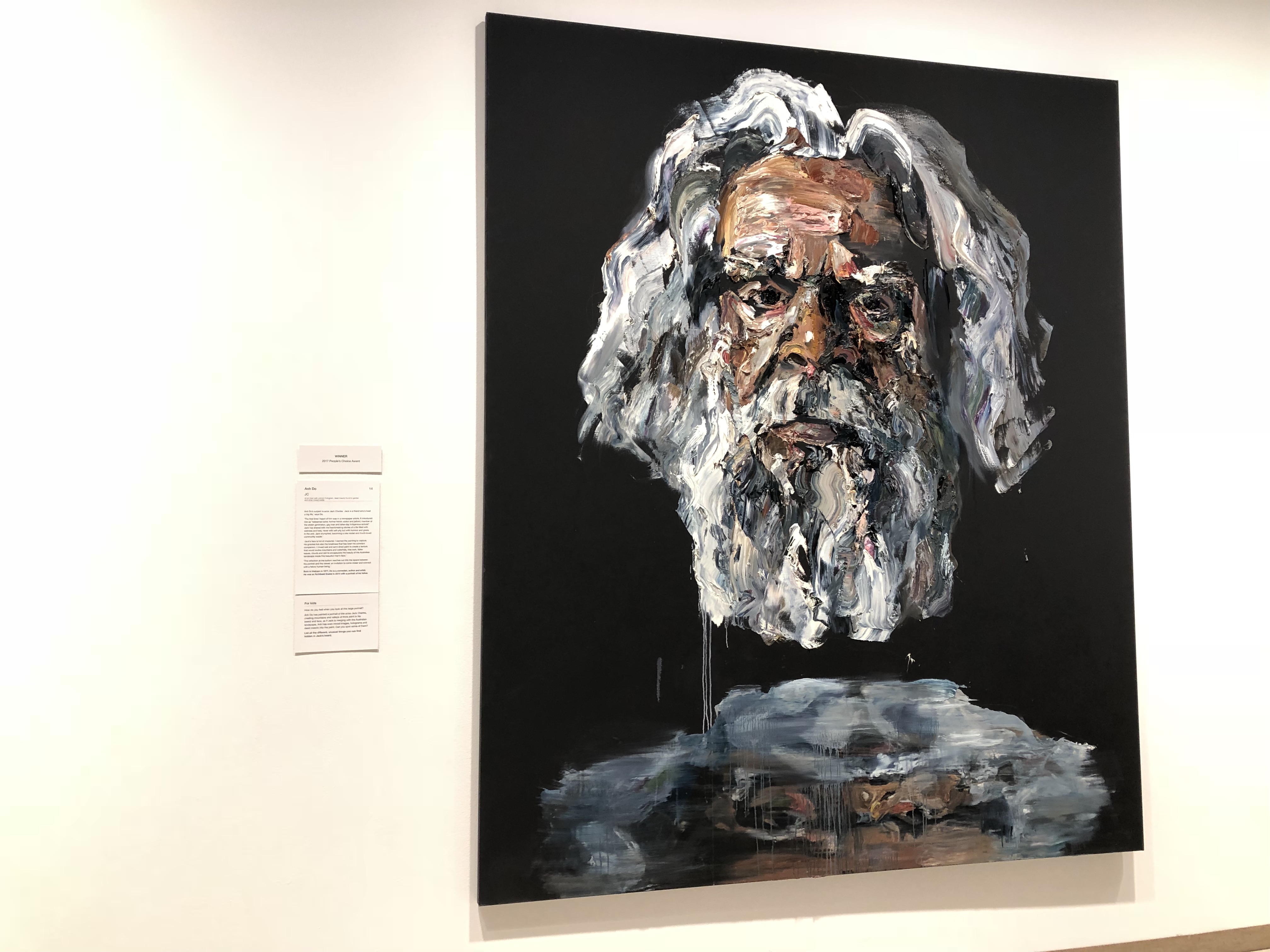
Before heading off, I spent the weekend in Sydney. Luckily, I was here for the final day of the 2017 Archibald Prize at the Art Gallery of New South Wales. For those not aware, the Archibald Prize is an annual art event held in Sydney. It is named after Jules Archibald, the founding editor of The Bulletin magazine. He had a passion for art and on his death in 1919, left money to fund a major portrait painting competition. The prize is huge – $100 000! There are also prizes for People’s Choice, voted by visitors, and the Packing Room Prize, which is awarded by staff of the Gallery who install the exhibition.
This is the first time I have seen the Archibald Prize and I had very high expectations. This is due to a variety of reasons including the hype surrounding the Prize and the prize money involved. I’m going to divide this post into two sections – where I believe it met these expectations and where it fell a little short. I should say here that I did not download the mobile guide.
Positives
I was very impressed with the layout of the exhibition. There was a slight bottle neck issue at the beginning, with crowds being funnelled into a small room. Once you made it through here, however, it was spacious and the works were not crowded together. This allowed for the display to not be overwhelming and it encouraged me to look more closely at each individual work.
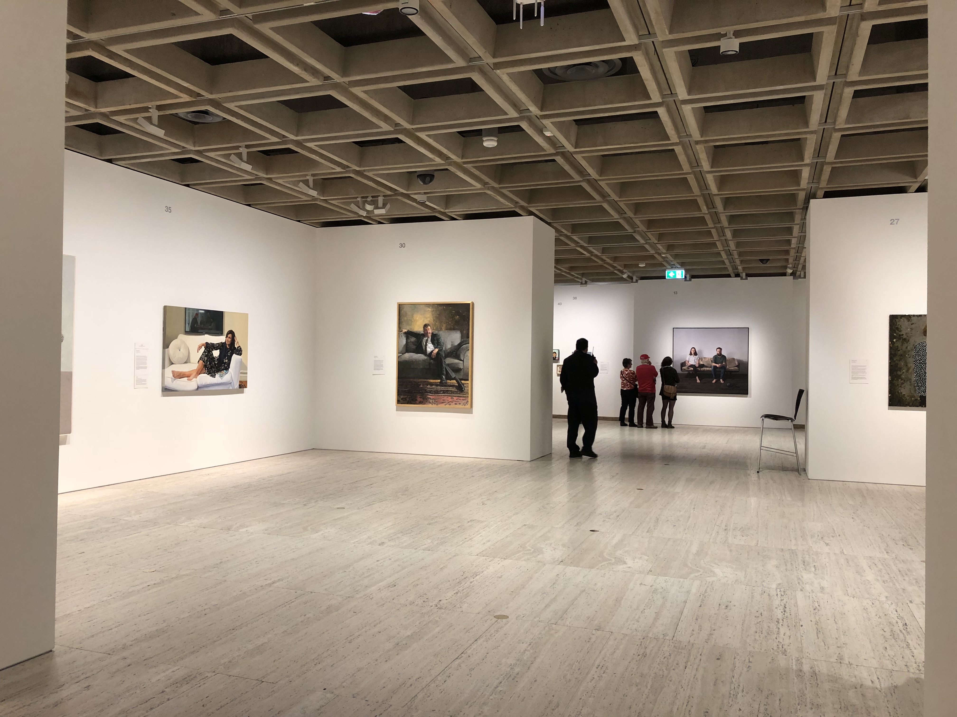
I also found that the balance was consistent throughout the exhibition. Incredibly colourful pieces were not all in the same room allowing for some breathing space. What struck me was the size of some of the artworks. I must admit I knew very little about entry requirements, but, some of the paintings were massive. This must have been difficult to curate! Yet, like I said, it was just so beautifully balanced and aesthetically incredible. Each time I walked into a new space, this feeling was just continuously confirmed.
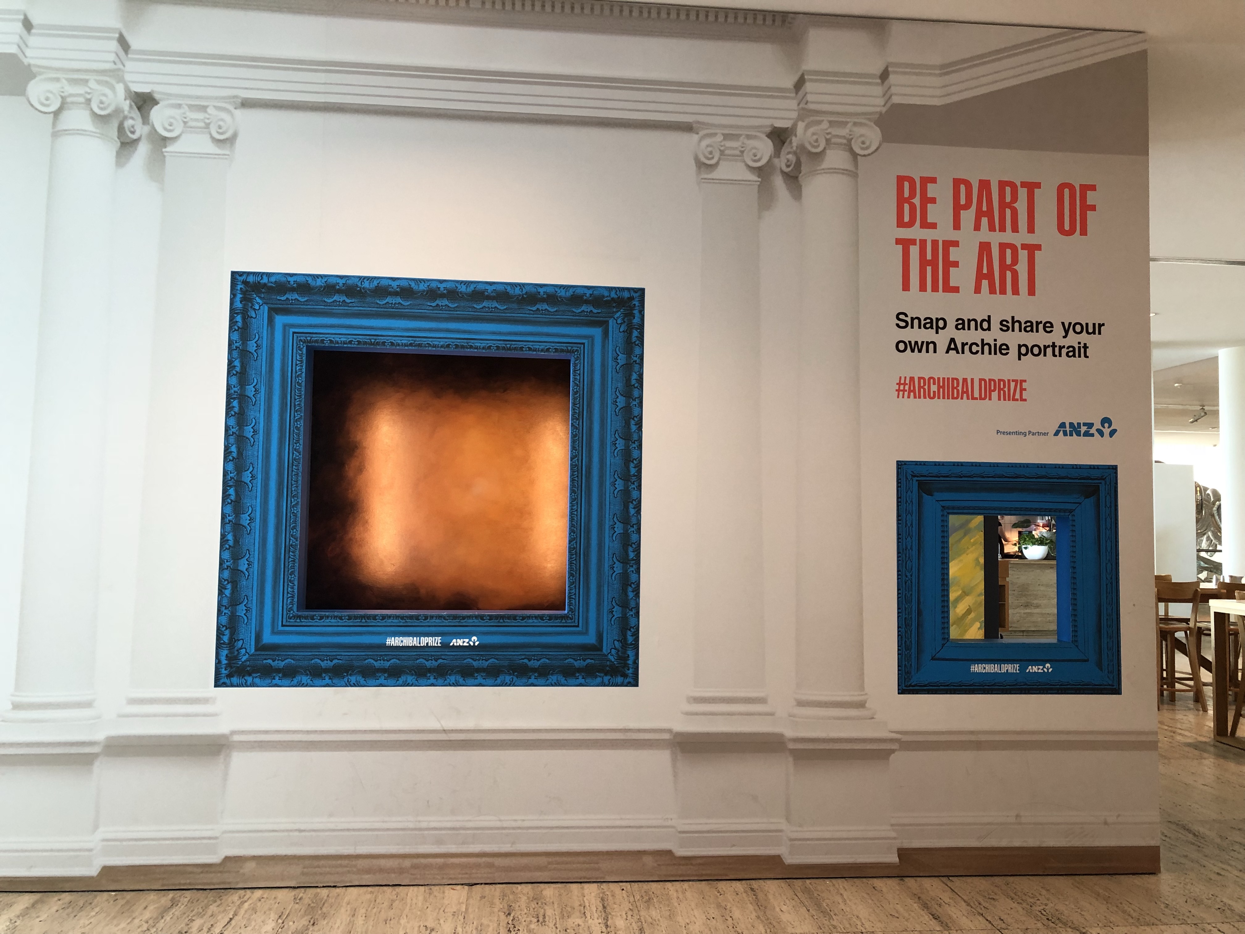
Another positive for me was the inclusion of children in the exhibition. There were labels for children (also a negative but I’ll get to that later) and, my personal favourite, a space dedicated to fun interaction. There were three large frames mounted on a wall and children/adults could stand behind the wall, move into a frame and have their photo taken. The idea being that your portrait was now part of the Archibald.
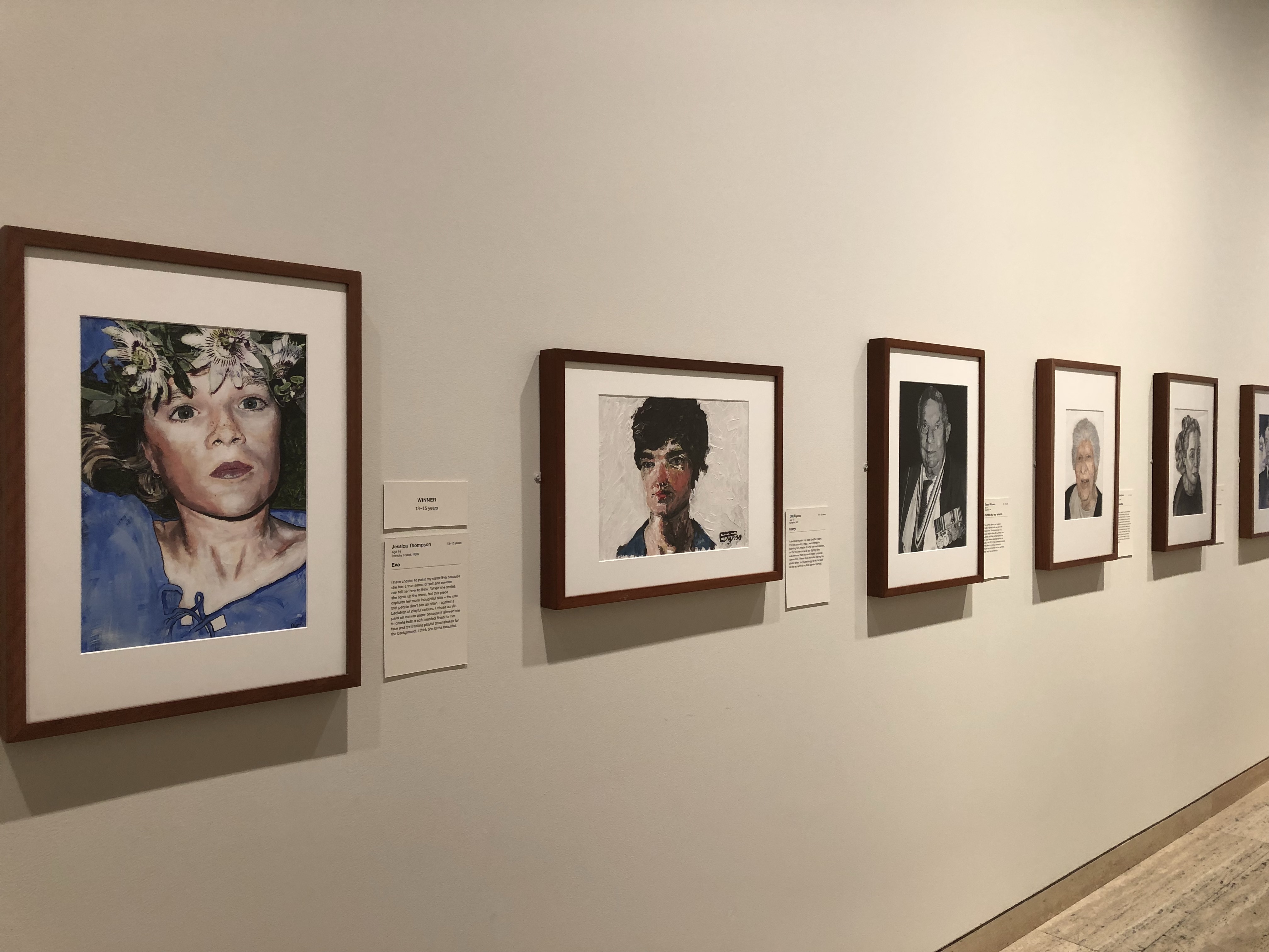
Running the length of a wall that separated these frames from the entrance to the Archibald, were the Young Archie finalist entries. Children can submit portraits they have created and have these displayed as part of the major exhibition. They were so lovely to see and I was absolutely in awe of the children’s creativity!
Overall, I had a lovely time looking through the entries of both adults and children admiring how they had captured various personalities.
Negatives
There was one major disappointment with the display – the labels. I know it was the final day, however, most of the labels I saw were grubby and/or peeling off the wall. It was not a good look. The information they contained was very interesting and it was a shame to see them peeling away.
On the topic of labels I have two more comments. The children’s labels were placed so high on the wall – just below eye level for adults. I can’t imagine young kids being able to see that high, let alone answer the questions. Maybe this was a way of encouraging parents to interact with their children by reading the labels to them? Who knows, but, it stood out to me. I did see there was a children’s trail available which may have been amazing.
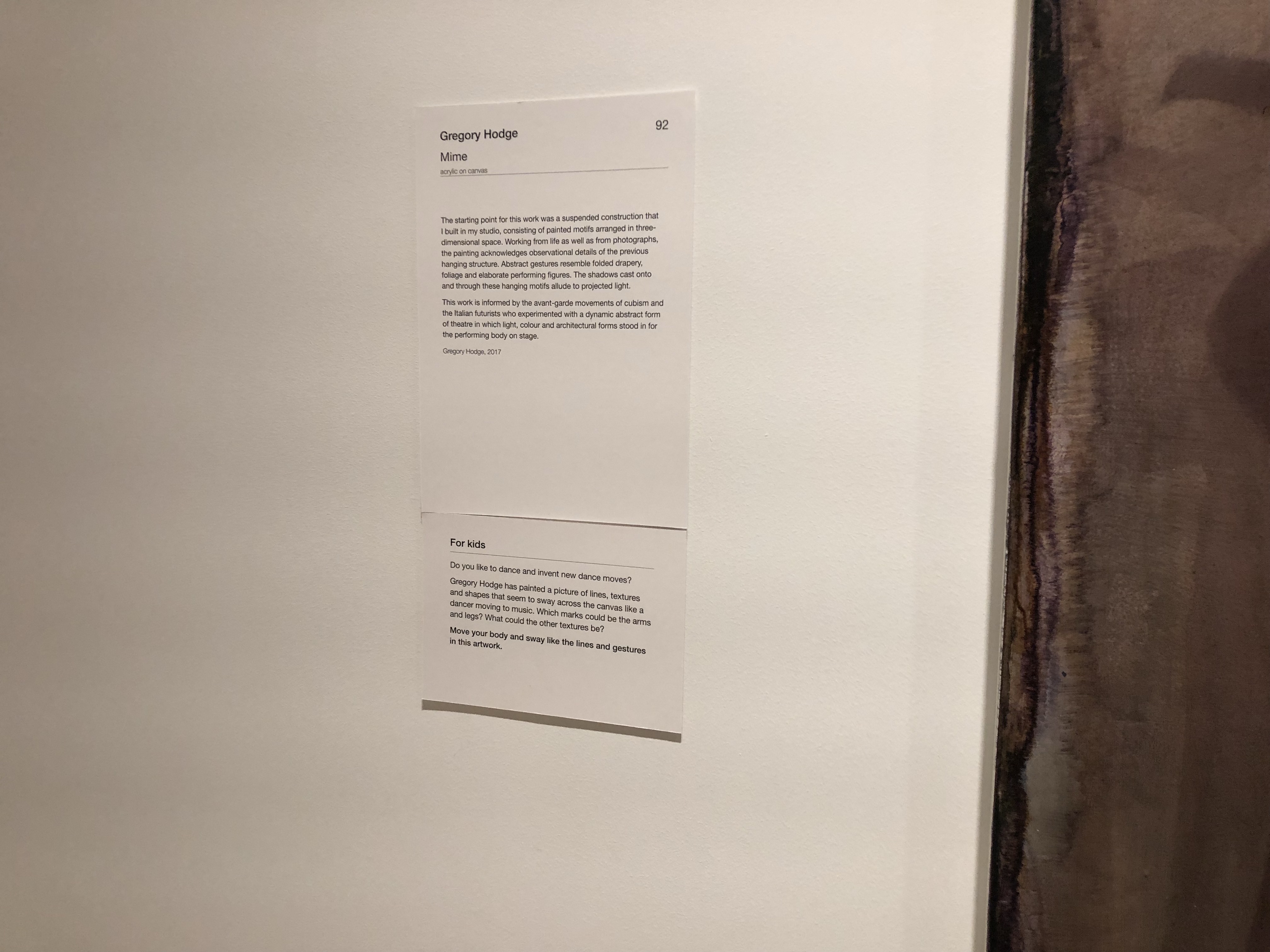
Finally, the labels indicating the winners looked identical to the artwork labels. They were really hard to find as they blended in with everything else. No wonder I saw so many people ask the guards and staff where the winners were located inside the space. It would have been nice to see some colour or just something different to help them stand out.
Of course, like always, this is just my personal opinion and I’d love to hear from you in the comments if you have any other or opposing thoughts!
I am very glad I got to experience the 2017 Archibald Prize. I think the fact it was busy did not detract from the exhibition, but enhanced it. Hearing what people had to say regarding the winners was actually quite fun. Many agreed with the choices, however, some were disappointed and it was interesting to hear why. It was an exhibition designed to make you feel quite comfortable and, therefore, I was quite happy to wonder around feeling no pressure from the crowds and enjoying the artworks.
The Wynne and Sulman Prizes were also on display, however, I wanted to just focus on the Archibald.
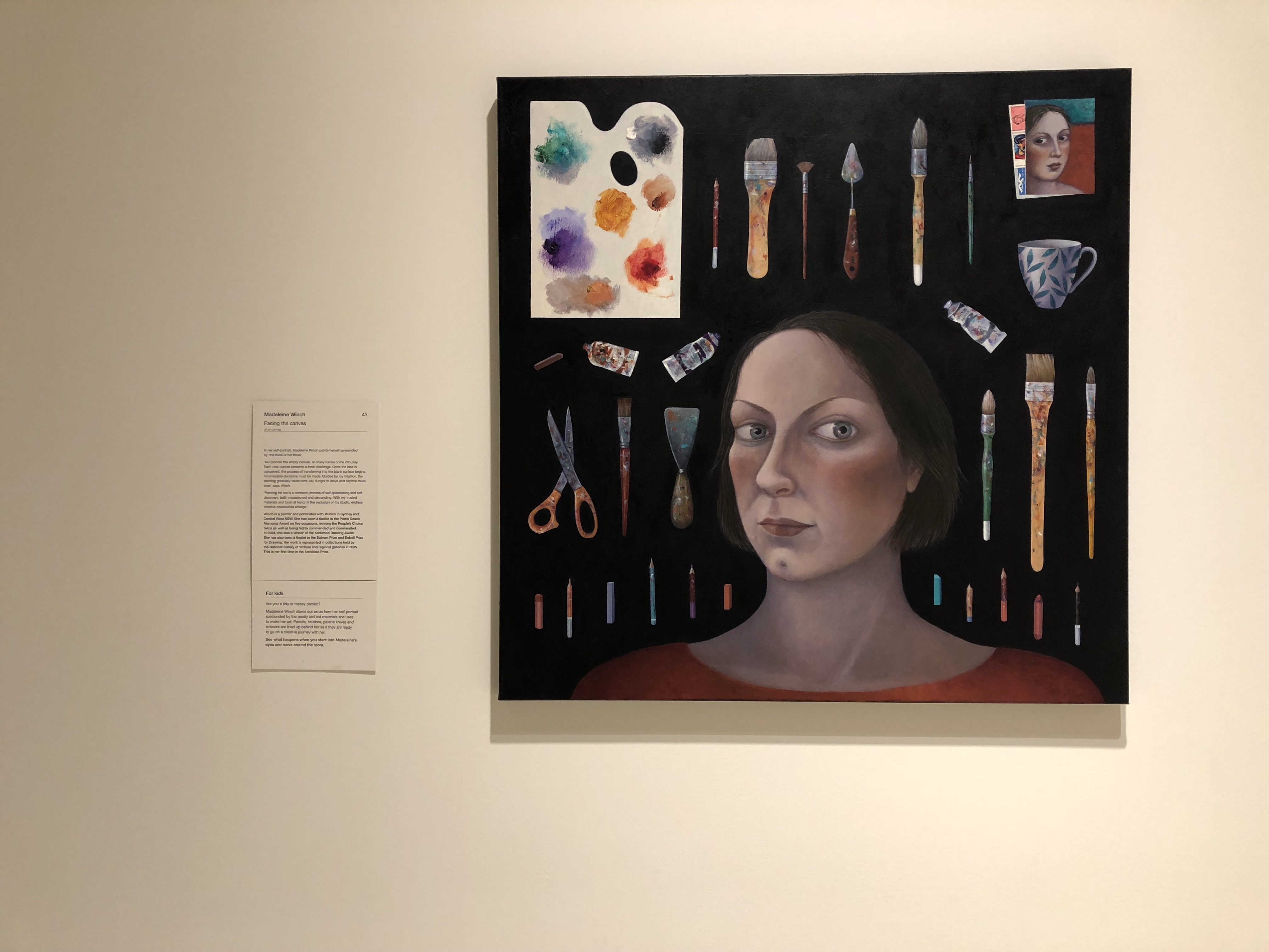
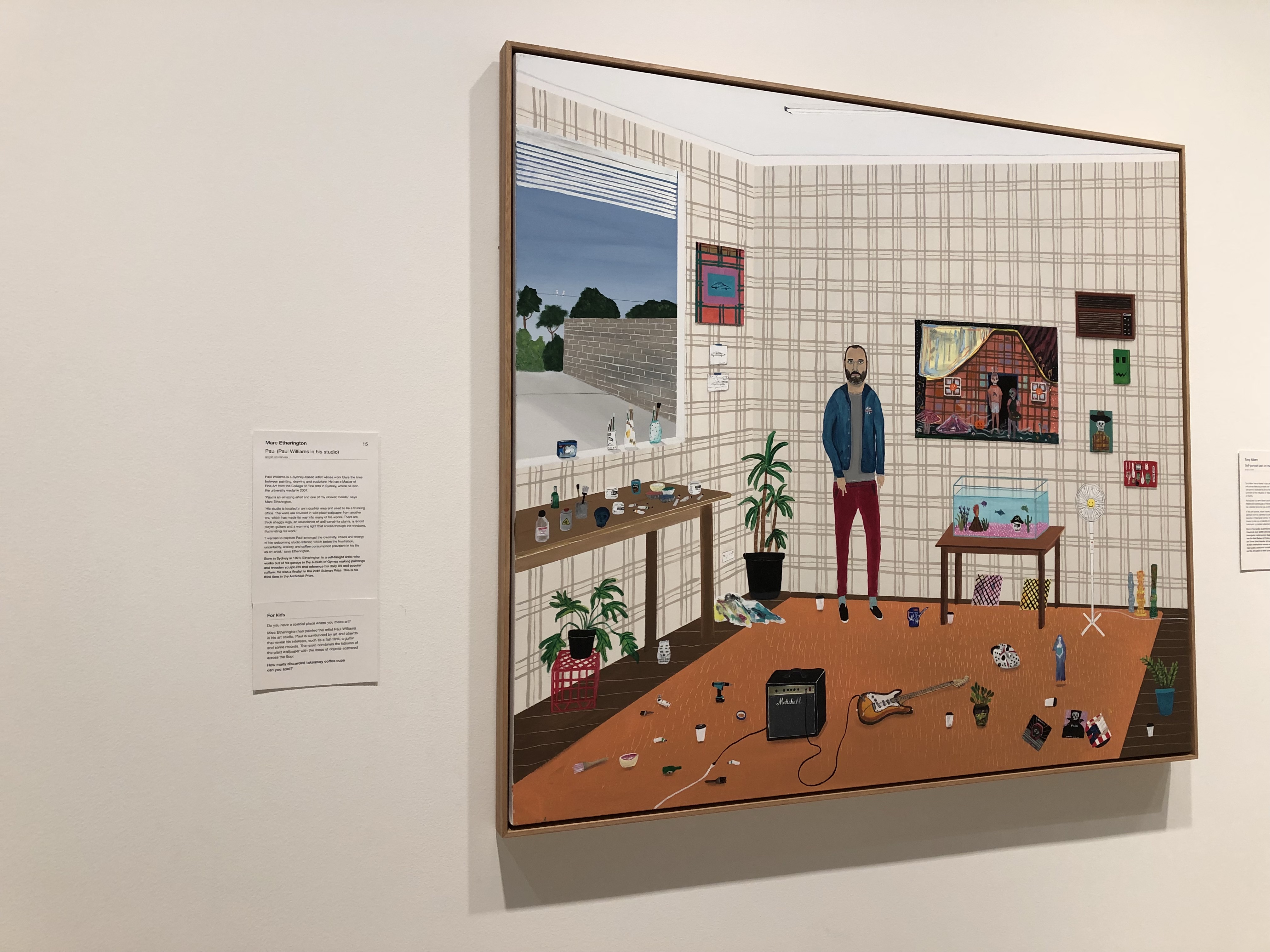
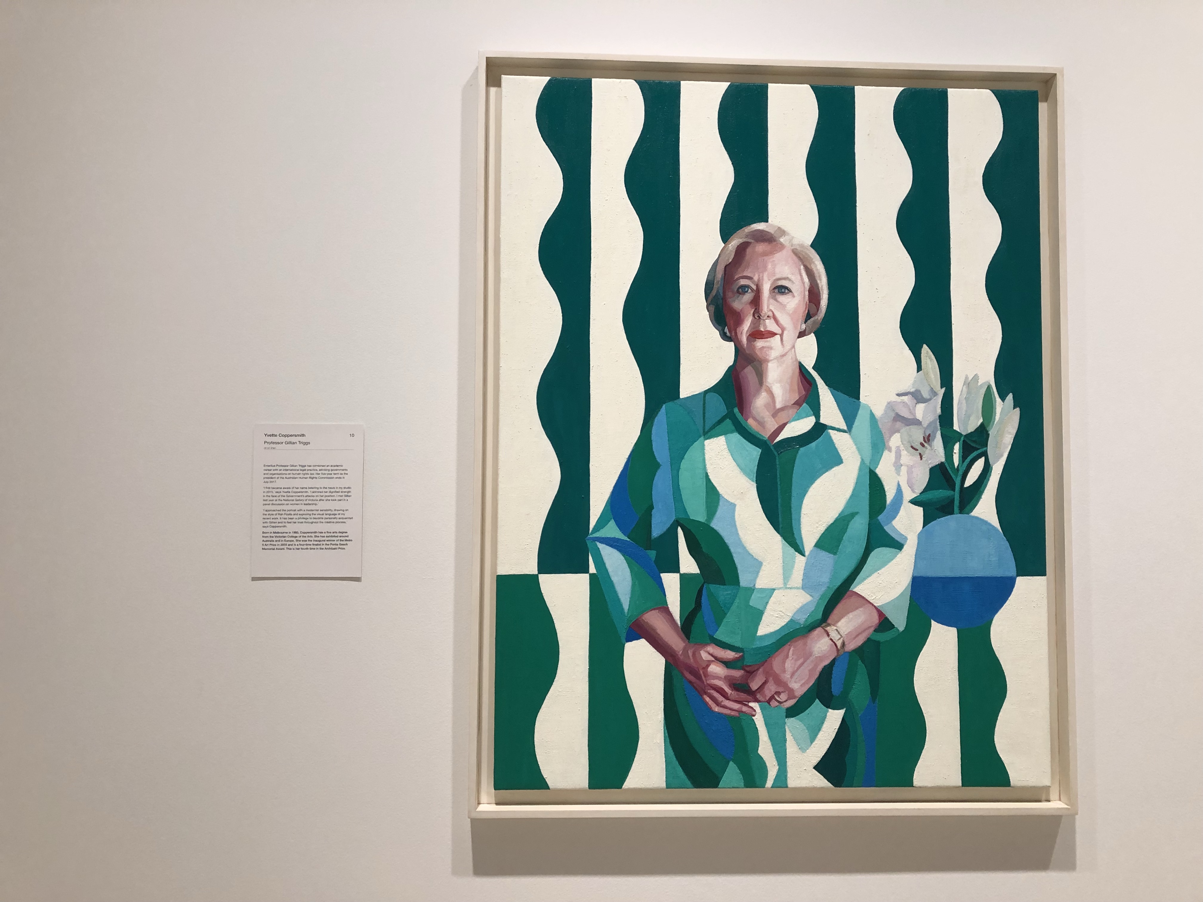
Below are some more images of the artwork on display. Enjoy!

Leave a comment