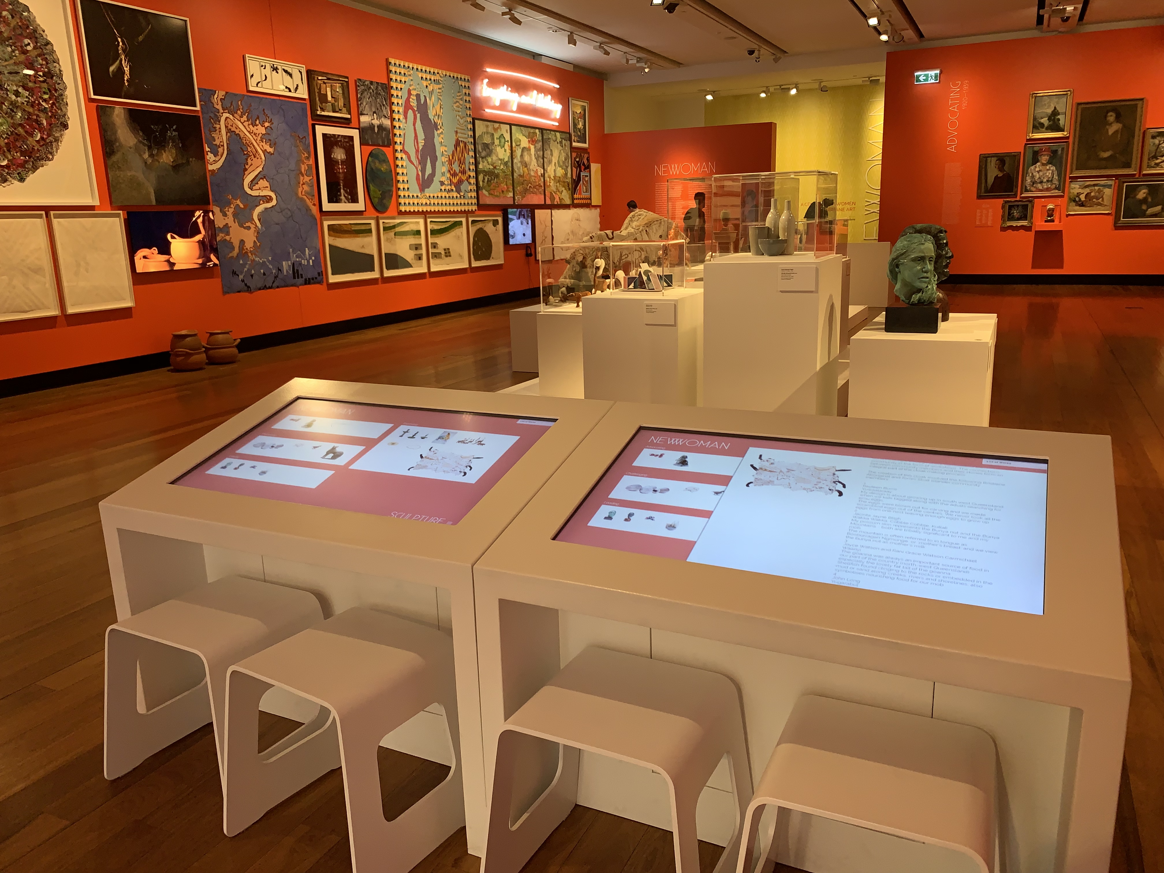
In mid-September this year, the Museum of Brisbane unveiled their new exhibition, New Woman. It features just over 80 artists, with artworks displayed chronologically starting from the 1920s. The exhibition is a really significant look at the women who have been an integral part of the development and continuing strength of Brisbane’s arts and culture scene. It is certainly a bright and colourful exhibition, accentuated by the almost neon orange walls. When I first entered the space I certainly had to adjust my eyes. There are a few aspects of this exhibition I want to focus on for this post.
Chronological Layout
Due to the layout of the room (one large room with no room dividers) visitors can explore the exhibition freely and not follow any prescribed path. However, for those wanting a bit more structure to their visit, you can move around the room in a clockwise direction (from the introductory panel) and view the works chronologically. Each time period has an overarching theme: advocating (1920-1939), teaching (1940-1959), challenging (1960-1979), leading (1980-1999) and expanding (2000-2019). I felt I got a lot more out of the exhibition by following the themes and slowly building my knowledge of Brisbane women artists over time.

Take, for example, the theme of challenging. The thematic panel explores how the 1960s and 1970s were a time of experimentation with the introduction of Modernism. However, it was also a time when female artists were challenging their role in society and how they were represented.
The artworks for each theme are displayed in a salon hang, i.e. a lot of works displayed together in a rustic but ‘work together’ kind of way. Depending on the display, I can either hate or love this technique. I am putting myself in the middle for this one. Mostly because I am really short and couldn’t appreciate the works that were super high, even when I was standing back. Also, the works higher up were often obscured by the lighting making them more difficult to see. However, it did have impact displaying all these works together quite closely.
Finally, on the theme of layout, the artworks don’t have individual labels. To discover more about each piece you have three options:
- Look on the wall near each theme for a layout card with numbers that correspond to an artwork
- Get a room guide
- Look up the works on large digital screens (there are four of them dotted around. These actually provide more information on the artist as well as the work on display so I highly recommend spending some time reading about your favourite works here.)

This is a great way to balance a salon hang. Rather than try to awkwardly include a label next to each work, the exhibition gives multiple options to find the relevant information without compromising the hang.
Text
I just want to take a moment here to talk about the text. Keep in mind the walls are close to neon orange. The text is in white writing and quite small. Virtually impossible to read and an accessibility issue. For those who have poor eyesight or find reading quite difficult, you may struggle in this exhibition. Perhaps the digital screens will be your best bet.
Favourite Works
As with so many posts, I want to take a moment to share some of my favourite pieces and why.
1. Monica Rohan, Easton Pearson, 1990
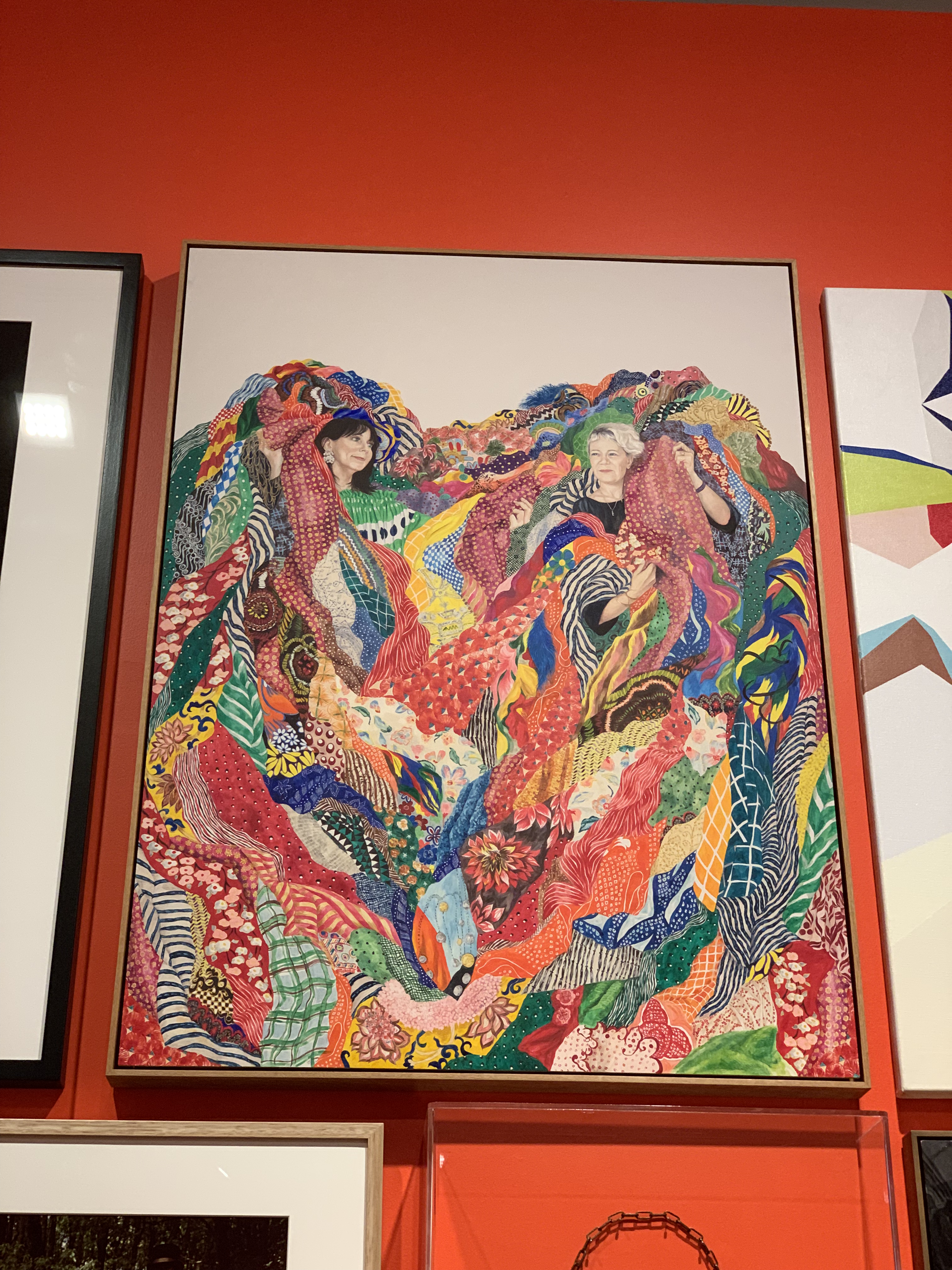
I absolutely adore the work of Monica Rohan. It is so unbelievably colourful and fun. Depicted here are fashion designers Pamela Easton and Lydia Pearson. All the different patterns and colours are actually inspired by their fashion label and designs. In 2016, this work was a finalist in the Archibald Prize.
2. Jeanettie Sheldon, Gum leaves decorated with landscape and seascape scenes, 1930
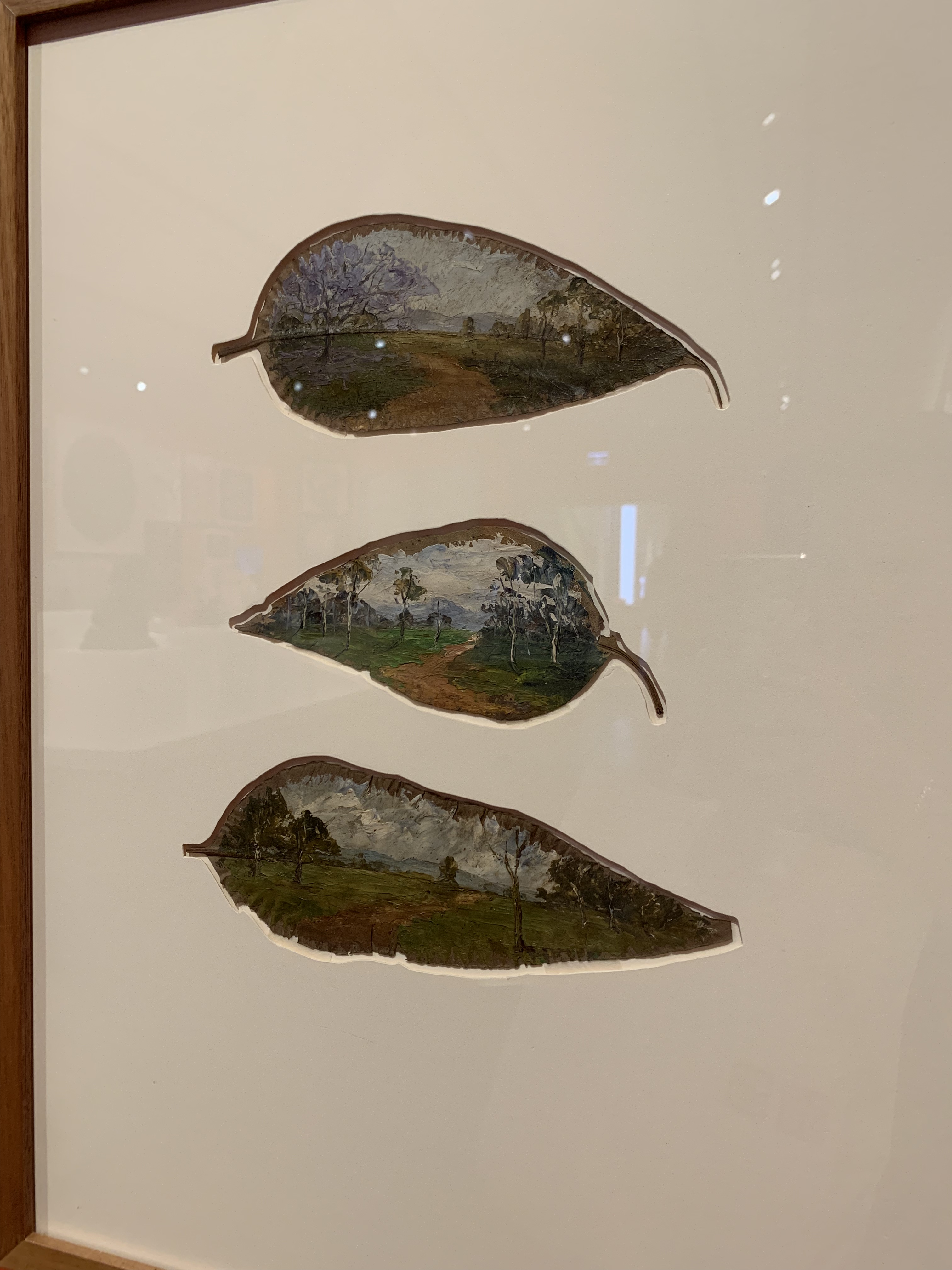
These are actual gum leaves painted with small, intricate, and beautiful scenes. It is amazing to think that they have lasted all this time!
3. Anne Wallace, Assignation, 1997
There is something very Art Deco-y about this work which immediately caught my eye. It plays with the notion of desire and a nostalgic past.

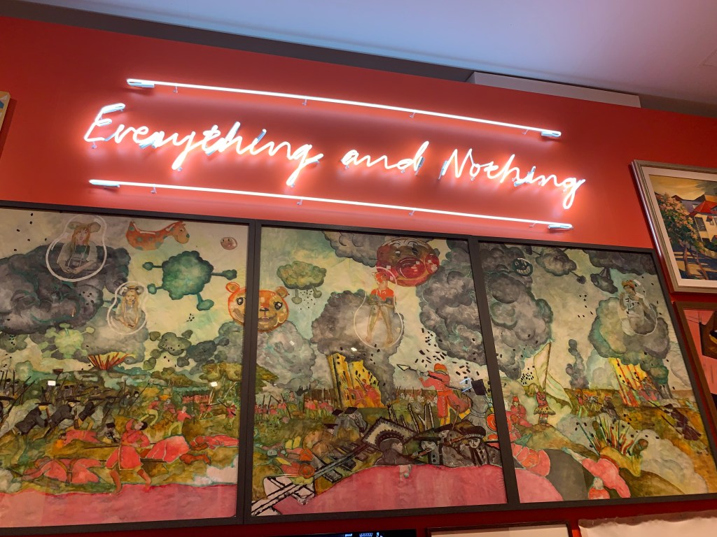
4. Courtney Coombs, Everything and Nothing, 2019
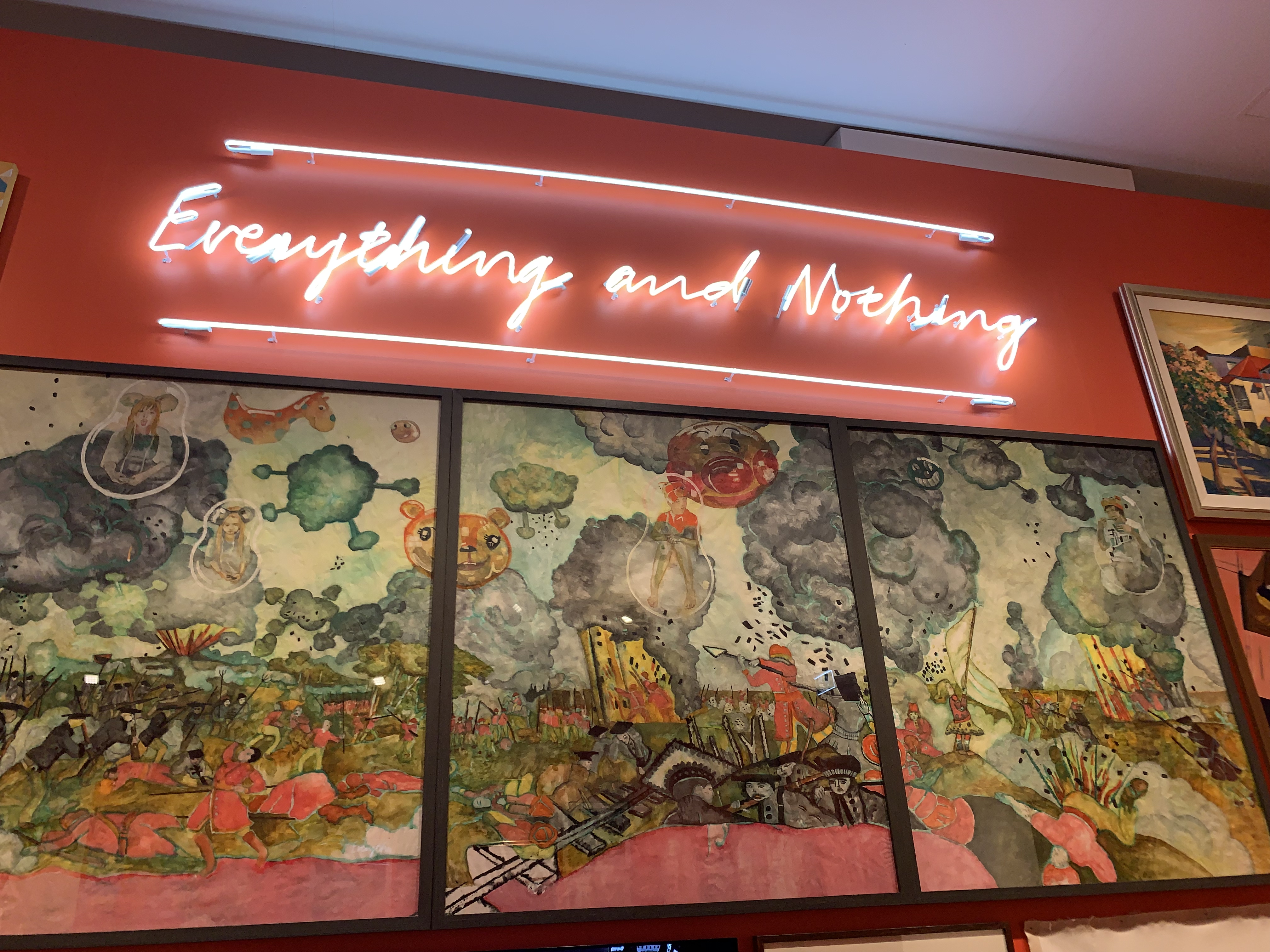
I love a good neon sign.
5. Caroline Barker, Untitled (life class model), 1925

Caroline Barker was an amazing still life and portraits artist. During her life, Barker taught art at many schools around Brisbane and inspired many talented artists including Margaret Olley, John Rigby and Hugh Sawrey (to name a few). Although this work is quite dark, it really stood out to me as one portraying a lot of emotion and depth.
Practical Information
New Woman is open at the Museum of Brisbane (3rd floor of Brisbane City Hall) until March 15, 2020. It is free. Apart from those issues with the text, it is accessible. I visited with a friend and we maybe spent half an hour looking through the exhibition reading some of the labels. If you were wanting to go through the digital information in a bit more depth, I’d probably allow half an hour to an hour.

Leave a comment