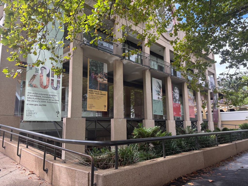
I was in Sydney a couple of weekends ago visiting a friend and seeing the Evil Dead Musical. Also on the agenda was the State Library of New South Wales, and their exhibition titled, Paper Universe. According to the introductory panel, this exhibition explores artist books and how they challenge the notion of what is a book and what medium can be used to create a book. The entire exhibition is weaved around this central theme and explores five sub-themes along the way. I will be structuring this review around the five sub-themes, selecting one to two highlight objects. To start, here are some general thoughts about the exhibition layout and design.
Layout and Design
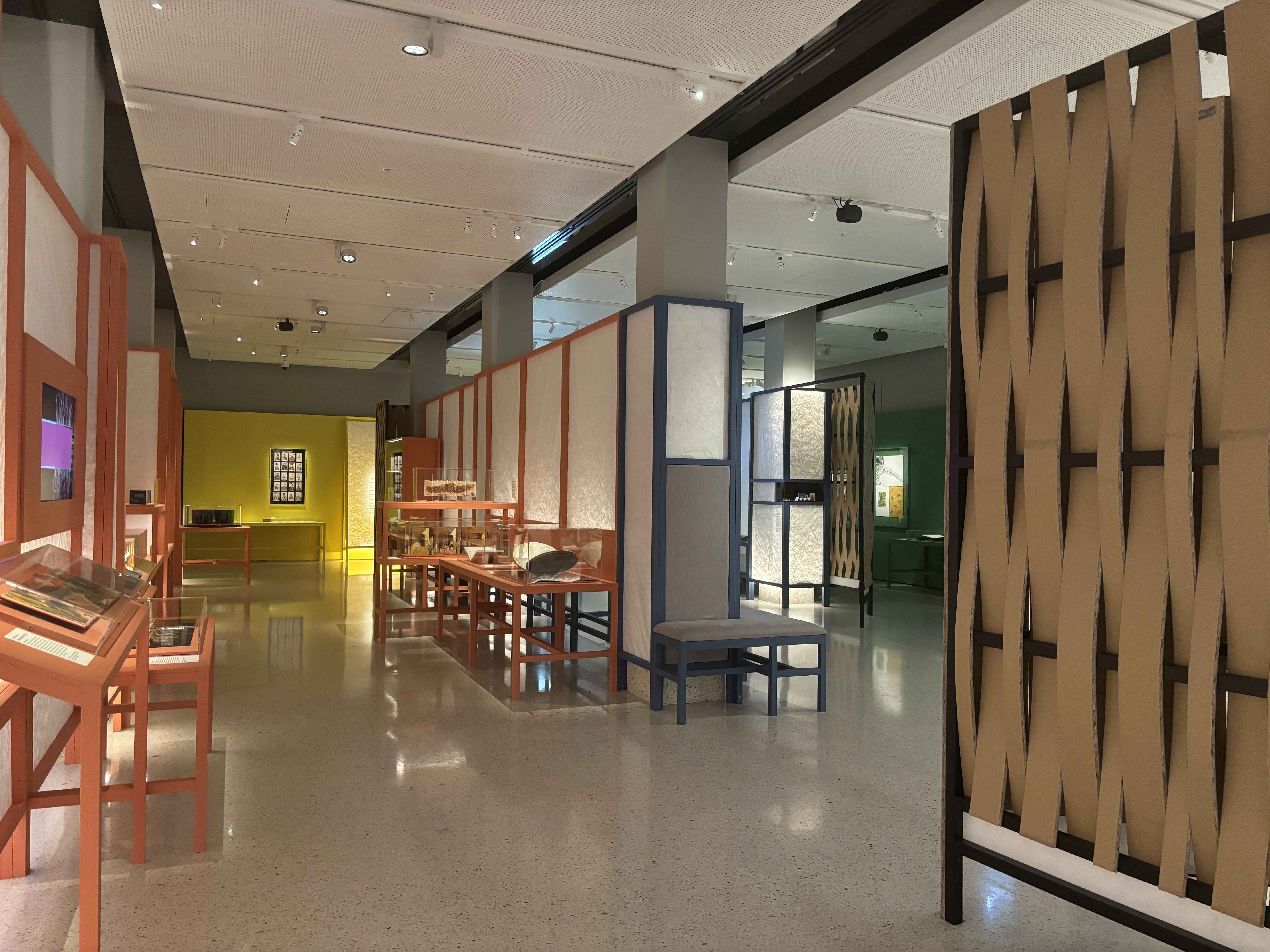
What really stood out to me about this exhibition is the flow and its commitment to the central theme. Each of the five sub-themes has a different colour associated. This colour is used on the exhibition scaffolding and for the display cases. You can, therefore, clearly see which objects belong to which sub-theme. There isn’t really a defined path to follow, so having the colours was crucial for wayfinding. There are a few paths you can take to explore the exhibition. I do recommend sticking to one sub-theme and seeing everything before moving on.
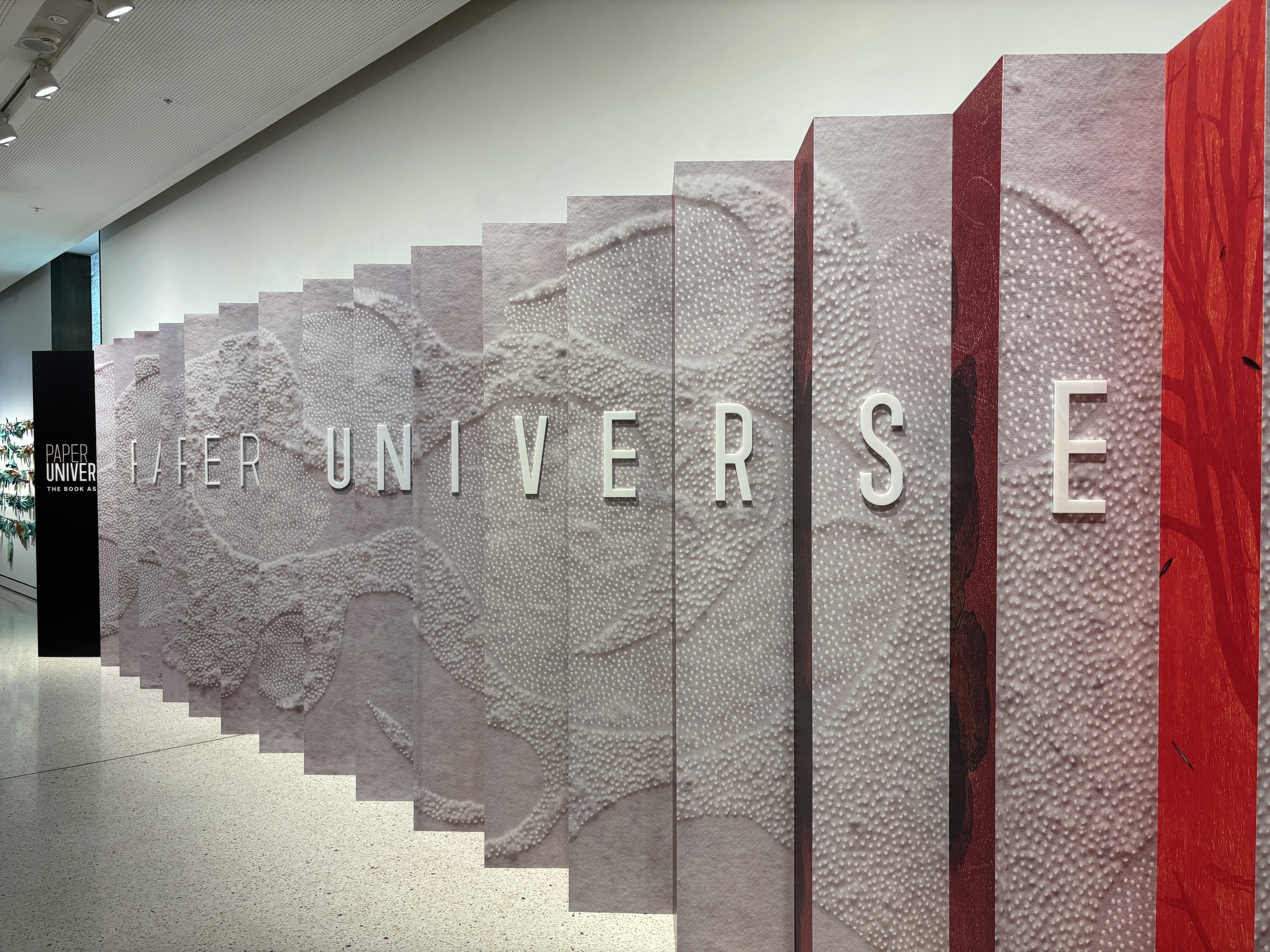
As for the exhibition design, materials such as cardboard and what looked like sheets of handmade paper are used heavily throughout. I will include an image below so you can see what I mean. This works so beautifully within the space and makes you feel as though you are encased within the pages of a book. Decisions such as these can really elevate an exhibition and its impact. Well, at least for me. I like feeling immersed when I’m in an exhibition and this definitely ticked the box.
Sub-Theme 1: The Artist’s Eye
Colour: Yellow
The first sub-theme I want to address is The Artist’s Eye. Central to this sub-theme is turning books into something dynamic. We are invited to challenge the traditional definition of a book and consider it through new eyes.
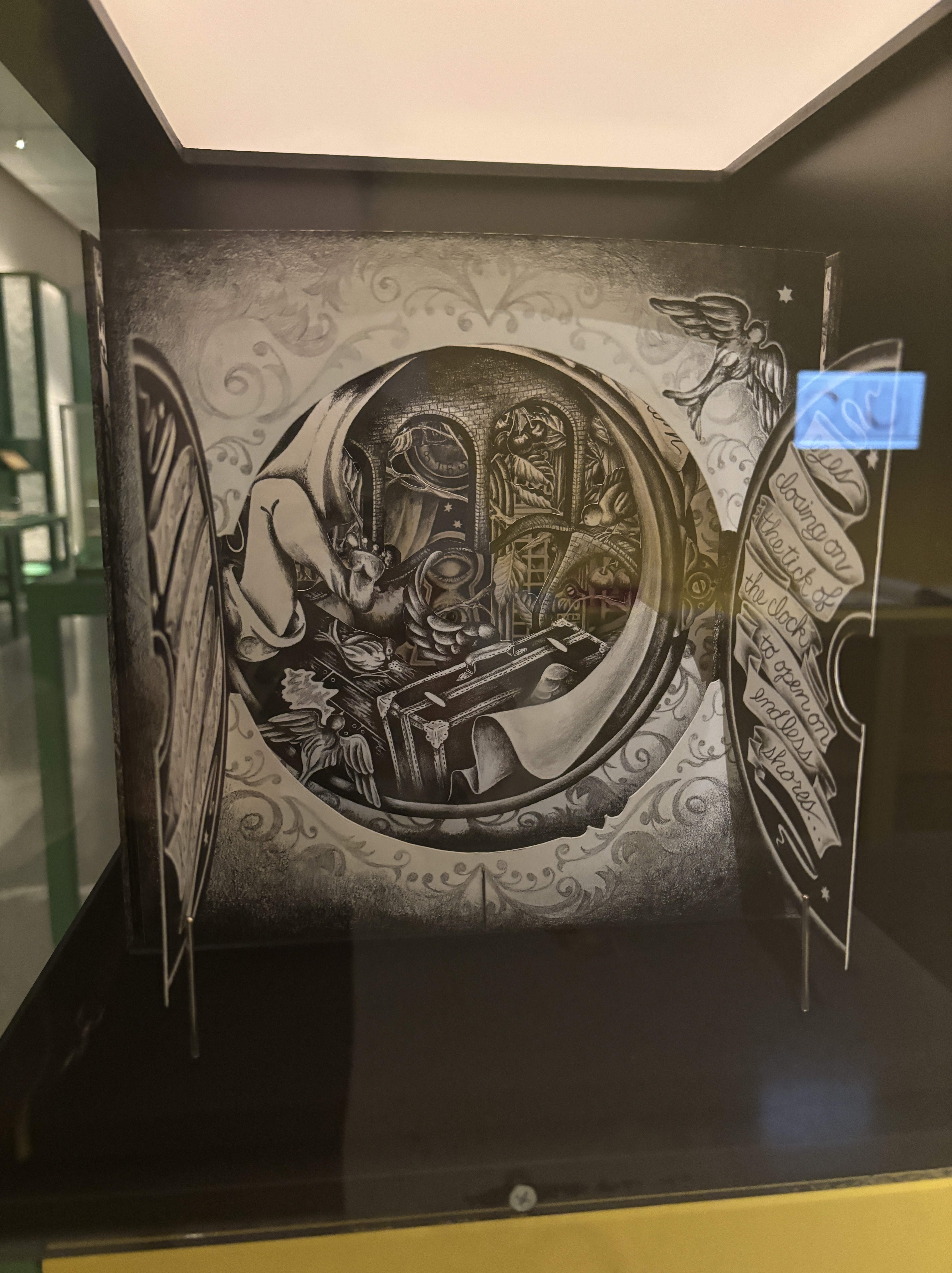
Highlight: Teresa Pankratz, Into the Night, 2016
This object immediately stood out to me as it reminded me of a fairy tale – one designed by M. C. Escher. The layers of lithographs create a tunnel, drawing your eyes toward the middle. Each layer has been designed to represent a dream or nightmare of the artist. The combination of art style and fantastical elements meant it was an easy pick for sub-theme highlight.
Sub-Theme 2: The Natural World
Colour: Green
Around the corner from The Artist’s Eye is a section dedicated to The Natural World and the influence of nature on art. In this space, viewers are asked to consider their relationship with the environment and reflect on their attitudes and responsibilities.
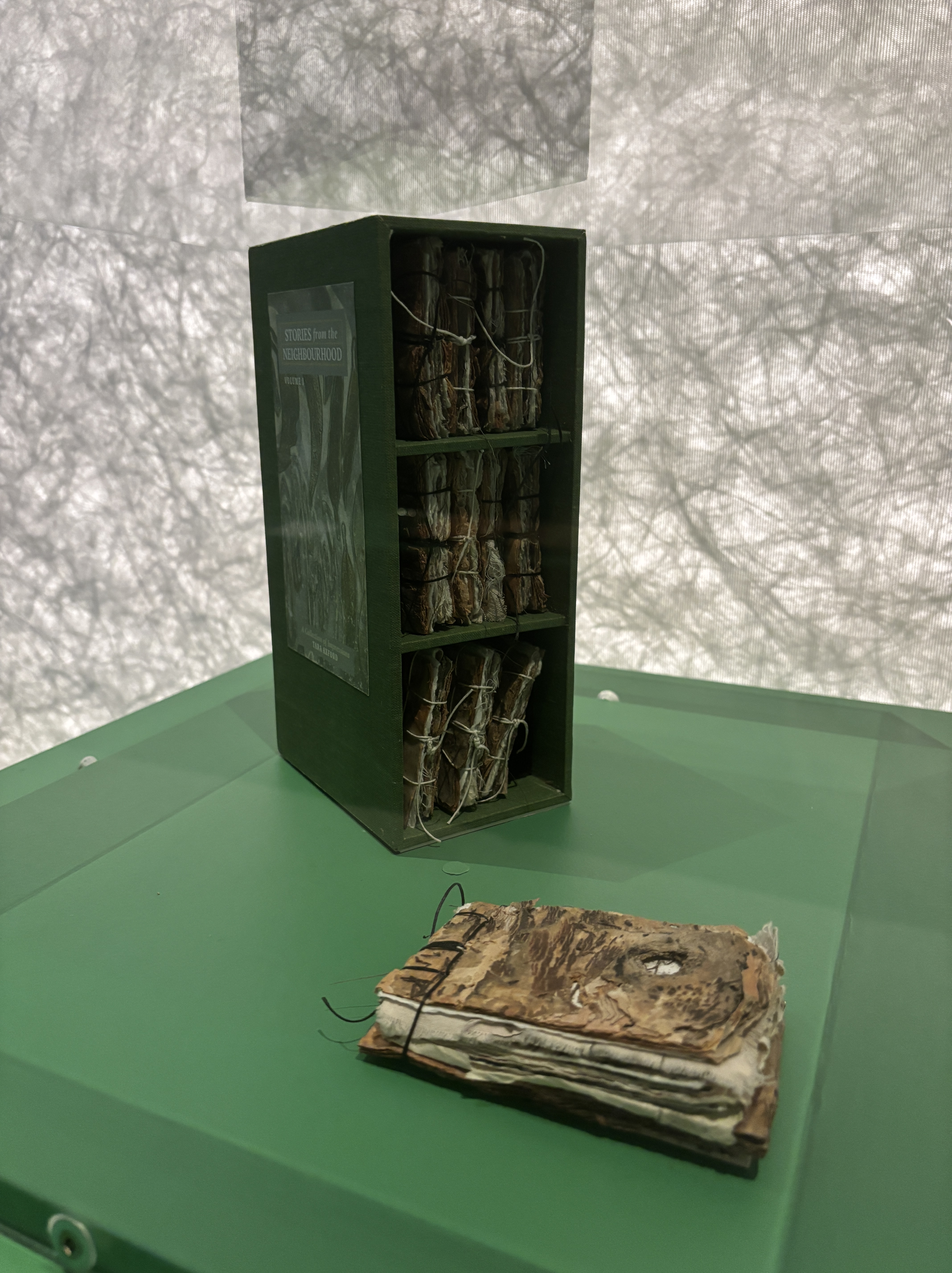
Highlight: Tara Axford, Stories from the Neighbourhood, 2022
It was difficult to select a highlight in this section. There are so many stunning flora and fauna illustrations. Ultimately, I selected this work because of the textures. These twelve mini books have been created using discarded paper works and paperbark found in the artist’s neighbourhood. The twelve books represent the twelve months of the year and encourage viewers to reflect on their memories formed while out and about in nature.
Sub-Theme 3: The Art of Inspiration
Colour: Dark Blue
One of the first sub-themes you encounter in the exhibition covers inspiration. What inspires artists and how does this inspiration reflect in their work? I really enjoyed this sub-theme because the works covered a whole range of art forms including poetry, music, and visual art.
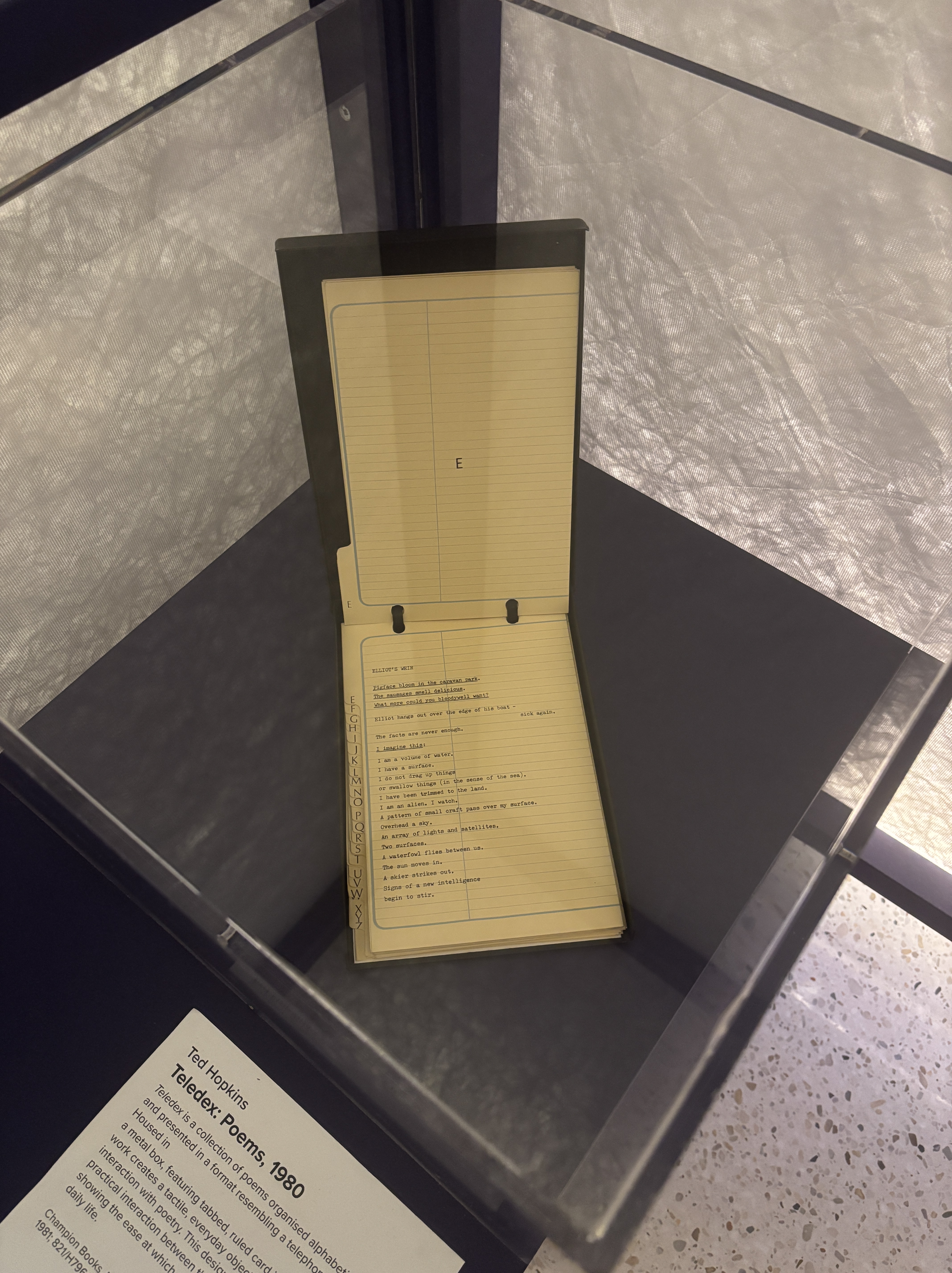
Highlight: Ted Hopkins, Teledex: Poems, 1980
Tucked away in a corner is a retro Teledex filled with poetry that has been organised alphabetically. If you were able to handle this object, you could flip through the pages and read a number of short poems. The purpose of this work is to highlight how something such as poetry can be integrated into daily life. One of the goals I have for this year is to read more poetry, so this object resonated with me.
Sub-Theme 4: Unveiling Identity
Within this sub-theme, objects have been selected that reflect on core identity and the relationship artists have to concepts such as culture, death and loss. It allows viewers the opportunity to reflect on their identities and how they see themselves navigating the current world.
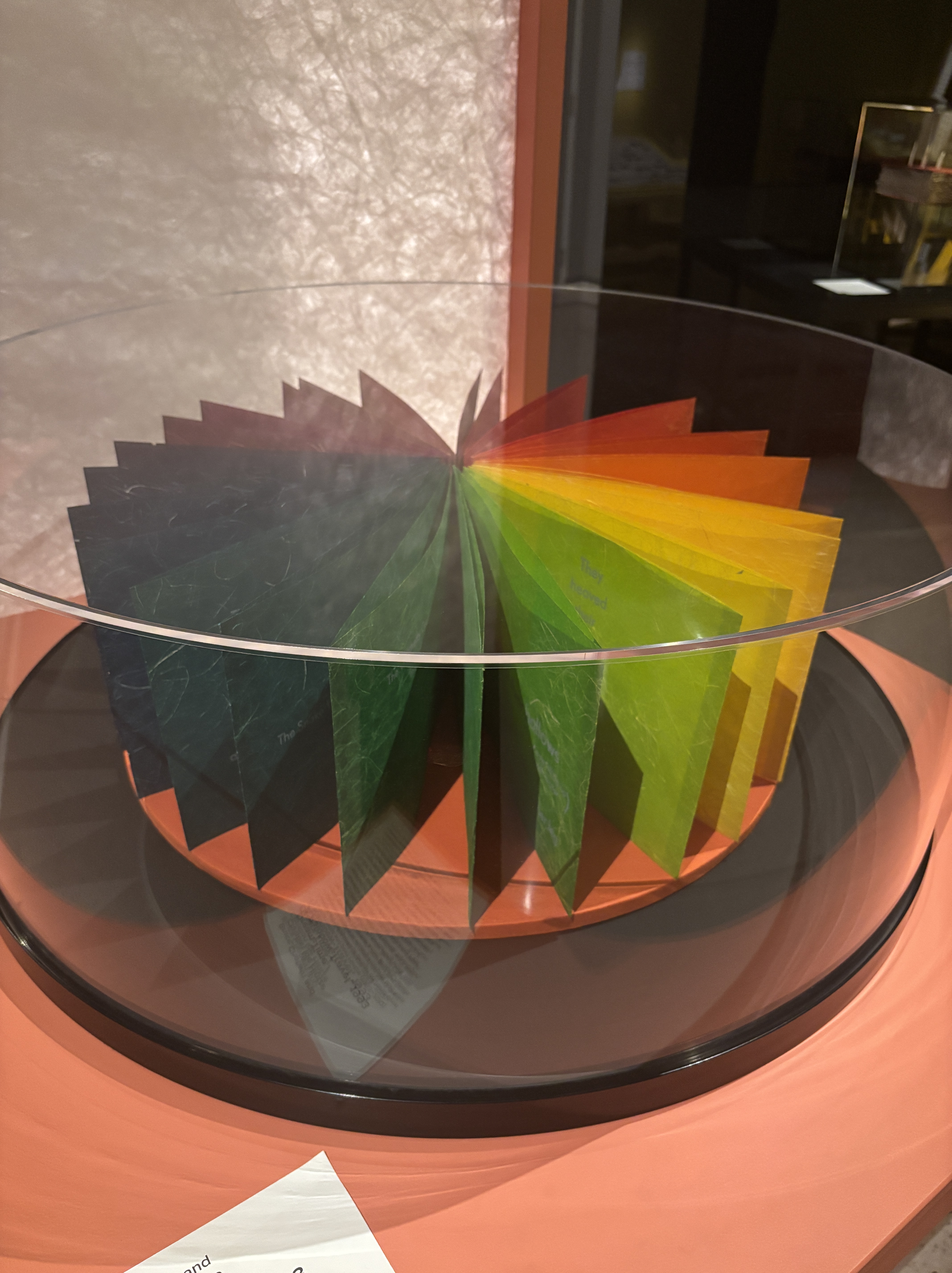
Highlight: Bruce Chatwin and Christian Ide Hintze, Dream-Time/A Rainbow-Travel, 1993
The reason why I gravitated towards this work is because it is so colourful. I am someone who is immediately drawn to anything colourful despite my interests in the macabre. This work is based on the text The Songlines by Bruce Chatwin. Published in the 1980s, it is a text exploring First Nations culture and connection to land. Hintze has drawn inspiration from this book and created typographical designs on hand-dyed Japanese papers. The object is displayed beautifully and really does draw your eye when you’re in the space.
Sub-Theme 5: The Civil Condition
Colour: Light Blue
Last, but not least, is a sub-theme focusing on societal values and issues. How do we see ourselves as responsible citizens within society and how has that changed over time? This was my favourite sub-theme of the exhibition and for that reason, I have two highlight objects.
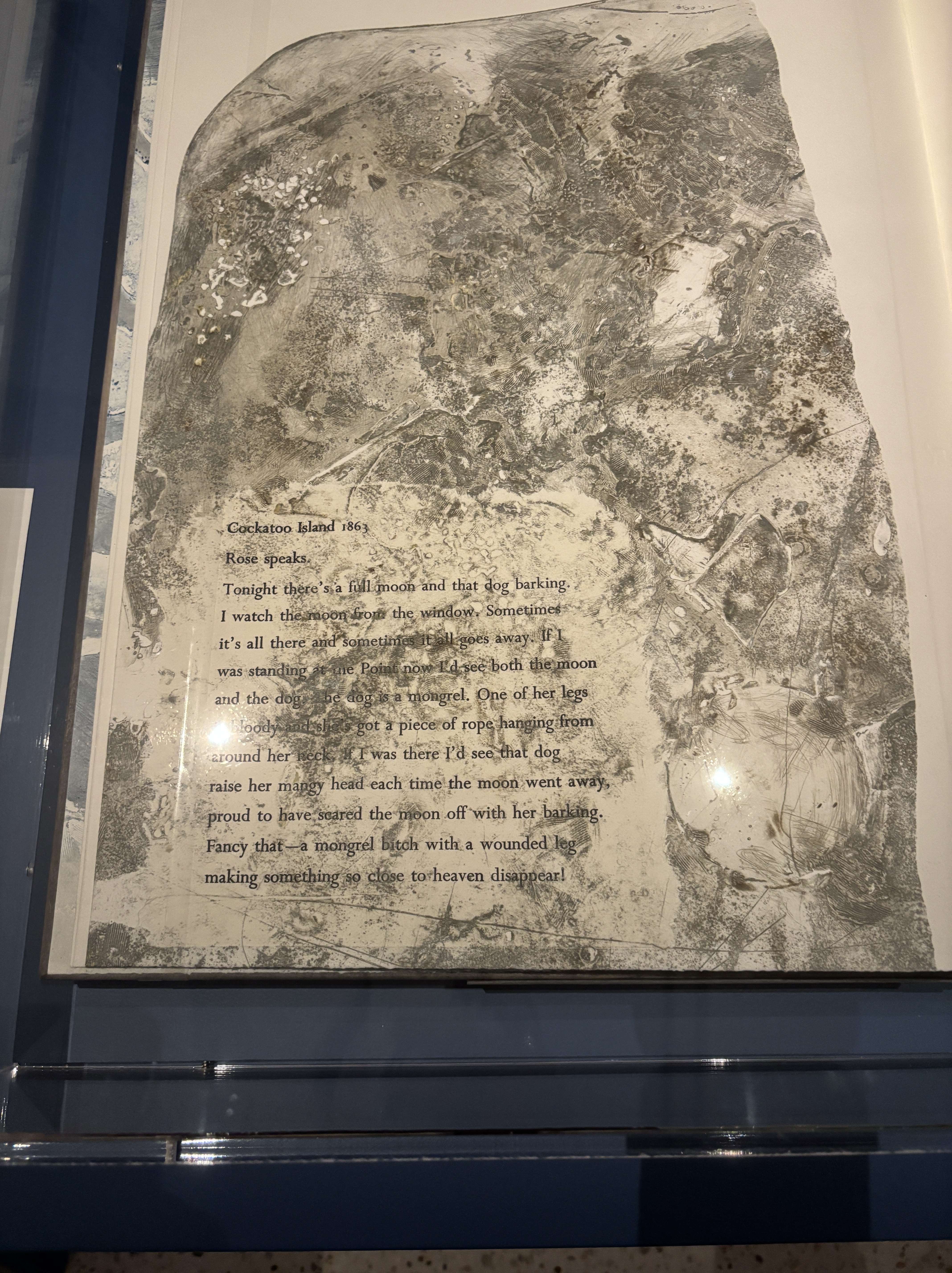
Highlight 1: Gwen Harrison, Sue Anderson and Peter Lyssiotis, Dancing Over Dark Waters, 2012
One of my first jobs in the museum/heritage sector was working as a tour guide on Cockatoo Island. To this day, it is one of the most enjoyable jobs I have ever worked. Whenever I see something Cockatoo Island related, it is going to be a highlight. This work examines the dark history of the island, when it functioned as a convict prison then industrial school for girls. Themes of marginalisation, incarceration, and colonisation are all intertwined in this work as it confronts the dark past and its ongoing impact.
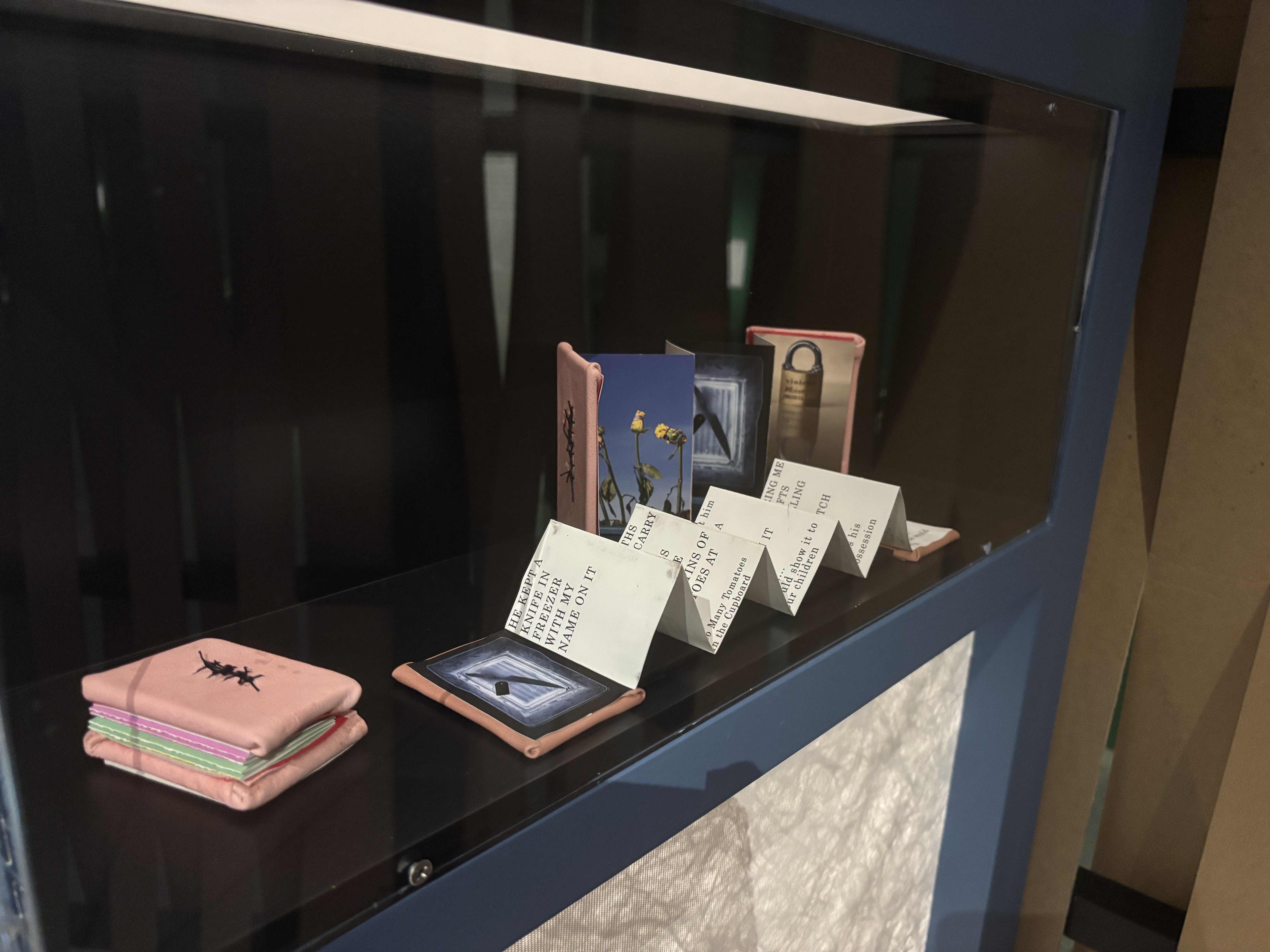
Highlight 2: Louise Whelan, States of Repair (2023), Why Didn’t She Leave (2021) and Resistance (2023)
These three books focus on providing a voice to those who are silenced by domestic violence. They are a physical reminder that these stories cannot be erased and they must be both heard and recognised. They are a perfect example, in this exhibition, of how some of the smallest objects can tell the most important stories.
Conclusion
I could have spent a couple more hours exploring this exhibition. Especially the activity at the end which is targeted at kids but I did want to see exactly what it entailed. It is a really relaxing and calming space to be in that holds not only a multitude of stories, but stories that are told in creative and impactful ways. If you are in Sydney or travelling through Sydney, I do recommend seeing this exhibition before it closes on May 3, 2026.

Leave a comment