
I’ve spent the last week in Auckland attending the Australasian Institute of Anatomical Sciences conference. It was a fascinating conference, and I was grateful to have the opportunity to present on a current work project. I had a couple of free days before the conference so visited both the Auckland Art Gallery Toi o Tāmaki and Auckland War Memorial Museum. This post is going to focus on one exhibition currently on display at the gallery, titled Gothic Returns: Fuseli to Fomison.
Layout
The exhibition is along a corridor on the mezzanine level of the gallery. Mid-way through is the entrance to the international historical art display. I wish this exhibition had more room to breath. I understand maximising the use of space but it was extremely cramped. There were four other people in the exhibition with me and it was a bit of a struggle to see all the artworks. I also had to spend about half an hour ducking in and out of the historical art display just to let the crowd through.
Aim
The main introductory panel explores why the theme of gothic is on display. It also describes gothic as ‘almost virus-like’ in that it’s a theme that has evolved and developed over time. There have been consistent elements such as melancholia, ominous moods, and things that unsettle. How this is represented, however, has changed. The panel also contextualises the theme for Auckland, describing how gothic flourished in New Zealand in the 1990s. The gallery’s gothic collection is impressive, with both historic and contemporary works on display.
The aim of the exhibition is stated at the end of the panel: this exhibition ‘unites old with new, playfully inviting viewers to enter the ever-enticing dark side of the imagination.’ After spending some time viewing the artworks on display, I can confirm it does achieve this aim and has a good mix of mediums as well as gothic genres.
Highlight Artworks
As always, I want to share some highlights. This exhibition was right up my alley with everything from horror films to cemeteries represented. Even though it isn’t a large exhibition, it is definitely a case of quality over quantity.
1. Henry Fuseli, Study for the Three Witches in Macbeth, circa. 1783, oil on canvas
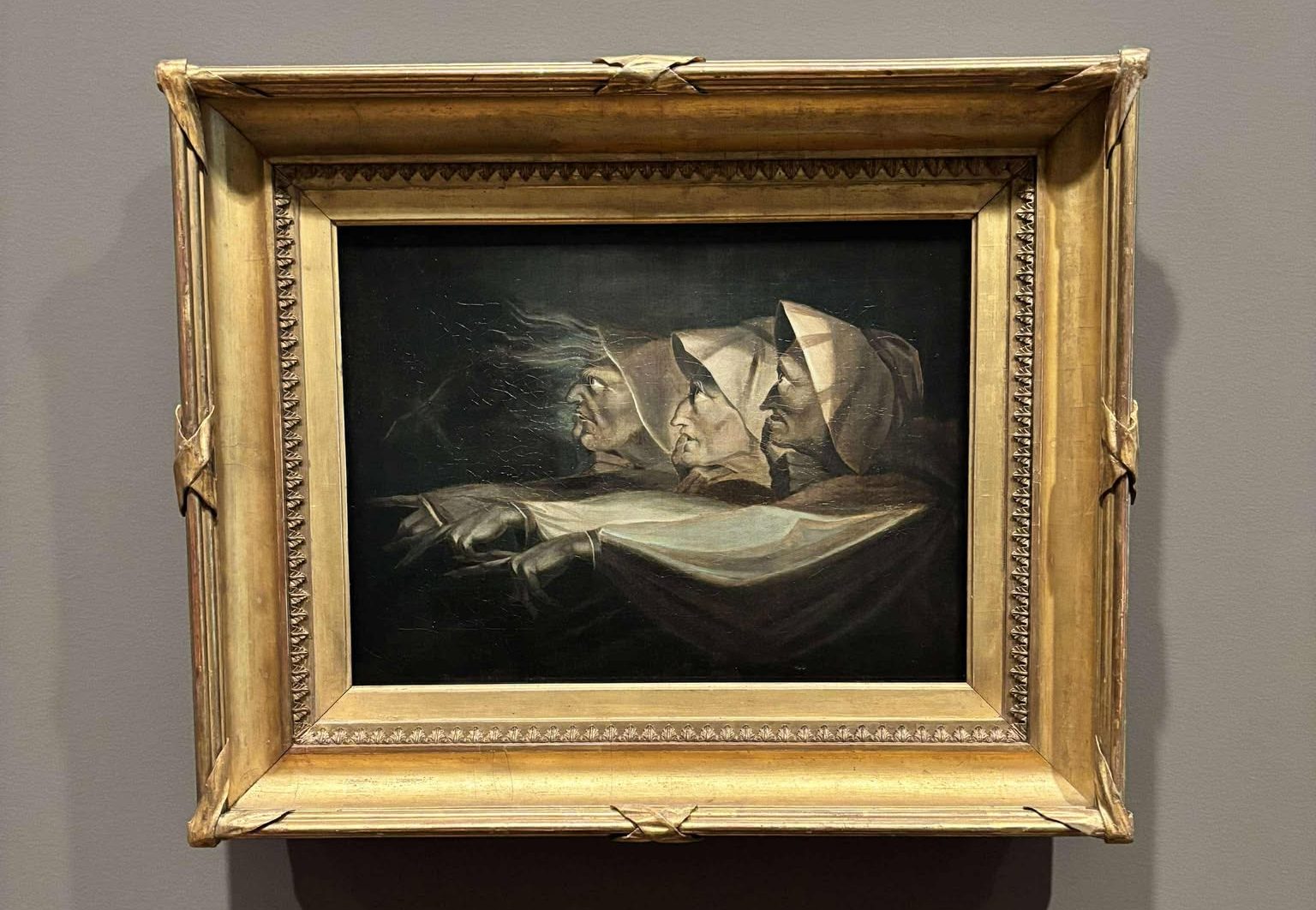
One of the first works on display is a study on the three witches from Shakespeare’s play Macbeth. I adore this artwork and the atmosphere it conjures. The labels are (sigh, white text on a grey background) written using accessible language and don’t presume the reader has a degree in art history. For that reason, I really engaged with the labels. I learnt with this work, for example, that it was created in opposition to the Neoclassicism movement that was gripping Britain at the time. I had also never taken note of the death-head moth floating just above their hands. The use of light and shadows is what strikes me about this artwork and adds an ominous flare.
2. Peter Siddell, Tombstone Angel, 1975, acrylic on hardboard

Opposite the three witches is this painting of Auckland cemetery by Peter Siddell. As a sidenote, I did spend time in this cemetery throughout the conference. The label for this artwork describes the scene as unsettling. Maybe I’ve spent too much time in cemeteries but to me, this doesn’t seem unsettling. Rather than being quiet and creepy, I see it as peaceful. It looks like a burial environment surrounded by nature and still cared for, as seen by the open door. The open door can look a bit creepy, but I actually see it as welcoming.
3. Tony Fomison, The Hand, 1970, oil on hessian on board

As I’m writing this I’m becoming acutely aware of the lack of female artists on display, which is a shame. This work displays a disembodied hand, covered in light and shadows. It is meant to be reminiscent of a horror film prop. The hand gesture conveys either a warning to stop or someone asking for help. I selected this work as a highlight because it reminds me of the three witches study that plays with light and shadow.
4. Ronnie van Hout, Psycho, 1999, house model
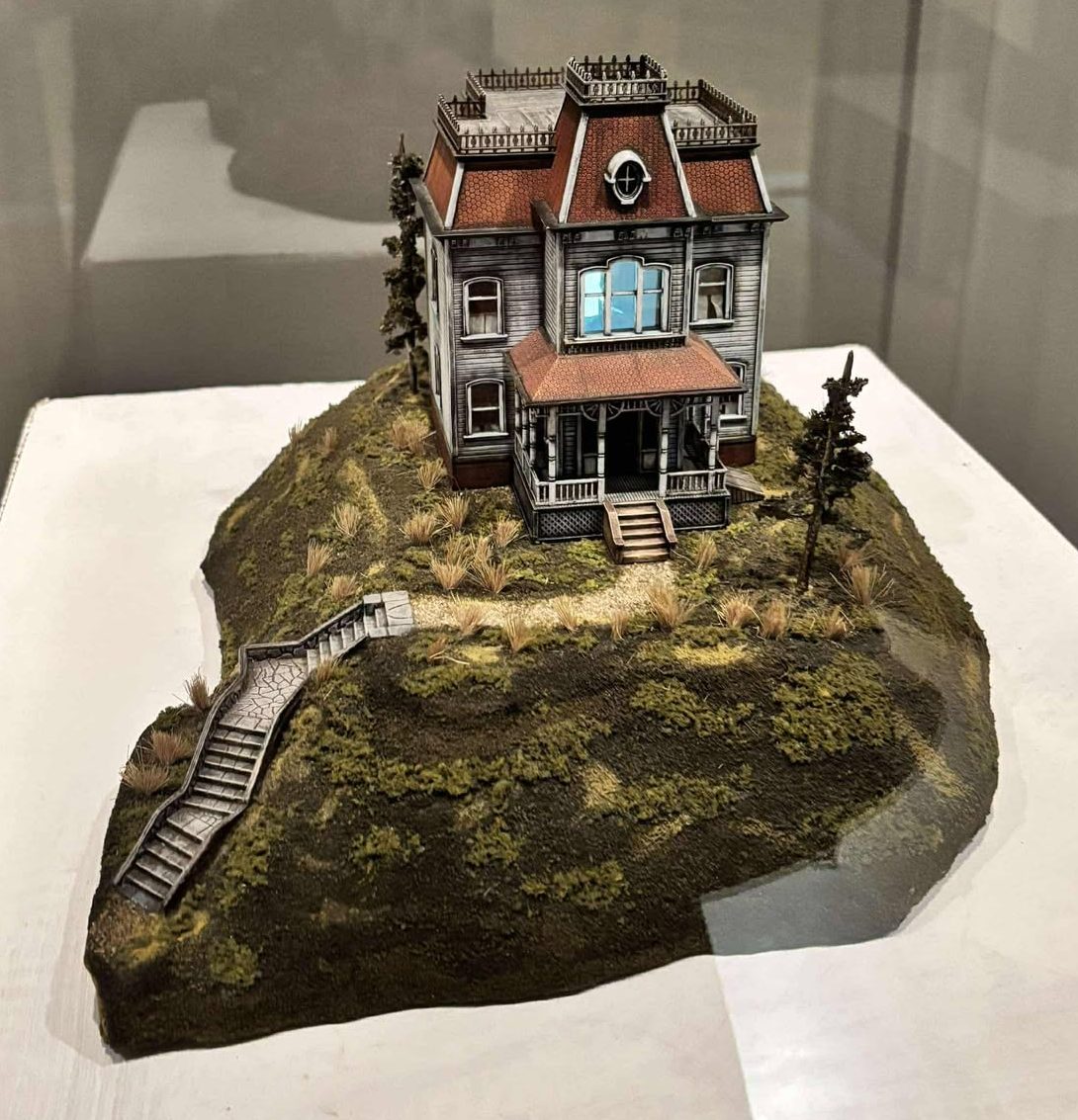
This little model of the Victorian mansion from Psycho was my favourite artwork. On the surface it looks like a cool model, transporting you into the world of horror. Almost a Beetlejuice vibe. When you read the label, you learn that the artist was creating a metaphor for his tortured mind. In the upstairs window you can see him wielding a knife. Again, I would have missed this detail if I didn’t read the label.
5. Tony Fomison, Skull Face 1970, oil on canvas board
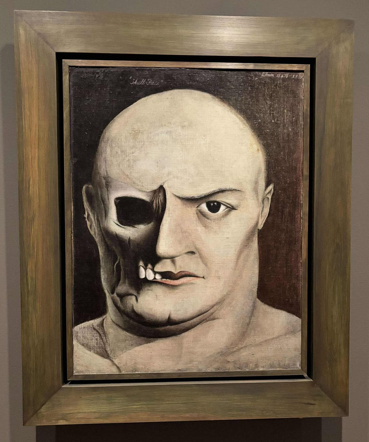
My final highlight artwork is this one by Tony Fomison. I selected it because both the work and label relate to the significance of art in the space of anatomy. Fomison used anatomical models to add that authenticity while dealing with themes of empathy and horror. I can definitely appreciate those while viewing this work.
Final Thoughts
To finish, I have two final thoughts. As I’ve said above, the lack of women artists in this space was disappointing to see. If it were a bigger exhibition space, I would have also enjoyed some different cultural perspectives on gothic. I also want to say that each time I come to New Zealand, I am impressed with how they integrate Māori language into their practice and culture. All of the exhibition labels in the gallery are written in both English and Māori.
Gothic Returns is on display until end of August, 2025. On the whole, the gallery is a fantastic free space to explore, open daily from 10am – 5pm.

Leave a comment