During a weekend getaway to Melbourne, I made sure to visit the National Gallery of Victoria (NGV) to see Escher X nendo | Between Two Worlds. I was quite familiar with the works of Escher having seen examples in optical illusion puzzle books. I was particularly excited to see the work titled Ascending and descending – luckily, it was in the exhibition!
Context
Just for some context, here is a very short summary of the artist Escher and design studio nendo.
M. C. Escher (1898-1972)
A Dutch graphic artist who was inspired by his travels and nature to create iconic prints. His later works were defined by tessellations, optical illusions, and representations of infinity.
nendo
A design studio based in Tokyo founded in 2002 by Oki Sato. The word nendo is Japanese for clay. The studio is focused on simplicity, curiosity and craftsmanship.

Layout
One significant issue I had with the exhibition was the entrance area. As a sidenote, the exhibition did have timed ticket entry. This, in theory, should control visitor numbers. In practice, and in this instance, it did not. Granted, it was the final weekend to see the exhibition so I was expecting large visitor numbers.
With all that in mind, the entrance area to the exhibition is a long dark corridor with a strobe light installation. Right at the end of this corridor are some introductory panels and artworks that encourage people to linger. Long story short, we were essentially stuck in a long dark corridor for quite some time waiting for the queue to move into the rest of the exhibition space. I’m not normally a claustrophobic person, but, this was quite a negative experience. Something similar happened at the end of the exhibition with a huge crowd forming in a narrow corridor to see the final artwork.
Apart from the beginning and the end, everything in between is really well curated. Each space feels as though it has its own identity that perfectly suits the theme being represented. The chronological layout allows visitors to trace the evolution of Escher’s work. It was interesting to see how the layout was not only chronological, but also, thematic. This was aided in part by the fact that Escher focused on quite distinct styles at various stages of his life.
Labels
The labels are quite difficult to read as they are white text on both black and medium grey backgrounds. I’m not a fan of this as it can really strain your eyes. I did appreciate, however, that the labels didn’t contain as much art terminology as ones I’ve read in the past. They did reveal some pretty interesting information. For example, the label for Ascending and descending explains what motivated Escher to create this print and what is the optical illusion.
The labels for kids continue to be quite problematic. They look identical to the other labels so are hard to identify at first glance. In addition, they are almost at the same height as the other labels making them hard for children to read. One thing I did notice, however, is that the kids labels are written in a much more accessible language than others I have seen at the NGV. So some positives and some continuing frustrations.

Artworks
Now it’s time to share my absolute favourite artworks in the exhibition. Disclaimer: they will all be Escher works. I will post a nendo work at the end of the post.
1. Ascending and descending – 1960 – lithograph


There is no competition for what was my favourite artwork in the show. This optical illusion was inspired by the publication of an endless staircase designed by mathematicians Roger and L. S. Penrose in 1958. This print shows a staircase that never gets any higher or lower. The figures walking the stairs are essentially doomed to never know which direction they’re going.
2. Print Gallery – 1956 – lithograph

In the corner of this print you can see a boy in a gallery looking at a wall of framed prints. At the top, the townscape twists and turns with a veranda forming the roof of the gallery. According to the label, Escher believed this to be one of his most successful prints.
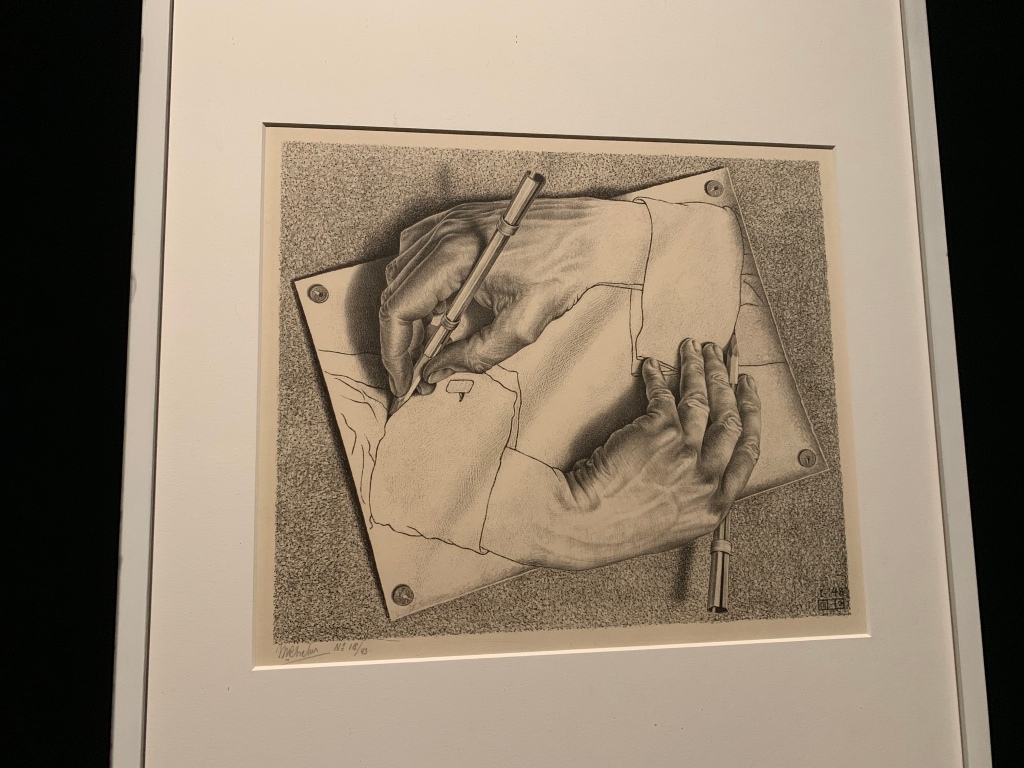
3. Drawing hands – 1948 – lithograph 
This is the print at the end of the exhibition. It is an incredible print that appears as though the hands are drawing each other. One of the most pertinent examples of how Escher matured and perfected the optical illusion style.
4. Hand with Reflecting Sphere – 1935 – lithograph

This is such a beautiful lithograph that also serves as a self-portrait. One of the most obvious themes here is that of reflection. Not only what is reflected in the sphere, but, the paintings on the walls etc are all linked to this theme.
5. Eye – 1946 – lithograph 
The main reason why I’ve included this print on the list is because you can see a skeleton reflected in the eye.
6. Waterfall – 1961 – lithograph

Similar to Ascending and descending this print plays with the notion of direction. It seems as though the water is defying gravity and flowing uphill. It is based on the Penrose triangle created by mathematician Roger Penrose.
7. Circle limit IV (Heaven and hell) – 1960 – woodcut

This print consists of angels and demons. The angels are a bit more difficult to see, but, sit between the demons.
nendo


This was my favourite installation work by nendo. In and amongst the houses are exhibition cases with Escher works on display. You felt as though you could really explore in this space. I loved the immersive nature and the ability to choose your own path.
Final Details
Unfortunately, Escher x nendo | Between Two Worlds is finishing on Sunday 7 April 2019. To see what is coming soon, make sure you visit the NGV website.

Leave a comment